- Made by AppCoda
- Contact us / Support
- Tweet this book
- Preface
- 1. Building Adaptive User Interfaces
- 2. Creating Table View Sections and Index list with Diffable Data Source
- 3. Animating Table View Cells
- 4. Working with JSON and Codable
- 5. How to Integrate the Twitter and Facebook SDK for Social Sharing
- 6. Working with Email and Attachments
- 7. Sending SMS and MMS Using MessageUI Framework
- 8. How to Get Direction and Draw Route on Maps
- 9. Search Nearby Points of Interest Using Local Search
- 10. Audio Recording and Playback
- 11. Scan QR Code Using AVFoundation Framework
- 12. Working with URL Schemes
- 13. Building a Full Screen Camera with Gesture-based Controls
- 14. Video Capturing and Playback Using AVKit
- 15. Displaying Banner Ads using Google AdMob
- 16. Working with Custom Fonts
- 17. Working with AirDrop, UIActivityViewController and Uniform Type Identifiers
- 18. Building Grid Layouts Using Collection Views and Diffable Data Source
- 19. Interacting with Collection Views
- 20. Adaptive Collection Views Using UITraitCollection and Compositional Layout
- 21. Building a Weather Widget Using WidgetKit
- 22. Building Slide Out Sidebar Menus Using Objective-C Libraries
- 23. View Controller Transitions and Animations
- 24. Building a Slide Down Menu
- 25. Self Sizing Cells and Dynamic Type
- 26. XML Parsing, RSS and Expandable Table View Cells
- 27. Applying a Blurred Background Using UIVisualEffect
- 28. Using Touch ID and Face ID For Authentication
- 29. Building a Carousel-Like User Interface
- 30. Working with Parse
- 31. Parsing CSV and Preloading a SQLite Database Using Core Data
- 32. Connecting Multiple Annotations with Polylines and Routes
- 33. Using CocoaPods in Swift Projects
- 34. Building a Simple Sticker App
- 35. Building iMessage Apps Using Messages Framework
- 36. Building Custom UI Components Using IBDesignable and IBInspectable
- 37. Using Firebase for User Authentication
- 38. Google and Facebook Authentication Using Firebase
- 39. Using Firebase Database and Storage to Build an Instagram-like App
- 40. Building a Real-time Image Recognition App Using Core ML
- 41. Building AR Apps with ARKit and SpriteKit
- 42. Working with 3D Objects in Augmented Reality Using ARKit and SceneKit
- 43. Use Create ML to Train Your Own Machine Learning Model for Image Recognition
- 44. Building a Sentiment Classifier Using Create ML to Classify User Reviews
- 45. Working with Image Tracking Using ARKit
- Published with GitBook
Chapter 1
Building Adaptive User Interfaces
In the beginning, there was only one iPhone with a fixed 3.5-inch display. It was very easy to design your apps; you just needed to account for two different orientations (portrait and landscape). Later on, Apple released the iPad with a 9.7-inch display. If you were an iOS developer at that time, you had to create two different screen designs (i.e. storyboards / XIBs) in Xcode for an app - one for the iPhone and the other for the iPad.
Gone are the good old days. Fast-forward to 2022: Apple's iPhone and iPad lineup has changed a lot. With the launch of the iPhone 13, 13 Pro, and 13 Pro Max, your apps are required to support an array of devices with various screen sizes and resolutions including:
- iPhone 4/4s (3.5-inch)
- iPhone 5/5c/5s (4-inch)
- iPhone 6/6s/7/8/SE (4.7-inch)
- iPhone 6/6s/7/8 Plus (5.5-inch)
- iPhone X/XS/11 Pro (5.8-inch)
- iPhone XR/11/12/12 Pro/13 Pro (6.1-inch)
- iPhone XS Max/11 Pro Max (6.5-inch)
- iPhone 12 Pro Max/13 Pro Max (6.7-inch)
- iPad (9.7-inch)
- iPad Mini (7.9-inch)
- iPad Pro (10.5/12.9-inch)
It is a great challenge for iOS developers to create a universal app that adapts its UI for all of the listed screen sizes and orientations. So what can you do to design pixel-perfect apps?
Starting from iOS 8, the mobile OS comes with a new concept called Adaptive User Interfaces, which is Apple's answer to support any size display or orientation of an iOS device. Now apps can adapt their UI to a particular device and device orientation.
This leads to a new UI design concept known as Adaptive Layout. Starting from Xcode 7, the development tool allows developers to build an app UI that adapts to all different devices, screen sizes and orientation using Interface Builder. From Xcode 8, the Interface Builder is further re-engineered to streamline the making of an adaptive user interface. It even comes with a full live preview of how things will render on any iOS device. You will understand what I mean when we check out the new Interface Builder.
To achieve adaptive layout, you will need to make use of a concept called Size Classes, which is available on iOS 8 or up. This is probably the most important aspect which makes adaptive layout possible. Size classes are an abstraction of how a device is categorized depending on its screen size and orientation. You can use both size classes and auto layout together to design adaptive user interfaces. In iOS, the process for creating adaptive layouts is as follows:
- You start by designing a generic layout. The base layout is good enough to support most of the screen sizes and orientations.
- You choose a particular size class and provide your layout specializations. For example, you want to increase the spacing between two labels when a device is in landscape orientation.
In this chapter, I will walk you through all the adaptive concepts such as size classes, by building a universal app. The app supports all available screen sizes and orientations.
Adaptive UI demo
No coding is required for this project. You will primarily use Storyboard to lay out the user interface components and learn how to use auto layout and size classes to make the UI adaptive. After going through the chapter, you will have an app with a single view controller that adapts to multiple screen sizes and orientations.
Creating the Xcode Project
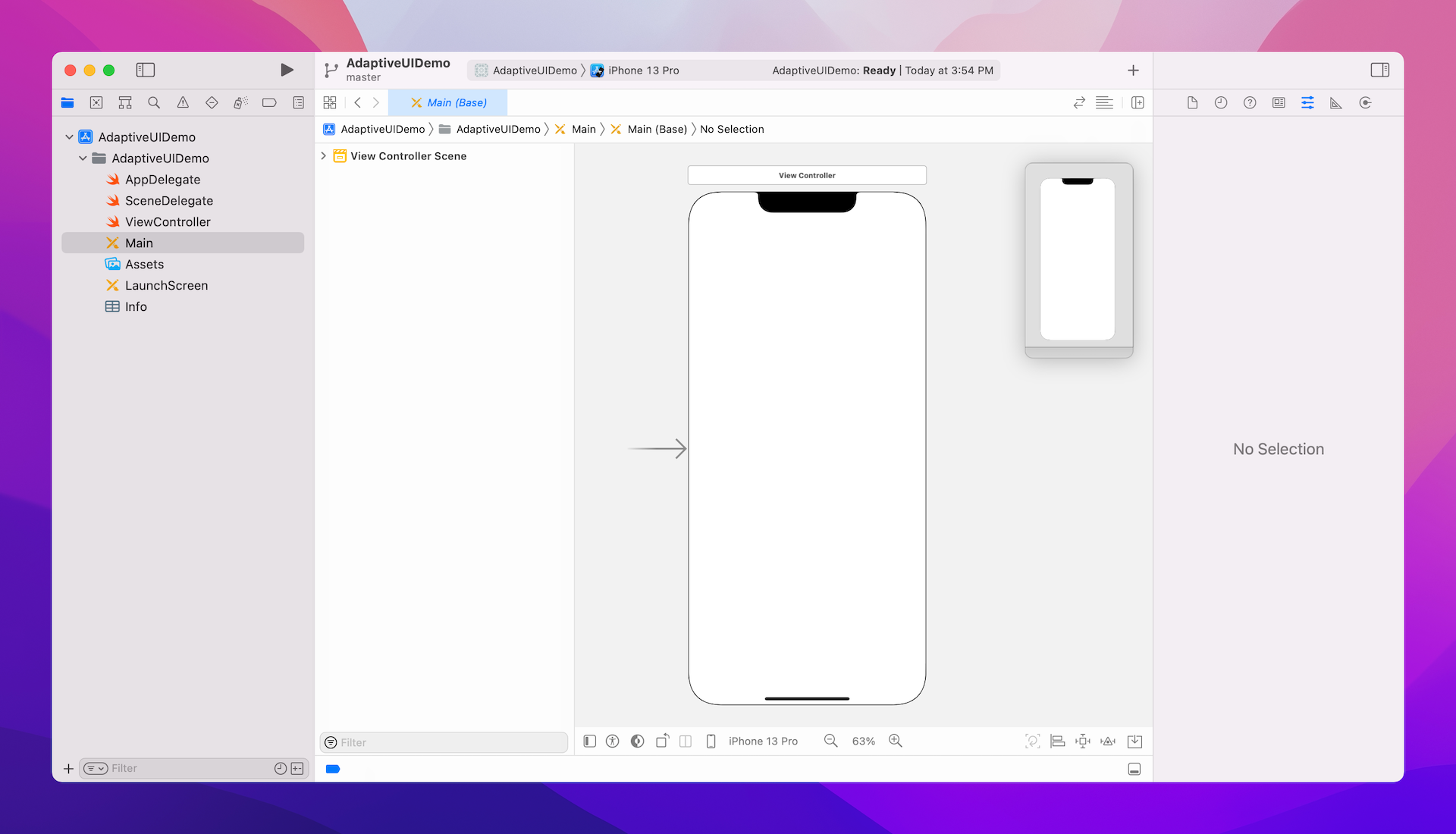
First, fire up Xcode, and create a new project using the Single View Application template. In the project option, name the project AdaptiveUIDemo and make sure to select Storyboard for the User Interface option.
Once the project is created, go to the project setting and set the Deployment Target from 15.0 to 9.3 (or lower). This allows you to test your app on iPhone 4s because iOS 10 (or up) no longer supports the 3.5-inch devices. You probably don't want to support the older generation of devices too, but in this demo, I would like to demonstrate how to build an adaptive UI for all screen sizes.
Now, open Main storyboard. In Interface Builder, you should find a view controller that has the size of an iPhone 11. The Interface Builder lets you lay out the user interface in a simulated device and you can easily switch between different devices using the device configuration controls in the bottom bar. For example, click iPhone 11 to open the device configuration pane, you will see other devices (e.g. iPhone 13 Pro) for your selection. For this demo, let's change it to iPhone 13 Pro.
Now we'll start to design the app UI. First, download the image pack from http://www.appcoda.com/resources/swift4/adaptiveui-images.zip and import the images to Assets.
Next, go back to the storyboard. I usually start with iPhone 13 Pro (6.1-inch) to lay out the user interface and then add layout specializations for other screen sizes. Therefore, if you have chosen other device (e.g. iPhone 11), I suggest you change the device setting to iPhone 13 Pro.
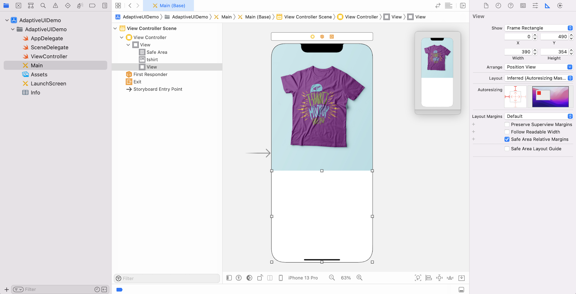
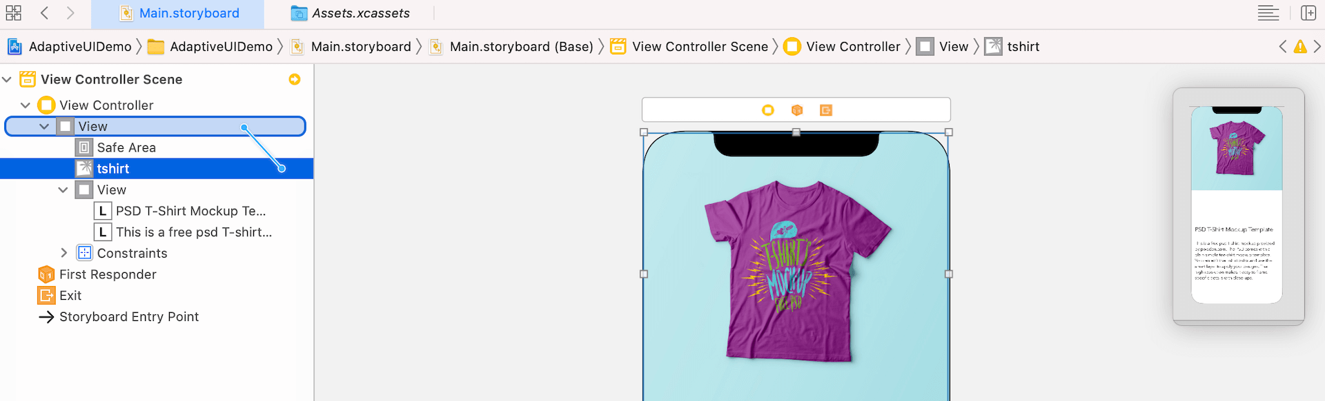
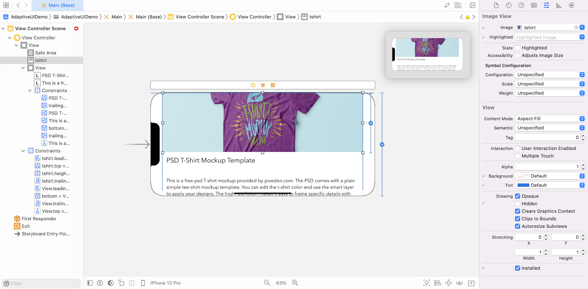
Now, drag an image view from the Object library to the view controller. Set its width to 390 and height to 490. Choose the image view and go to the Attributes inspector. Set the image to tshirt and the mode to Aspect Fill.
Then, drag a view to the view controller and put it right below the image view. This view serves as a container for holding other UI components like labels. By grouping related UI components under the same view, it will be easier for you to work with auto layout in the later section. In Size inspector, make sure you set the width to 390 and height to 354.
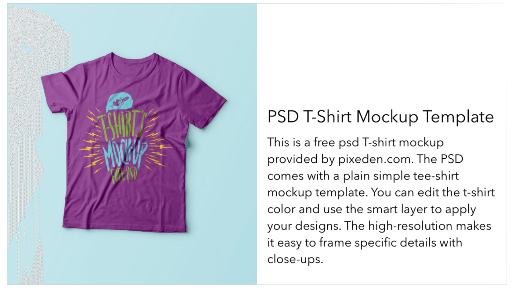
Throughout the chapter, I will refer to this view as Product Info View. Your layout should be similar to the figure below.
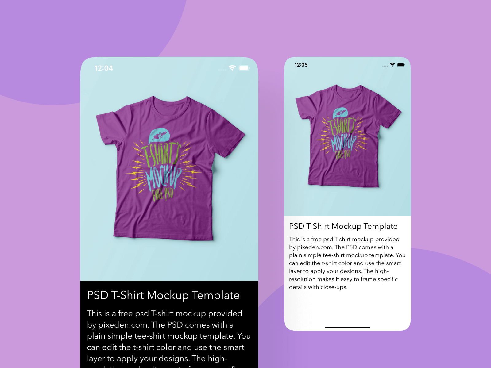
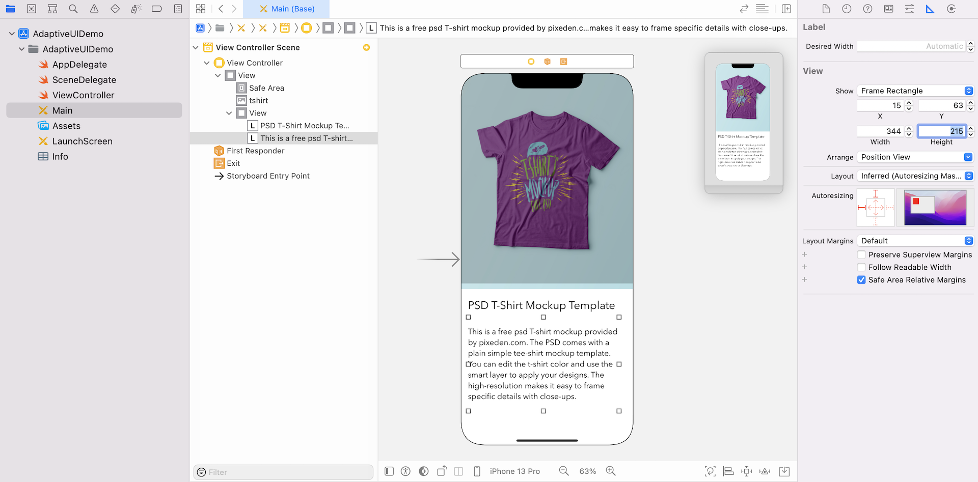
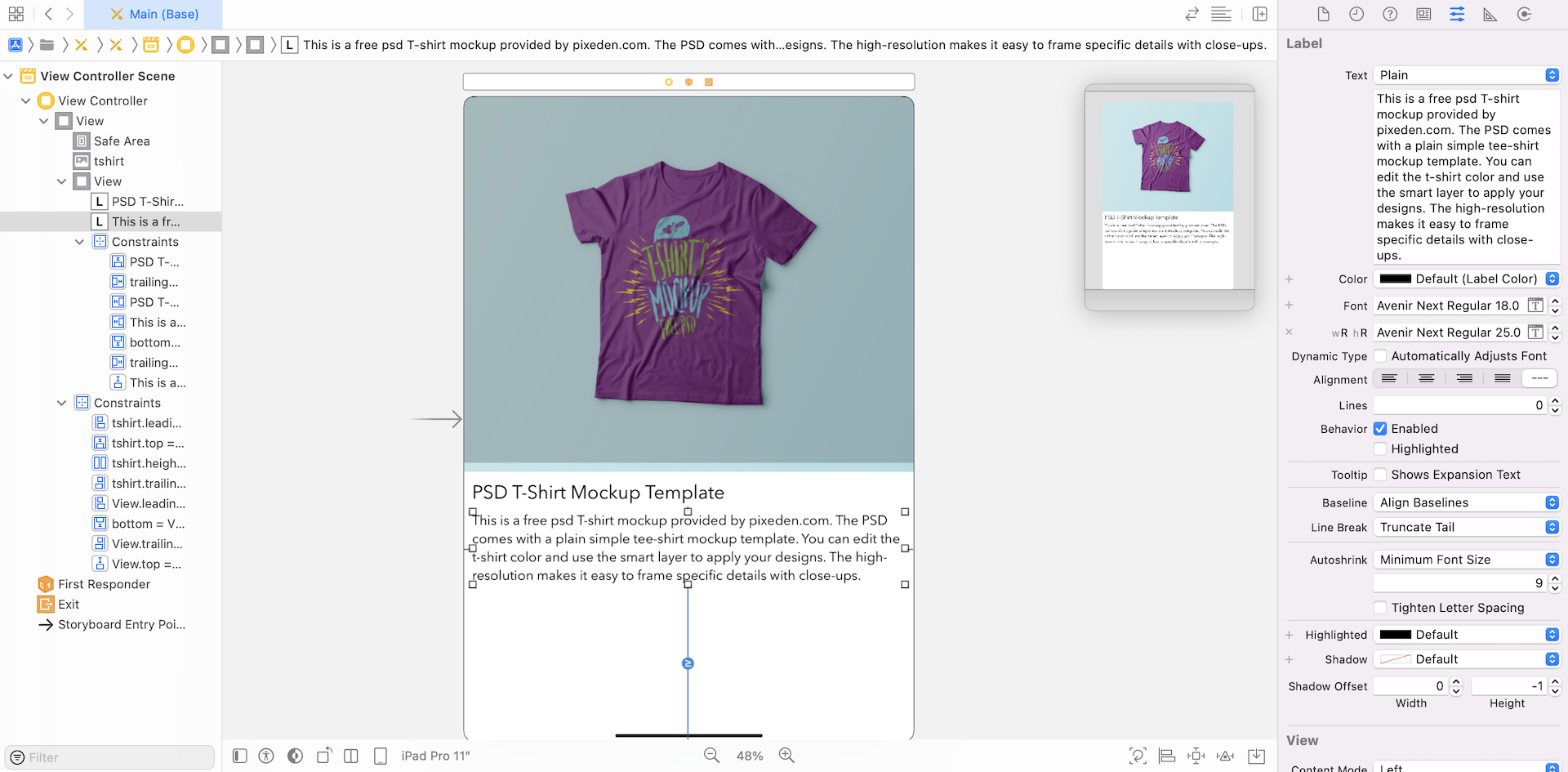
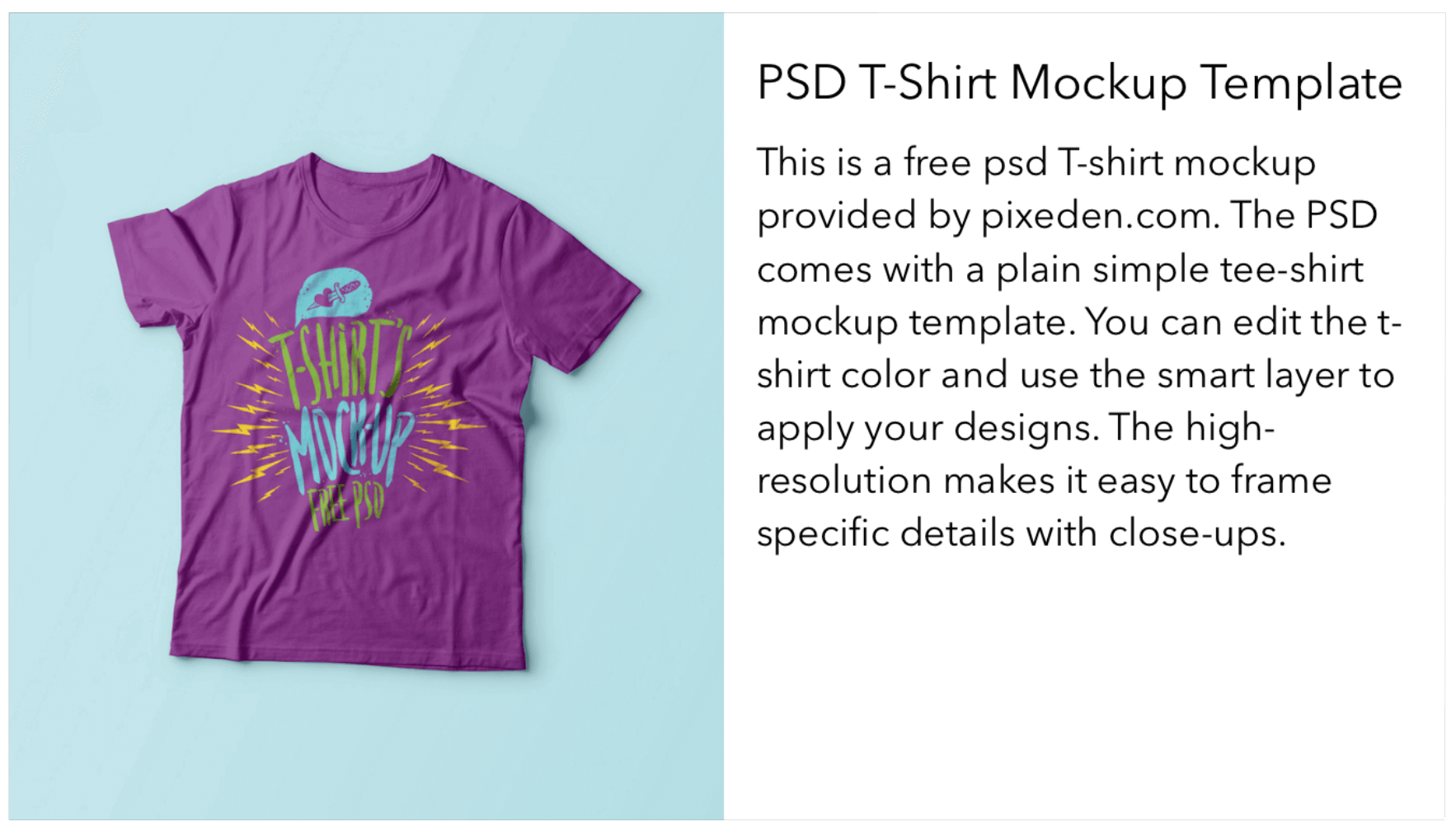
Next, drag a label to Product Info View. Change the label to PSD T-Shirt Mockup Template. Set the font to Avenir Next, and its size to 25 points. In the Size inspector, change the value of X to 15 and Y to 20.
Drag another label and place it right below the previous label. In Attributes inspector, change the text to This is a free psd T-shirt mockup provided by pixeden.com. The PSD comes with a plain simple tee-shirt mockup template. You can edit the t-shirt color and use the smart layer to apply your designs. The high-resolution makes it easy to frame specific details with close-ups. and set the font to Avenir Next. Change the font size to 18 points and the number of lines to 0.
Note that the two labels should be placed inside Product Info View. You can double-check by opening Document Outline. The two labels are put under the view. If you've followed the procedures correctly, your screen should look similar to this:
Even if your design does not match the reference design perfectly, it is absolutely fine. We will use auto layout constraints to lay out the view later.
Now, the app UI is perfect for iPhone 13 Pro. Let's conduct a quick test to check out the look and feel of the design on different devices.
In Xcode, you have two ways to live preview the app UI:
- By using device configuration pane
- By using the Preview Assistant
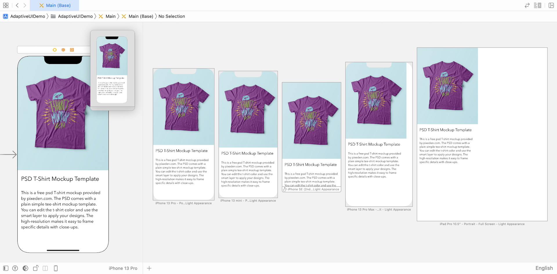
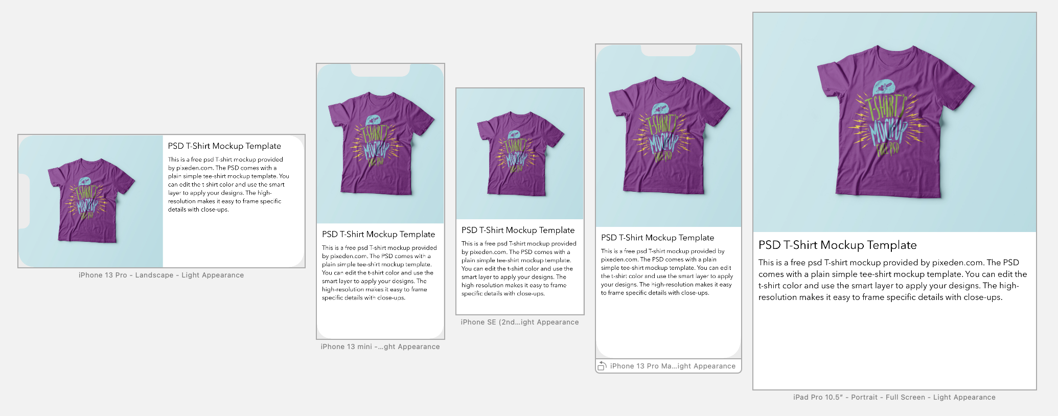
As you have tried out earlier, you can click iPhone 13 button in the configuration bar to switch over to another device. Now try to change the device to iPhone SE or 13 Pro Max to see how it looks. It doesn't look good. The image and the text are both truncated. You can continue to switch over to other devices to preview the UI.
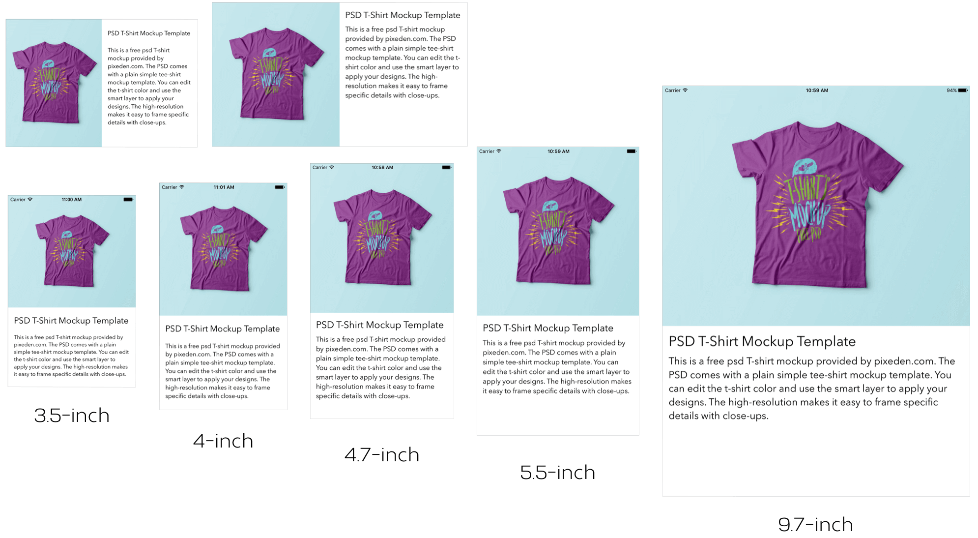
Alternatively, you can use the Preview Assistant, which lets you evaluate the resulting design on different size displays at one time.
To bring up the preview assistant, click the Adjust Editor Options button and choose Preview.
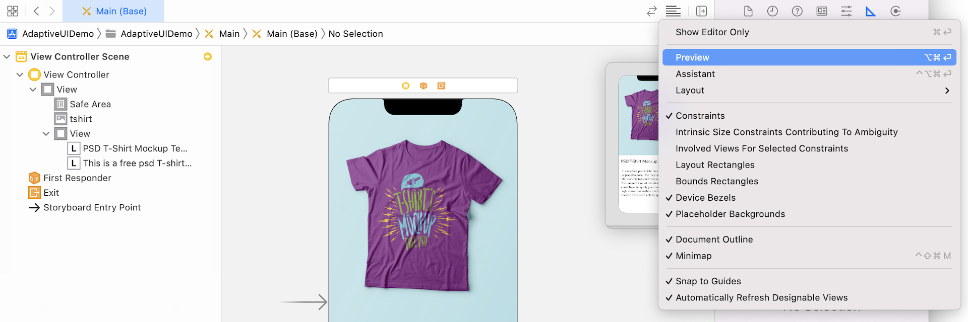
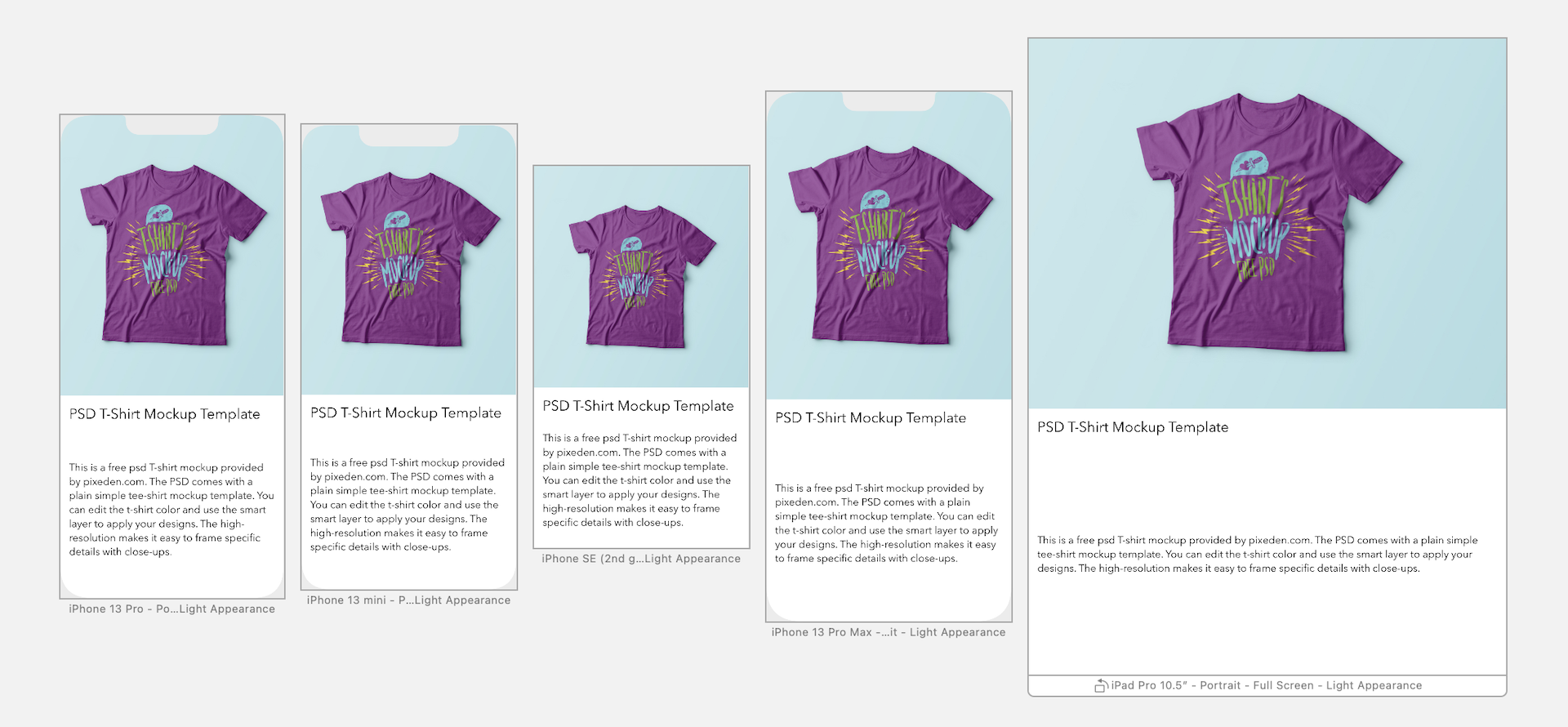
Xcode will then display a preview of the app's UI in the assistant editor. By default, it shows you the preview of your selected iOS device. You can click the + button at the lower-left corner of the assistant editor to get a preview of an iPhone SE and other devices. If you add all the devices including the iPad in the assistant editor, your screen should look like the image pictured below. As you can see, the current design doesn't look good on all devices except iPhone 13 Pro. So far we haven't defined any auto layout constraints. This is why the view doesn't fit properly on all devices.
Adding Auto Layout Constraints
Okay, let's define the layout constraints for the UI components. First, let's start with the image view. Some developers are intimidated by auto layout constraints. I used to start by writing the layout constraints in a descriptive way. Taking the image view as an example, here are some of the constraints I can think of:
There should be no spacing between the top, left and right side of the image view and the main view.
The image view takes up 55-60% of the main view.
There is no spacing between the image view, and the Product Info View should be zero.
If you translate the above constraints into auto layout constraints, they will convert as such:
Create spacing constraints for the top, leading (i.e. left) and trailing (i.e. right) edges of the image view. Set the space to zero.
Define a height constraint between the image view and the main view, and set the multiplier of the constraint to 0.585. (I calculated this value beforehand, but any value between 0.55 and 0.6 should work.)
Create a spacing constraint between the image view and the Product Info View and set its value to zero.
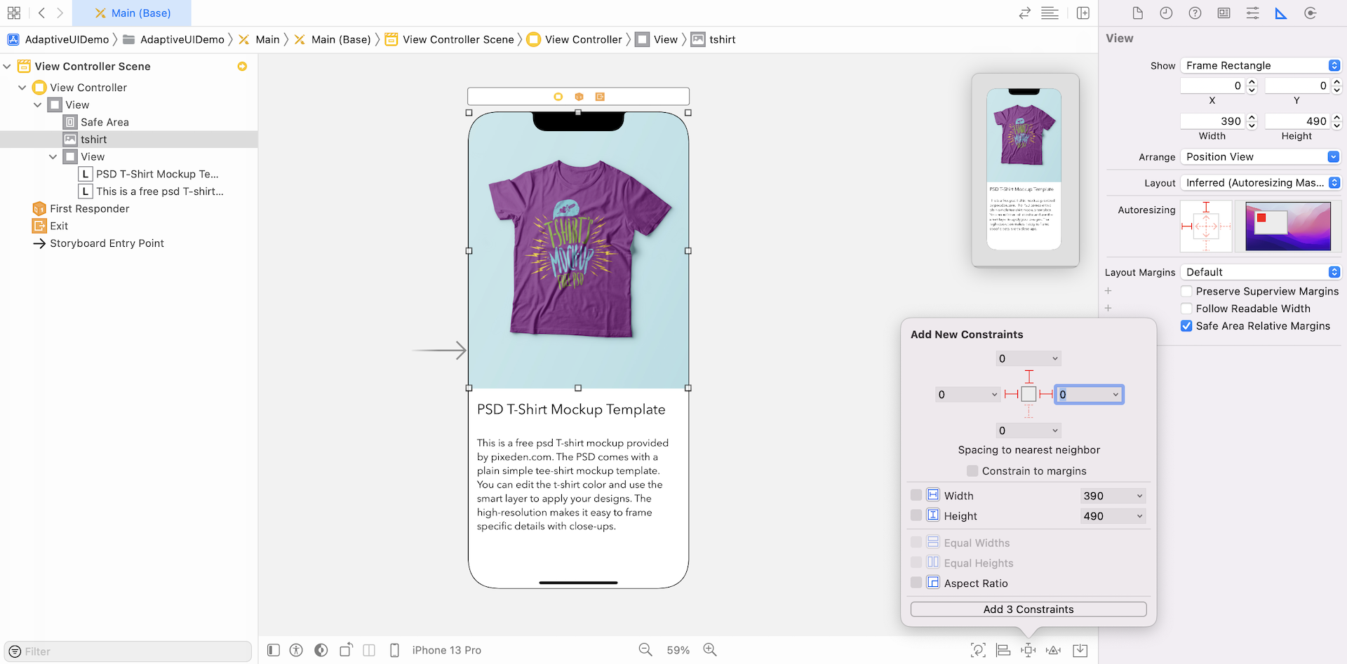
Now select the image view and click the Add new constraints button on the auto layout menu to create spacing constraints. For the left, top and right sides, set the value to 0. Make sure the Constrain to margin option is unchecked because we want to set the constraints relative to the super view's edge. Then click the Add 3 constraints button.
Next, open Document Outline. Control-drag from the image view (tshirt) to the main view. When prompted, select Equal Heights from the pop-up menu.
Once you added the Equal Heights constraint, the constraint should appear in the Constraints section of Document Outline. Select the constraint and go to Size inspector. Here you can edit the value of the constraint to change its definition.
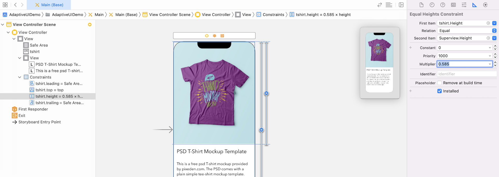
Before moving on, make sure the first item is set to tshirt.Height and the second item is set to Superview.height. If not, you can click the selection box of the first item and select Reverse First and Second item.
As mentioned earlier, the image view should only take up around 60% of the main view. So change the multiplier to 0.585.
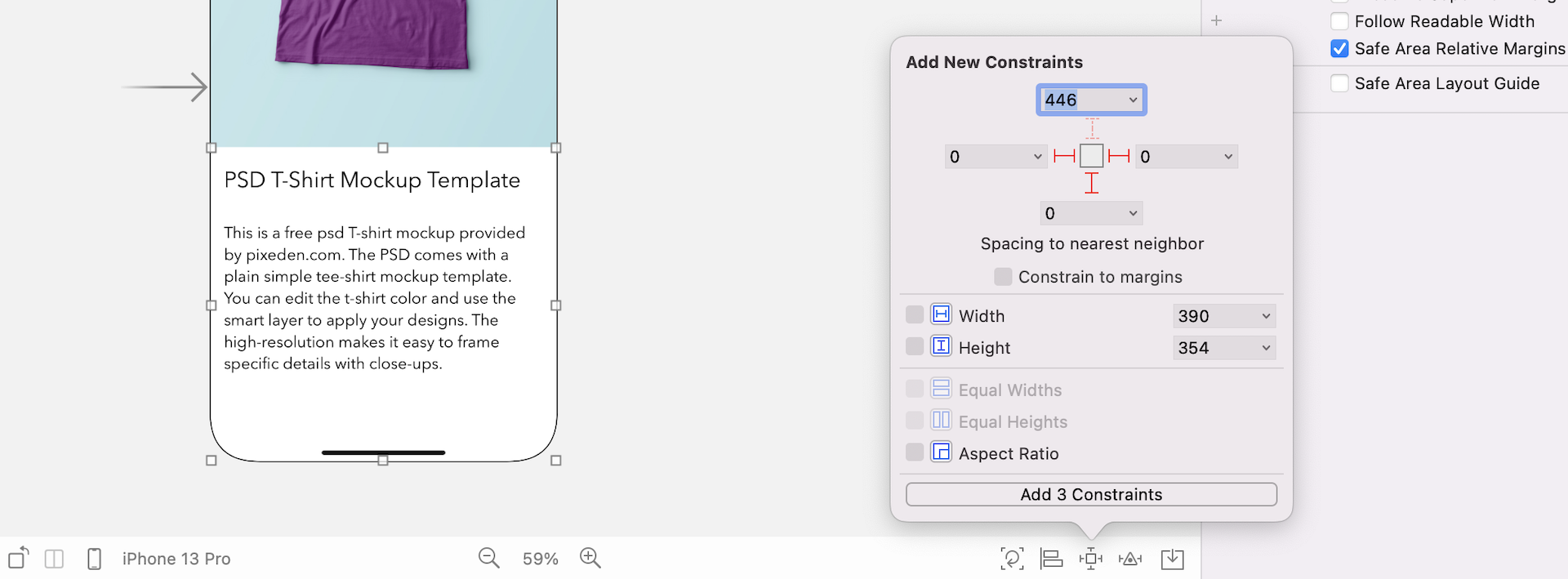
Next, select Product Info View and click the Add new constraints button. Select the left, right, and bottom sides, and set the value to 0. Make sure the Constrain to margin option is unchecked. Then click the Add 3 constraints button. This adds three spacing constraints for the Product Info View.
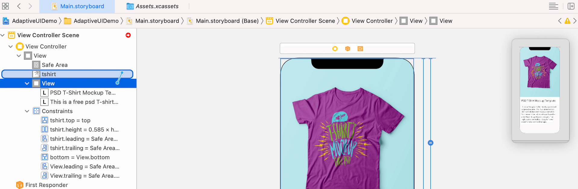
Furthermore, we have to define a spacing constraint between the image view and the Product Info View. In Document Outline, control-drag from the image view (tshirt) to Product Info View. When prompted, select Vertical Spacing from the menu. This creates a vertical spacing constraint such that there is no spacing between the bottom side of the image view and the top of the Product Info View.
If you take a look at the views rendered on other devices, the image view should now fit for all devices; however, there is still a lot of work to do for the labels.
Now, let's define the necessary constraints for the two labels.
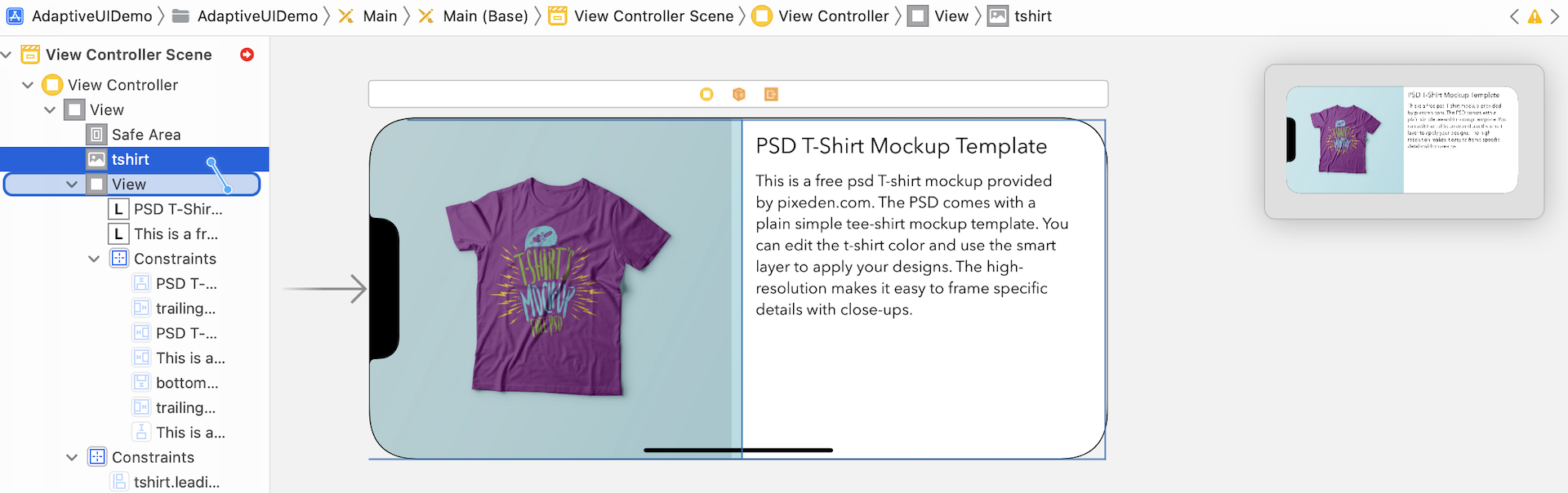
Select the title label, which is the one with the larger font size. Click the Add new constraints button. Set the value of the top side to 15, left side to 15 and right side to 15. Again, make sure the Constrain to margins is deselected and click Add 3 Constraints.
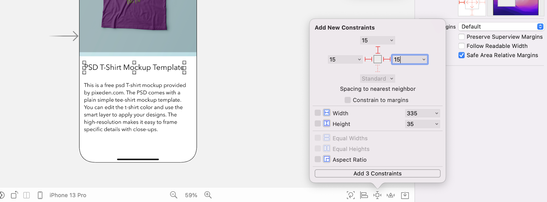
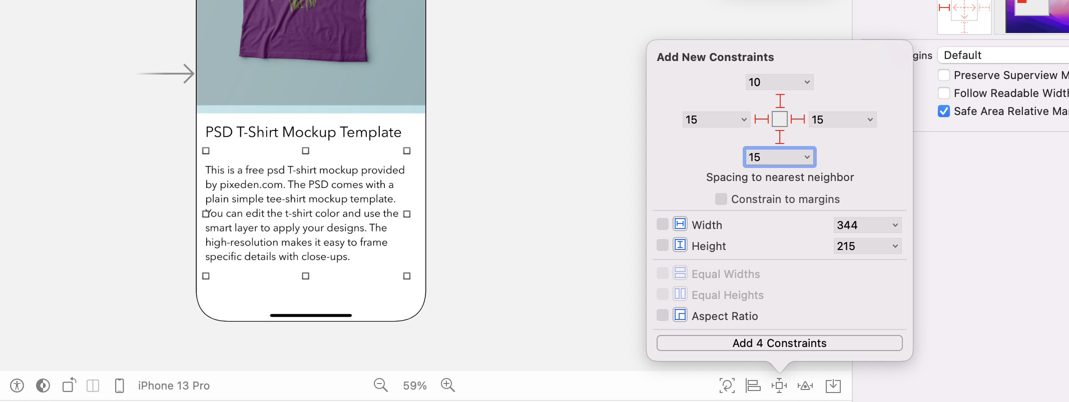
Next, select the other label. Again, we'll add three spacing constraints for the top, left, right, and bottom sides. Click the Add new constraints button and add the constraints accordingly.
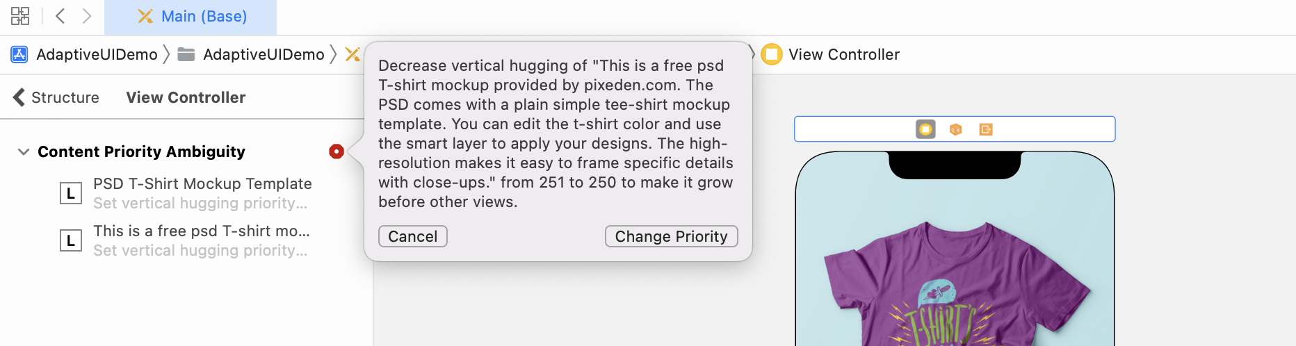
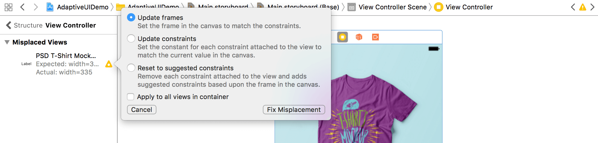
As soon as the constraint is added, you will see a few constraint lines in red, indicating some layout issues. Auto layout issues can occur when some of the constraints are ambiguous. To fix these issues, open Document Outline and click the red disclosure arrow to see a list of the issues.
Xcode is smart enough to resolve these issues for us. Simply click the indicator icon and a pop-over shows you the possible solutions. When prompted, click Change Priority to resolve these issues.
Sometimes, you may see the yellow indicator. This indicates that there are some misplacements of the views. Again, you can let Interface Builder fix the issues for you by updating the frames to match the constraints. If you don't see this warning, you can ignore this step.
Cool! You've created all the auto layout constraints. You can check out the preview and see how the UI looks on various devices.
The view looks much better now, with the image view perfectly displayed and aligned. However, there are still a couple of issues:
- The description label is vertically centered on devices with larger screen size. We want to it to be displayed right below the title label.
- The title and description labels are partially displayed for some of the iPhone models.
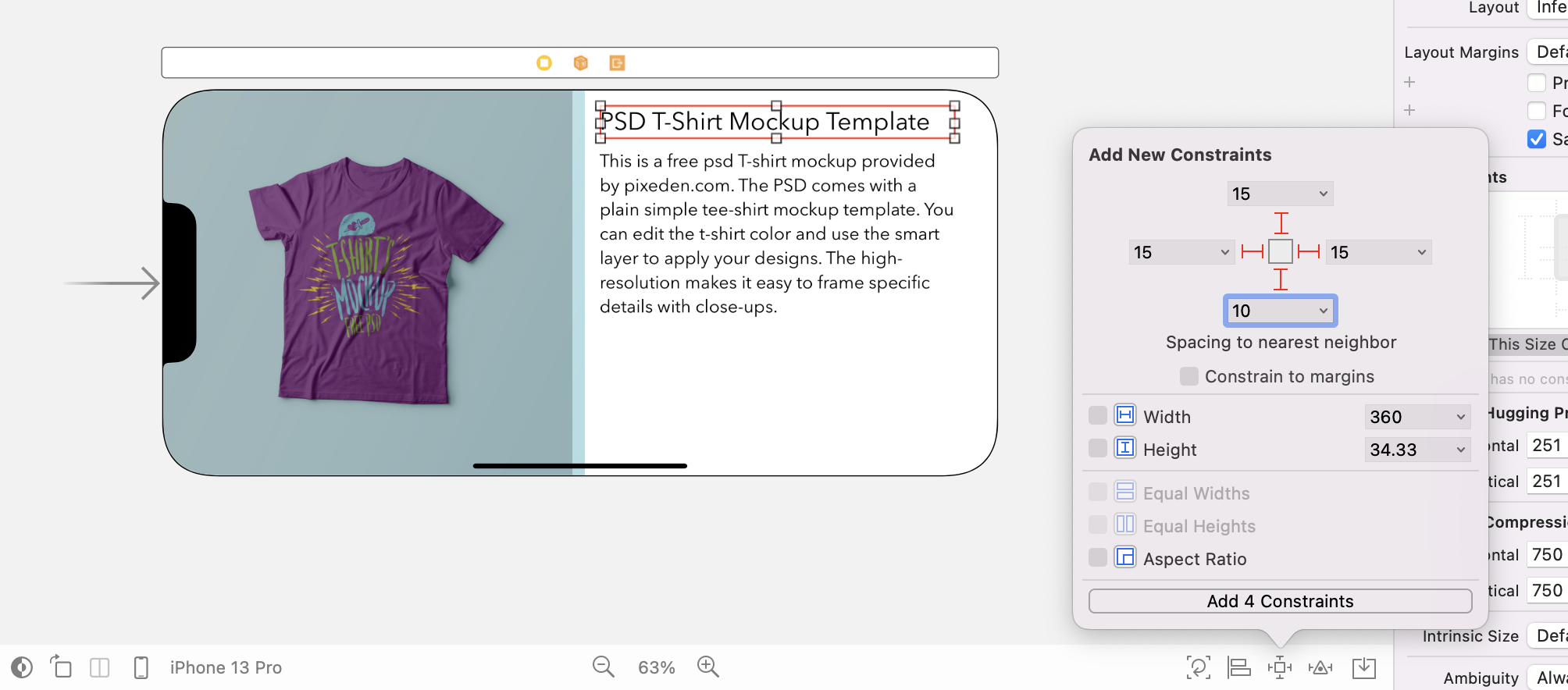
Let's take a look at the first issue. Do you remember that we defined a couple of vertical space constraints for the description label? The constraint said that the description label should be 10 points away from the title label and 15 points away from the bottom of the super view (refer to figure 1.13). In order to satisfy the constraints, iOS has to expand the description label on larger screen size. Thus, the description stays vertically centered.
Content Hugging Priority
Let me side track a bit and ask you a question. Why doesn't iOS expand the title label instead of the description label? Take a look at figure 1.18. There are actually two options for iOS to render the UI that satisfies the layout constraints. How does iOS come up with that choice?
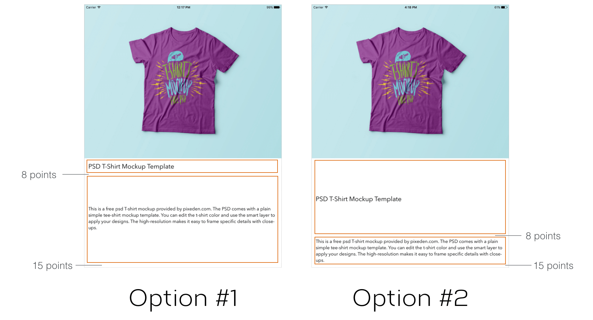
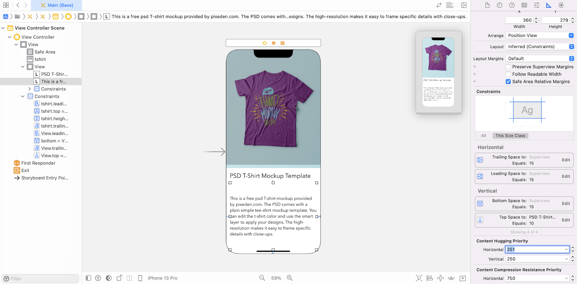
If you select the description label and go to the Size inspector, you should notice that the content hugging priority (vertical) is set to 250. Now select the title label and check out its content hugging priority. You should notice that it is set to 251. In other words, it has a higher content hugging priority (for the vertical axis) than the description label.
The value of content hugging priority helps iOS determine which view it should enlarge. The view with a higher hugging priority can resist from growing larger than its intrinsic size. Here, the title label has a higher hugging priority. This is why iOS chooses to make the description label larger, while the size of the description label is unchanged.
Editing the Relation of the Constraints
Now that you should have a basic understanding of the content hugging priority, let's continue to fix the first issue we have discovered.
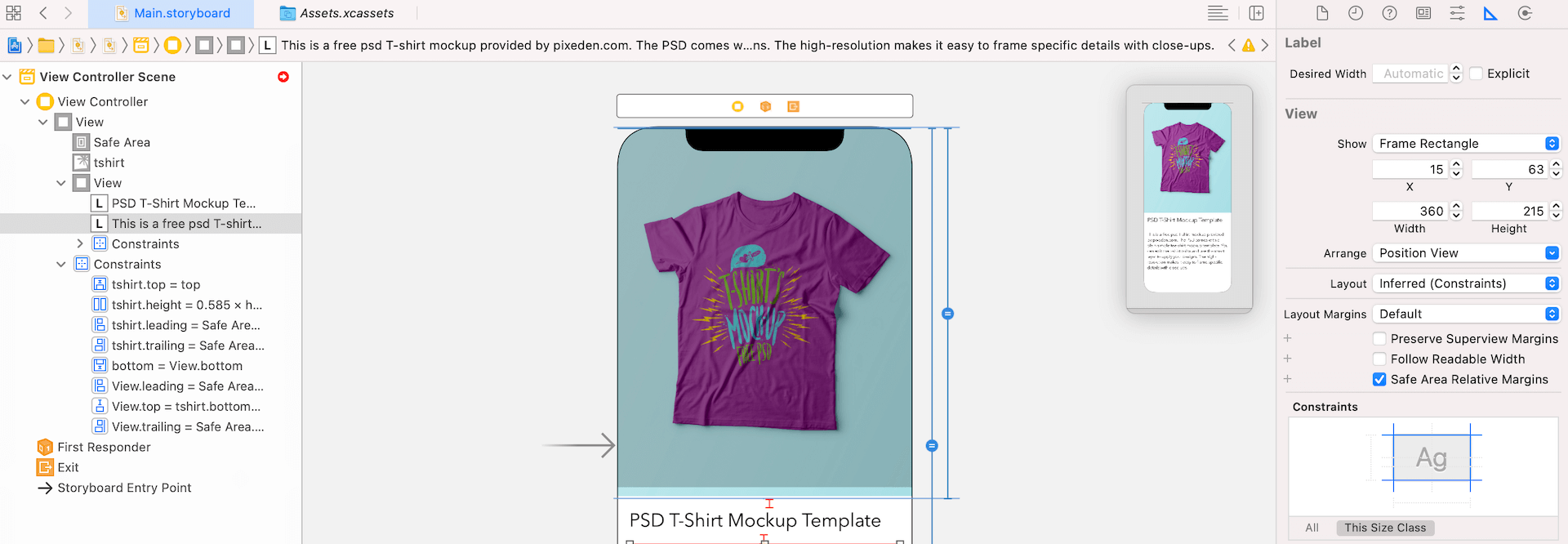
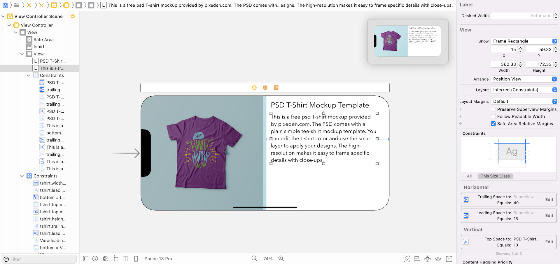
You can always view the constraints of a particular component under Size inspector. Select the description label and go to Size inspector. You will find a list of constraints under the Constraints section.
We have defined four spacing constraints for the label. If you look into the constraints, each of them has a relation Equal. This means each side of the label should have the exact same space as we specify in the constraints, when rendering the description label. The space can't be bigger or smaller.
So how can we modify the constraint so that the description label is placed under the title label, regardless of the screen size?
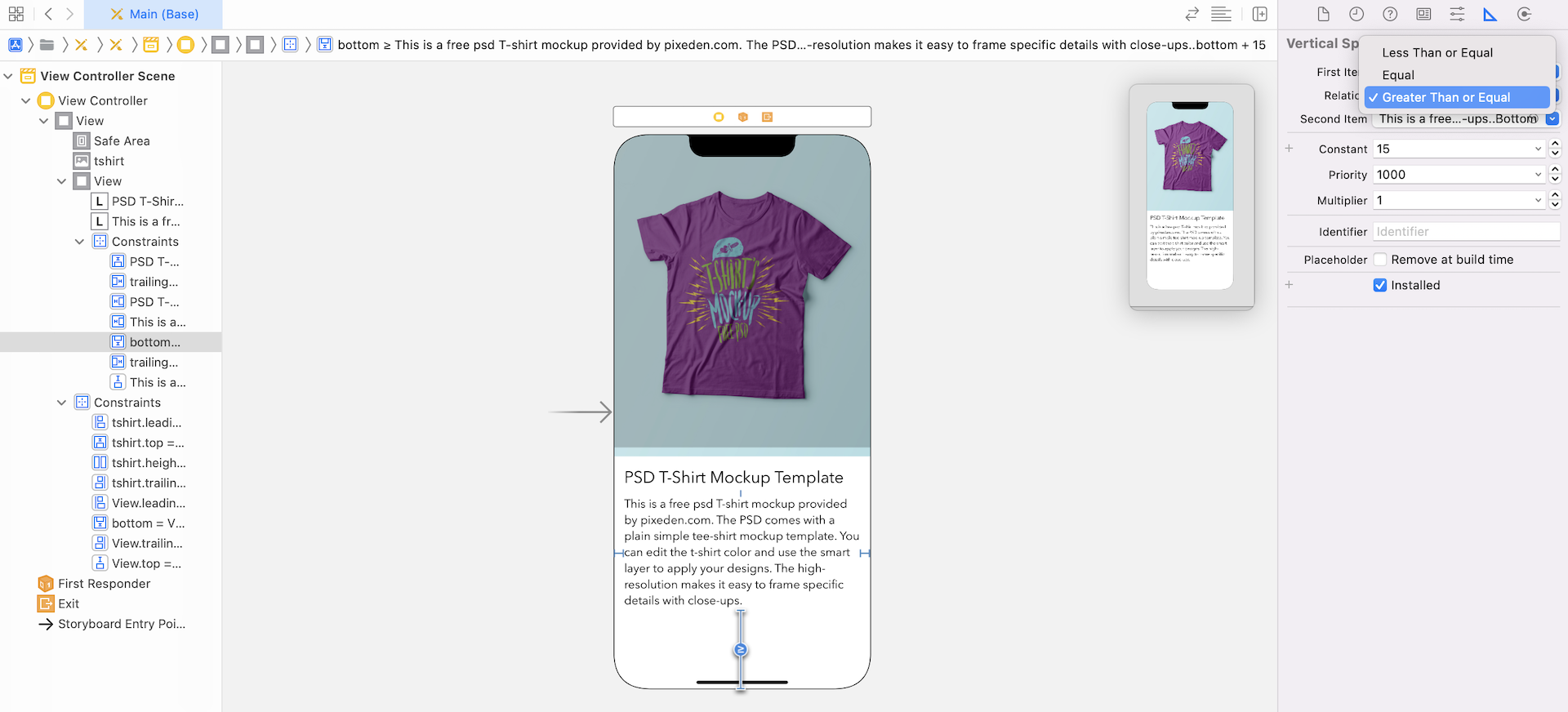
I guess you may know the answer. Instead of strictly set the constraint relation to Equal, the bottom space constraint should have some more flexibility. The space is not required to equal 15 points. This is just the minimum space we want. The space can actually grow with the screen size.
Now click the Bottom Space constraint to edit it. Change the relation from Equal to Greater than or Equal. Once the change is made, the space issue should be fixed.
Okay, it's time to look into the second layout issue:
- The title and description labels are partially displayed for some of the iPhone models.
This issue is pretty easy to fix. We can just let iOS auto shrink the font size for devices with smaller screen sizes. Select the title label and go to the Attributes inspector. Set the value of Autoshrink option to Minimium Font Size. Repeat the same procedures for the description label.
That's it. If you preview the UI on iPhone SE (1st generation) or execute the project on these devices, both labels are displayed properly.
Size Classes
As I mentioned at the very beginning of the chapter, designing adaptive UI is a two-part process. So far we have created the generic layout. The base layout is good enough to support most screen sizes. The second part of the process is to use size classes to fine-tune the design.
First, what is a size class?
A size class identifies a relative amount of display space for both vertical (height) and horizontal (width) dimensions. There are two types of size classes in iOS: regular and compact. A regular size class denotes a large amount of screen space, while a compact size class denotes a smaller amount of screen space.
By describing each display dimension using a size class, this results in four abstract devices: Regular width-Regular Height, Regular width-Compact Height, Compact width-Regular Height and Compact width-Compact Height.
The table below shows the iOS devices and their corresponding size classes.
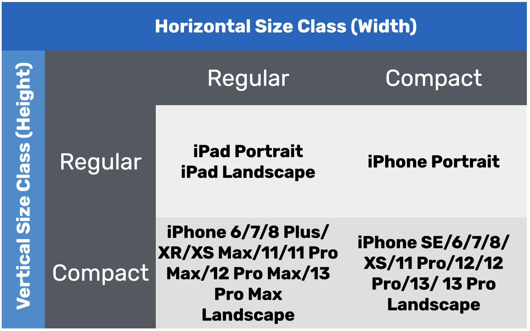
To characterize a display environment, you must specify both a horizontal size class and vertical size class. For instance, an iPad has a regular horizontal (width) size class and a regular vertical (height) size class.
With the base layout in place, you can use size classes to provide layout specializations which override some of the design in the base layout. For example, you can change the font size of a label for devices that adopt compact height-regular width size. Or you can change a position of a button, particularly for the regular-regular size.
Note that all iPhones in portrait orientation have a compact width and a regular height. In other words, your UI will appear almost identically on an iPhone SE as it does on an iPhone 13 Pro.
The iPhone 6/7/8 Plus/11/11 Pro Max/12/12 Pro Max/13 Pro Max, in landscape orientation, has a regular width and compact height size. This allows you to create a UI design that is completely different from that of an iPhone 13 Pro (or lower).
Using Size Classes for Font Customization
With some basic understanding of size classes, let's see how we use it to apply layout specialization.
Needless to say, we want to make the title and description labels perfect for iPhones. The current font size is ideal for the iPhones but too small for iPad. What we're going to do is make the font a bit larger for the iPad devices.
With size classes, you can now adjust the font style for a particular screen size. In this case, we want to change the font size for all iPad models. In terms of size classes, the iPad device defaults to regular size class for horizontal (width) and regular size class for vertical (height).
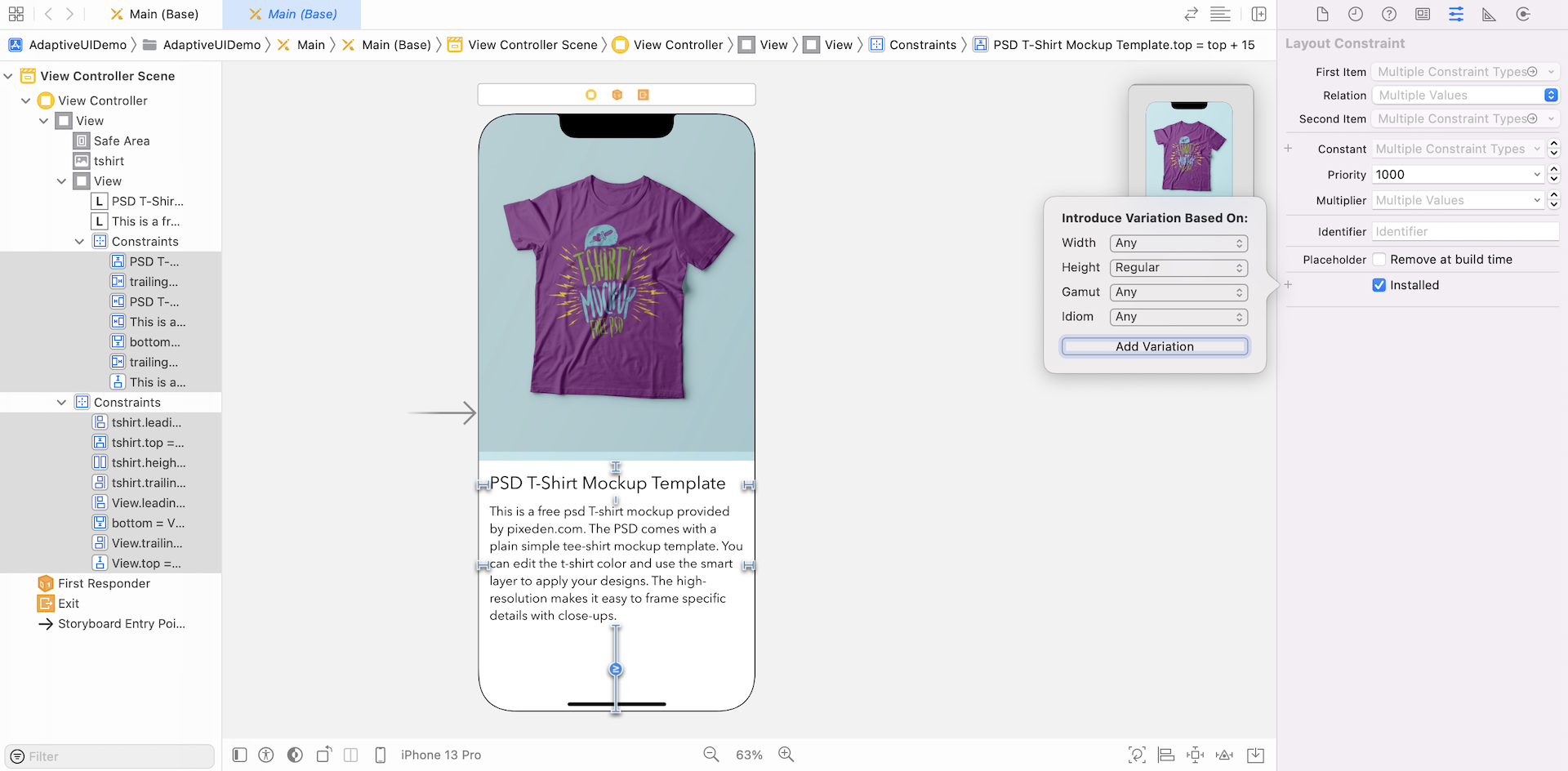
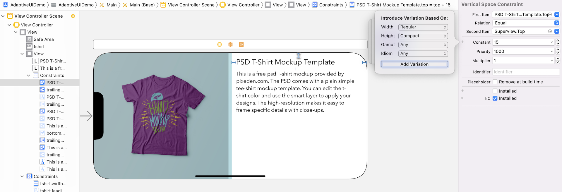
To set the font size for this particular size class, switch to the "iPad Pro 11" device in Interface Builder and select the title label. Under the Attributes inspector, you should see a plus (+) button next to the font field. Click the + button. Make both width and height are set to Regular, and then click Add Variation.
You will then see a new entry for the Font option, which is dedicated to that particular size class. Keep the size intact for the original Font option but change the size of wR hR font field to 35 points.

This will instruct iOS to use the second font with a larger font size on iPad. For the iPhone devices, the original font will still be used to display the text. Now select the description label. Again, under the Attributes inspector, click the + button next to the Font option and click Add Variation. Change the size of wR hR font field to 25 points. Look at the preview or test the app in simulators. The layout looks perfect on all screen sizes.
Using Size Classes to Customize a View
Now that the UI adapts perfectly for all devices in portrait orientation, how do they look in landscape orientation? In the preview assistant, click the rotate button on a device (e.g. iPhone 13 Pro). Or you can check out the UI in landscape mode using the simulator. The view looks okay but I think there is a better way to lay out the UI in the landscape orientation.
I will show you how to create another design for the view to take advantage of the wider screen size. This is the true power of size classes.
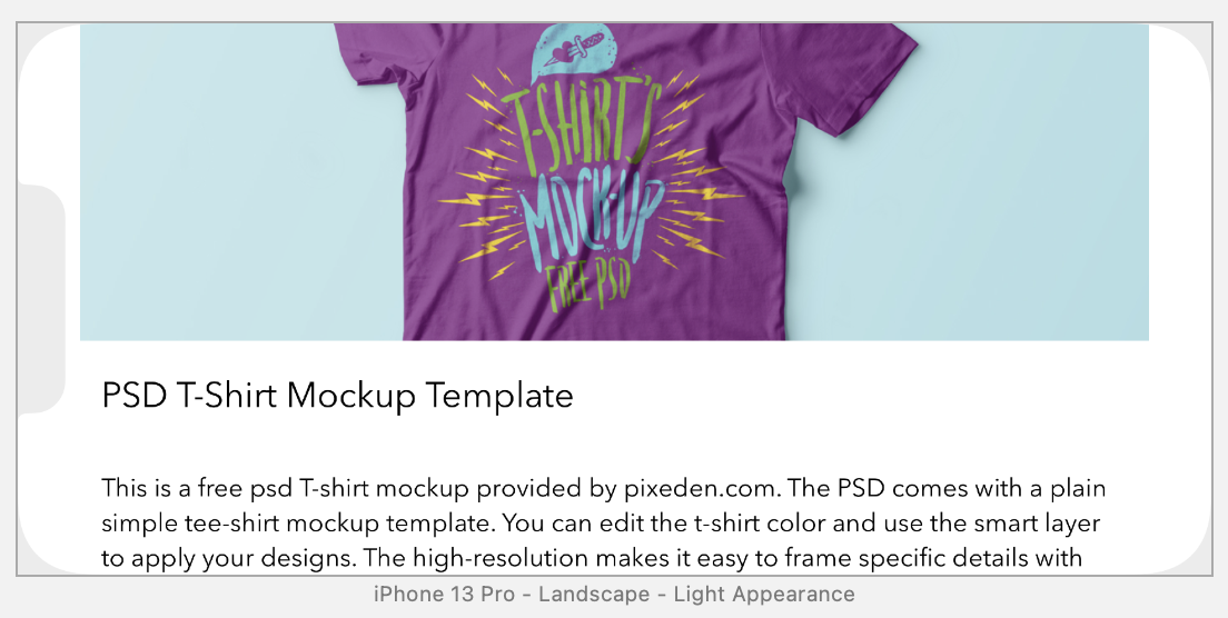
With a wider but shorter screen size, it would be best to present the image view and Product Info View side by side; each takes up 50% of the main view. This screen shows the final view design for iPhone landscape.
So how can we use size classes to create two different UIs? Currently, we only have a single set of auto layout constraints that apply to all size classes. In order to create two different UIs, we will have to use two different sets of layout constraints for each of the UIs:
- For iPad and iPhone (Portrait), we utilize the existing layout and layout constraints.
- For iPhone (Landscape), we re-layout the UI and define a new set of layout constraints.
First, we have to move the existing layout constraints to a size class such that the constraints are activated when the device is an iPad or iPhone in portrait orientation. In the device configuration pane, you should find the Orientation button, which is designed for rotating the device between landscape and portrait orientation. When you click the button, it should rotate the device sideway.
While in the landscape mode, any changes you made to the canvas will apply to the current variation (or size class) only.
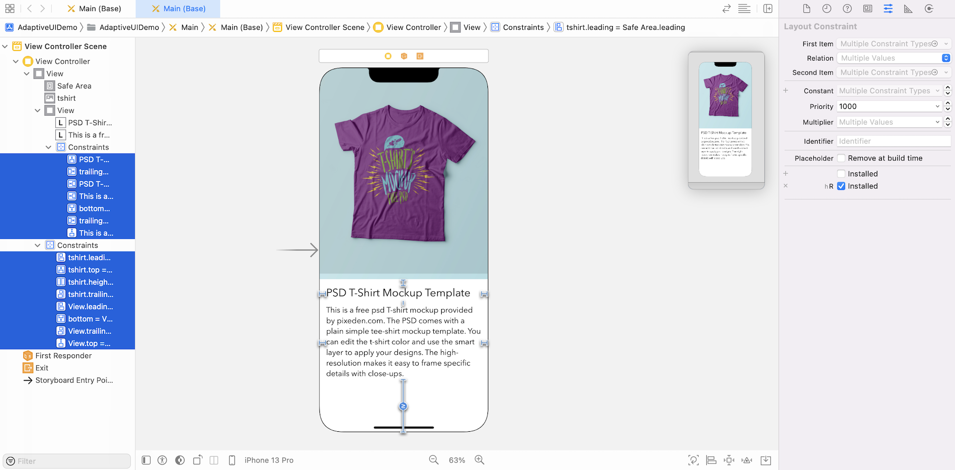
Meanwhile, let's switch it back to the portrait mode. As we want to migrate all existing constraints to this variation, select all constraints in the document outline view (hold the command key and select each of the constraints). Next, go to the Size inspector and click the + button (next to the installed option) to create a variation.
Interface Builder shows you an Installed checkbox for the regular-height size class. Because all existing constraints should be applied to this size class only. Uncheck the Installed checkbox and check the hR Installed checkbox. This means all the selected constraints are activated for the iPad and iPhone (Portrait) devices.
How do you know if the constraints are applied to the regular-height device only? In the device configuration pane, click the Orientation button to change the orientation of the iPhone to landscape. You should find that the UI in landscape is no longer rendered properly. And, all the constraints are grayed out, which means they do not belong to this size class.
Now it's time to redesign the app layout in landscape orientation and define a separate set of layout constraints.
From now on, all the changes you're going to make will apply to the selected size class only (i.e. compact-width and compact height).
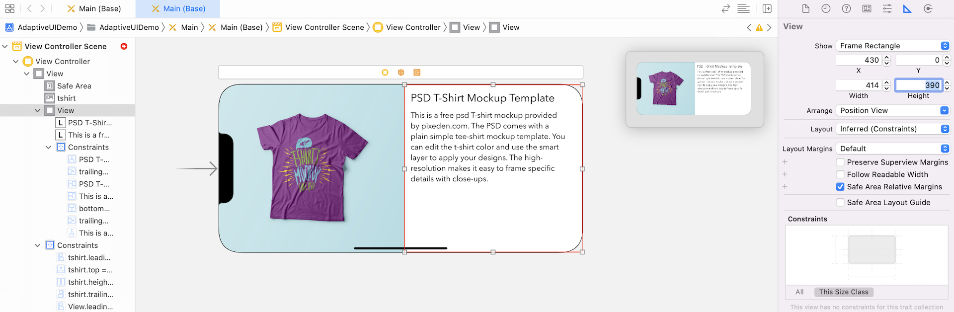
First, select the t-shirt image view. In the Size inspector, set x to 0, y to 0, width to 430 and height to 390. In the Attributes inspector, make sure the Clip to Bounds option is enabled.
Next, select the view that holds the title and description label. Go to the Size inspector, set x to 430, y to 0, width to 414 and height to 390.
Once you complete the changes, your layout should look similar to figure 1.30.
So far we haven't defined any layout constraints for this size class. Now select the t-shirt image view and click the Add new constraints button. Add four space constraints for all sides.
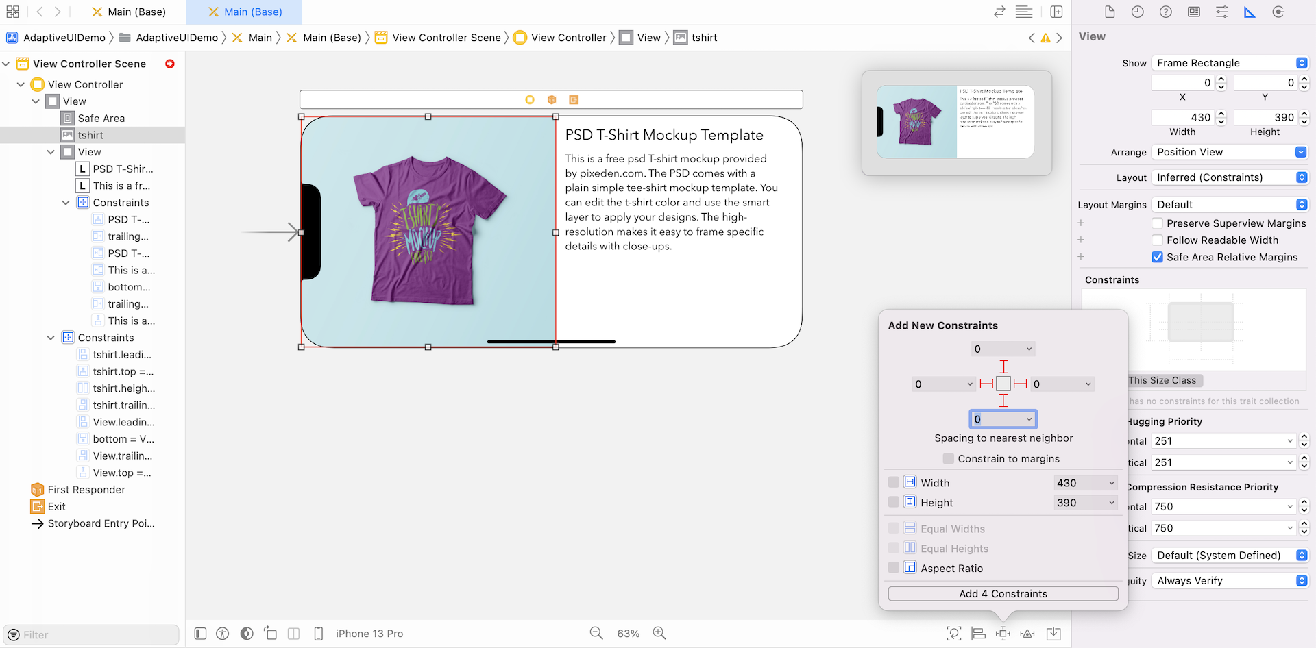
Next, select the view and add three space constraints for the top, left and right sides.
As we want both views to take up 50% of the screen, control-drag from the t-shirt image view to the container view. When the popover appears, select Equal Widths to add the constraint. Next, select the tshirt.width = View.width constraint. Go to the Size inspector and set the multiplier to 1. This ensures both views to take up 50% of the screen.
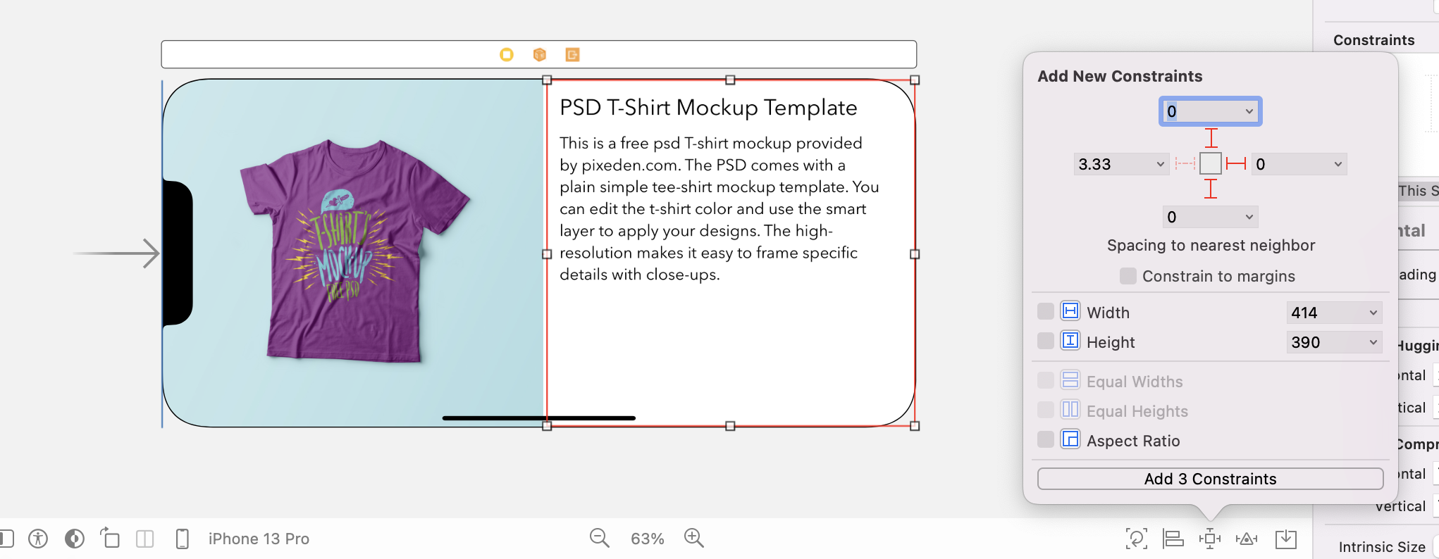
The rest is to add the layout constraints for the title and description labels. Select the title label and click the Add New Constraints button. Add the space constraints for the top, bottom, left and right sides (see figure 1.34). Then, add two space constraints (left and right sides) for the description label.
That's it. Your final layout looks similar to figure 1.35.
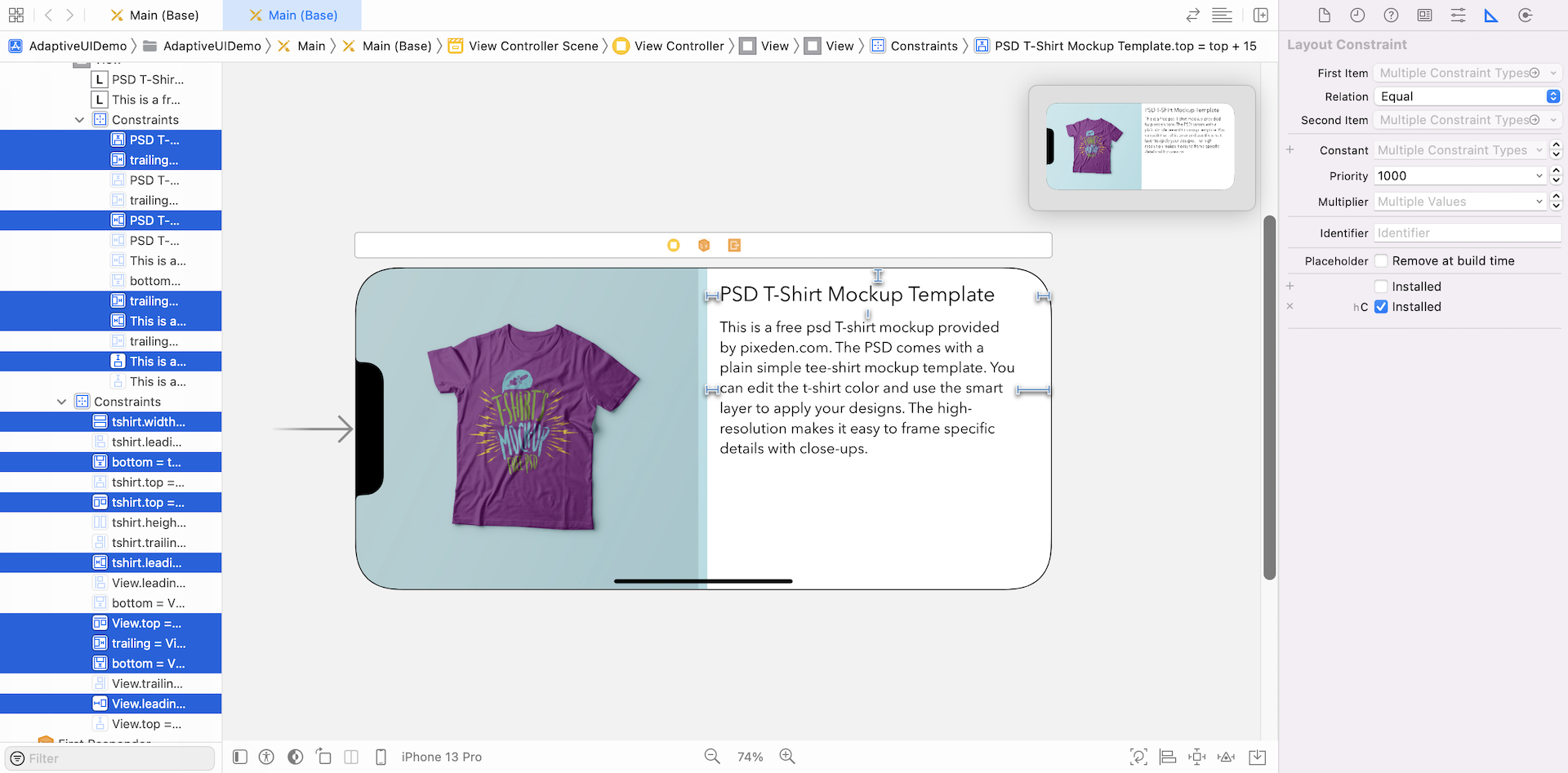
If you look closer to the constraints in the document outline view, you should see that some constraints are enabled, while some are grayed out. These constraints in normal color should apply to the compact-width and compact-height size class. Therefore, we have to select those constraints and create a specialization for them. In the Attribute inspector, click the + button next to the Installed checkbox. For the variation option, set the Width option to Any and the Height option to Compact. Click Add Variation to confirm.
Once you added the variation, uncheck the Installed checkbox and tick the Installed checkbox of hC. This means all the selected constraints are only applied to the landscape orientation.
If you switch over to the portrait mode, you will see a different set of constraints enabled.
This is how you use Size Classes to apply different sets of layout constraints, and lay out two different UIs in Interface Builder. If you run the app using any of the iPhone simulators, you will see two distinct UIs for portrait and landscape orientations. Another great thing is that iOS renders a smooth transition when the view is changed from portrait to landscape. It looks pretty awesome, right?
Using Size Classes to Customize Constraints
Hopefully, you now understand how to use size classes to customize fonts and view design for a specific size class combination. On top of these customizations, you can use size classes to customize a particular constraint.
What if you want to change the view design of the iPhone 8 Plus/11 Pro Max/12 Pro Max/13 Pro Max (landscape) to this view but keep the design intact for other iPhones?
As you can see, the title and description have been moved to the lower-right part of the view. Obviously, we have to customize the top spacing constraints between the title label and its superview.
Let's see how it can be done.
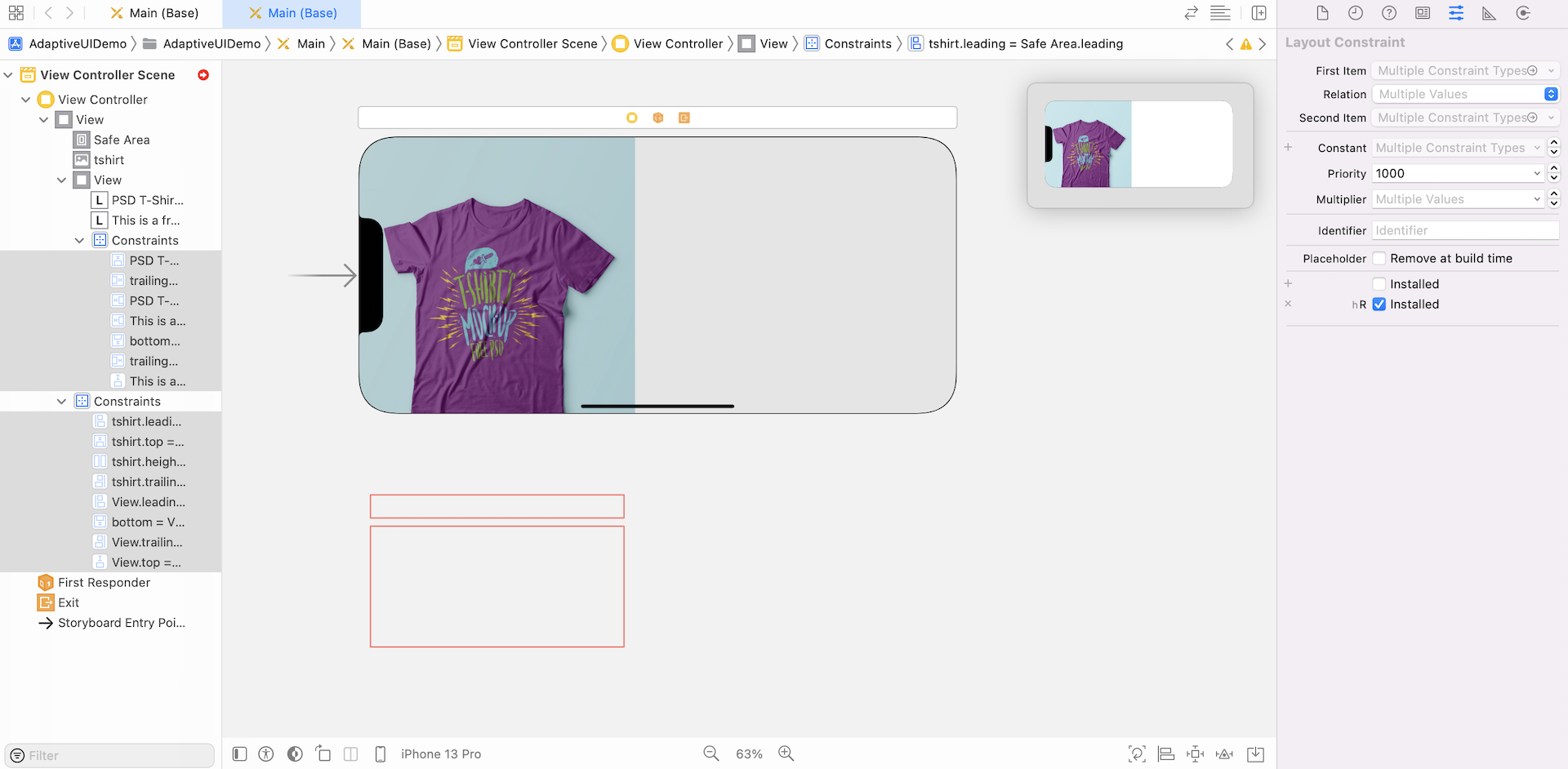
First, change the device to iPhone 13 Pro Max and set the orientation to landscape in the device configuration pane. We want to apply layout specialization for this device in this particular orientation. Next, select the vertical space constraint for the top side of the title label. In the Attributes inspector, you should see the constant field. The value defines the vertical space in points. As we want to increase this value for this particular size class, click the + button and confirm to add variation.
This will create an additional field for the wR hC size class. Set the value to 150 points. That's it.
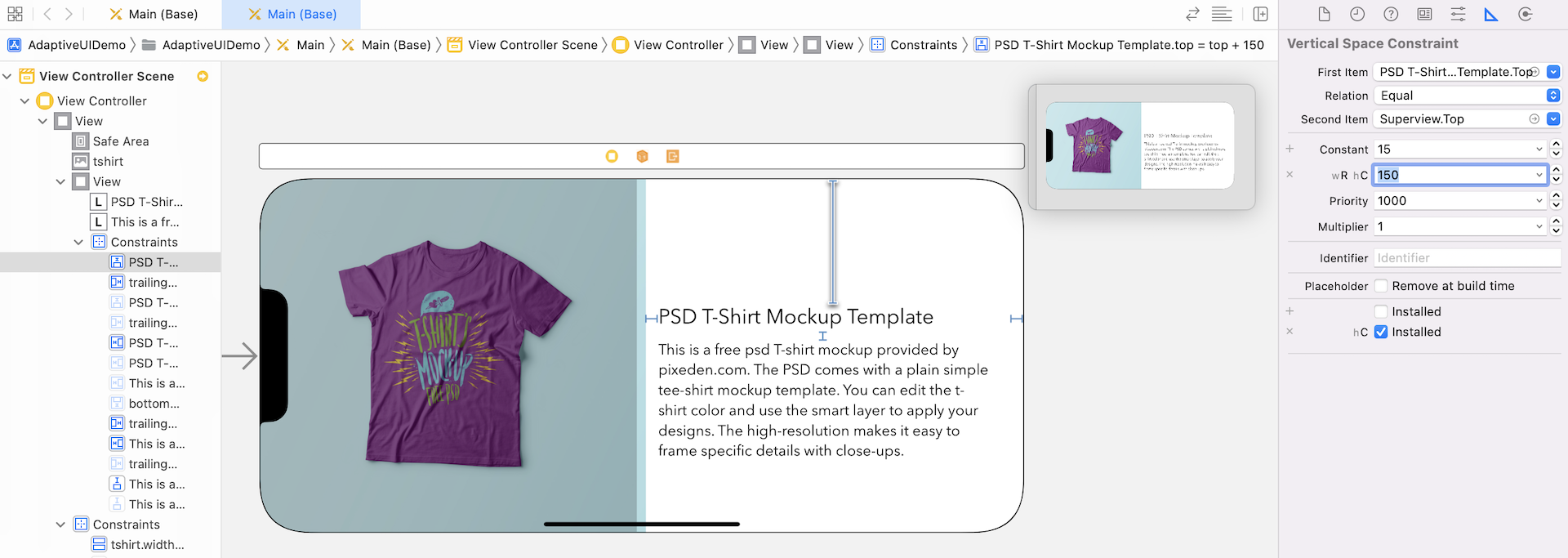
You can preview the new UI design in Interface Builder or using the simulator. On iPhone 5.5-inch (or some larger devices), the new UI will appear when the device is in landscape orientation.
Summary
With Interface Builder, Apple provides developers with a great tool to build adaptive UIs in iOS apps. I hope you already understand the concept of size classes and know how to use them to create adaptive layouts.
Adaptive layout is one of the most important concepts introduced since iOS 8. Gone are the days where developers had only a single device and screen size for which to design. If you are going to build your next app, make sure you grasp the concepts of size classes and auto layout, and make your app adapts to multiple screen sizes and orientations. The future of app design is more than likely going to be adaptive. So get ready for it!
For reference, you can download the Xcode project from http://www.appcoda.com/resources/swift55/AdaptiveUIDemo.zip.