- Made by AppCoda
- Contact us / Support
- Tweet this book
- Preface
- 1. Building Adaptive User Interfaces
- 2. Creating Table View Sections and Index list with Diffable Data Source
- 3. Animating Table View Cells
- 4. Working with JSON and Codable
- 5. How to Integrate the Twitter and Facebook SDK for Social Sharing
- 6. Working with Email and Attachments
- 7. Sending SMS and MMS Using MessageUI Framework
- 8. How to Get Direction and Draw Route on Maps
- 9. Search Nearby Points of Interest Using Local Search
- 10. Audio Recording and Playback
- 11. Scan QR Code Using AVFoundation Framework
- 12. Working with URL Schemes
- 13. Building a Full Screen Camera with Gesture-based Controls
- 14. Video Capturing and Playback Using AVKit
- 15. Displaying Banner Ads using Google AdMob
- 16. Working with Custom Fonts
- 17. Working with AirDrop, UIActivityViewController and Uniform Type Identifiers
- 18. Building Grid Layouts Using Collection Views and Diffable Data Source
- 19. Interacting with Collection Views
- 20. Adaptive Collection Views Using UITraitCollection and Compositional Layout
- 21. Building a Weather Widget Using WidgetKit
- 22. Building Slide Out Sidebar Menus Using Objective-C Libraries
- 23. View Controller Transitions and Animations
- 24. Building a Slide Down Menu
- 25. Self Sizing Cells and Dynamic Type
- 26. XML Parsing, RSS and Expandable Table View Cells
- 27. Applying a Blurred Background Using UIVisualEffect
- 28. Using Touch ID and Face ID For Authentication
- 29. Building a Carousel-Like User Interface
- 30. Working with Parse
- 31. Parsing CSV and Preloading a SQLite Database Using Core Data
- 32. Connecting Multiple Annotations with Polylines and Routes
- 33. Using CocoaPods in Swift Projects
- 34. Building a Simple Sticker App
- 35. Building iMessage Apps Using Messages Framework
- 36. Building Custom UI Components Using IBDesignable and IBInspectable
- 37. Using Firebase for User Authentication
- 38. Google and Facebook Authentication Using Firebase
- 39. Using Firebase Database and Storage to Build an Instagram-like App
- 40. Building a Real-time Image Recognition App Using Core ML
- 41. Building AR Apps with ARKit and SpriteKit
- 42. Working with 3D Objects in Augmented Reality Using ARKit and SceneKit
- 43. Use Create ML to Train Your Own Machine Learning Model for Image Recognition
- 44. Building a Sentiment Classifier Using Create ML to Classify User Reviews
- 45. Working with Image Tracking Using ARKit
- Published with GitBook
Chapter 19
Interacting with Collection Views

In the previous chapter, I covered the basics of UICollectionView. You should now understand how to display items in a collection view. However, you may not know how to interact with the collection view cells. As mentioned before, a collection view works pretty much like a table view. To give you a better idea, I will show you how to interact with the collection view cells, especially about how to handle single and multiple item selections.
We'll continue to improve the collection view demo app. Here is what we're going to implement:
- When a user taps an icon, the app will bring up a modal view to display the icon in a larger size.
- We'll also implement social sharing in the app in order to demonstrate multiple item selections. Users are allowed to select multiple icons and share them on Messages.
Let's first see how to implement the first feature to handle single selection. When the user taps any of the icons, the app will bring up a modal view to display a larger photo and its information like description and price. If you didn't go through the previous chapter, you can start by downloading the starter project from http://www.appcoda.com/resources/swift55/CollectionViewSelectionStarter.zip.
The starter project is very similar to the final project we built in the previous chapter. There are only a couple of changes for the Icon structure. I just changed the Icon structure a bit to store the name, image, and description of an icon. You can refer to Icon.swift to reveal the changes.
Designing the Detail View Controller
Before I showed you how to interact with the collection view, let's start by designing the detail view controller that is used to display the icon details.
Go to Main storyboard, drag a View Controller from the Object library to the storyboard. Then add an Image View to it. In the Size inspector, set X to 0, Y to 0, width to 390 and height to 490. Under the Attributes inspector, change the mode of the image view to Aspect Fit.
Next, drag a button and place it at the bottom of the view controller. Set its width to 390 points and height to 60 points. In the Attributes inspector, set the type to System and change its background color to yellow (or whatever color you prefer). The tint color should be changed to white to give it some contrast.
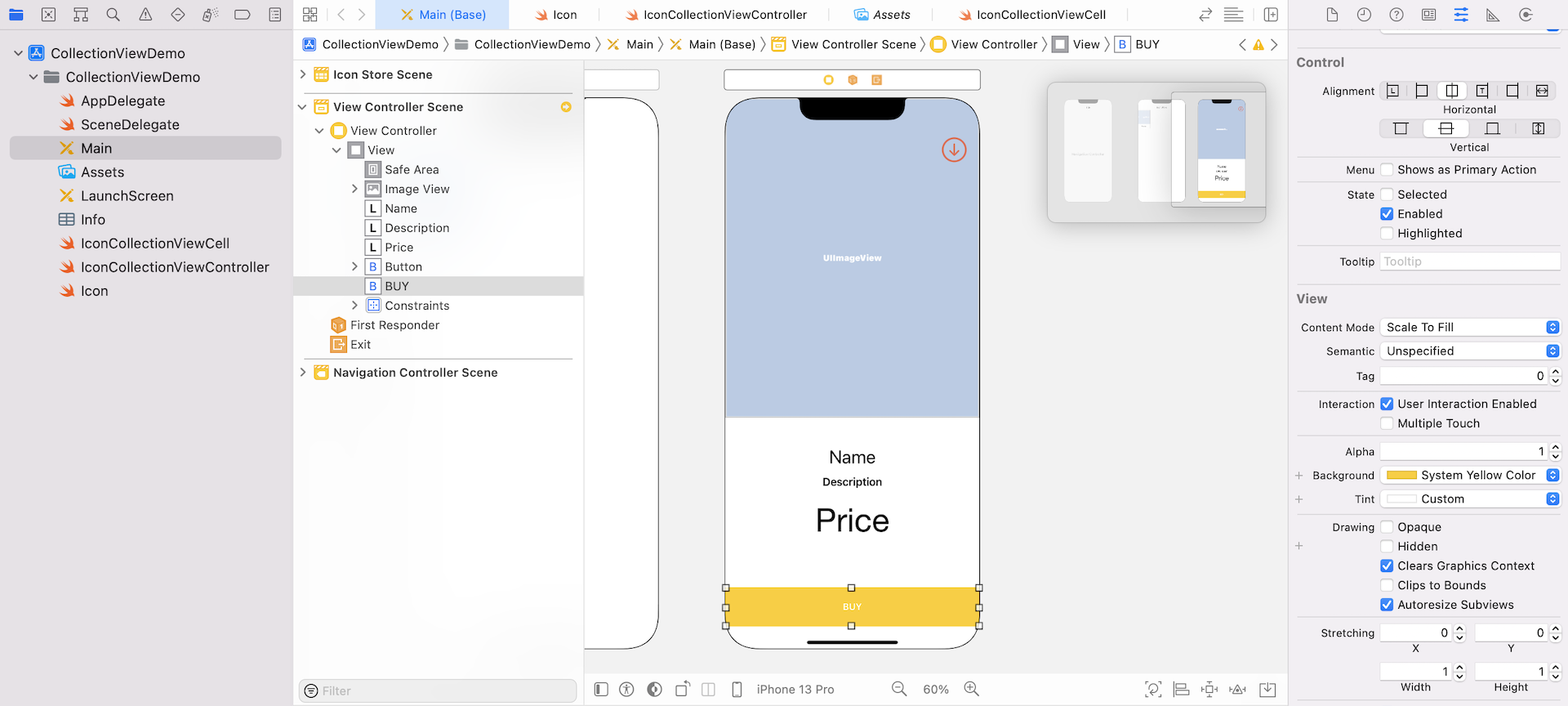
Now, let's add three labels for the name, description, and price of the icon. Place them in the white area of the detail view controller. You can use whatever font you like, but make sure you the alignment of the labels to center.
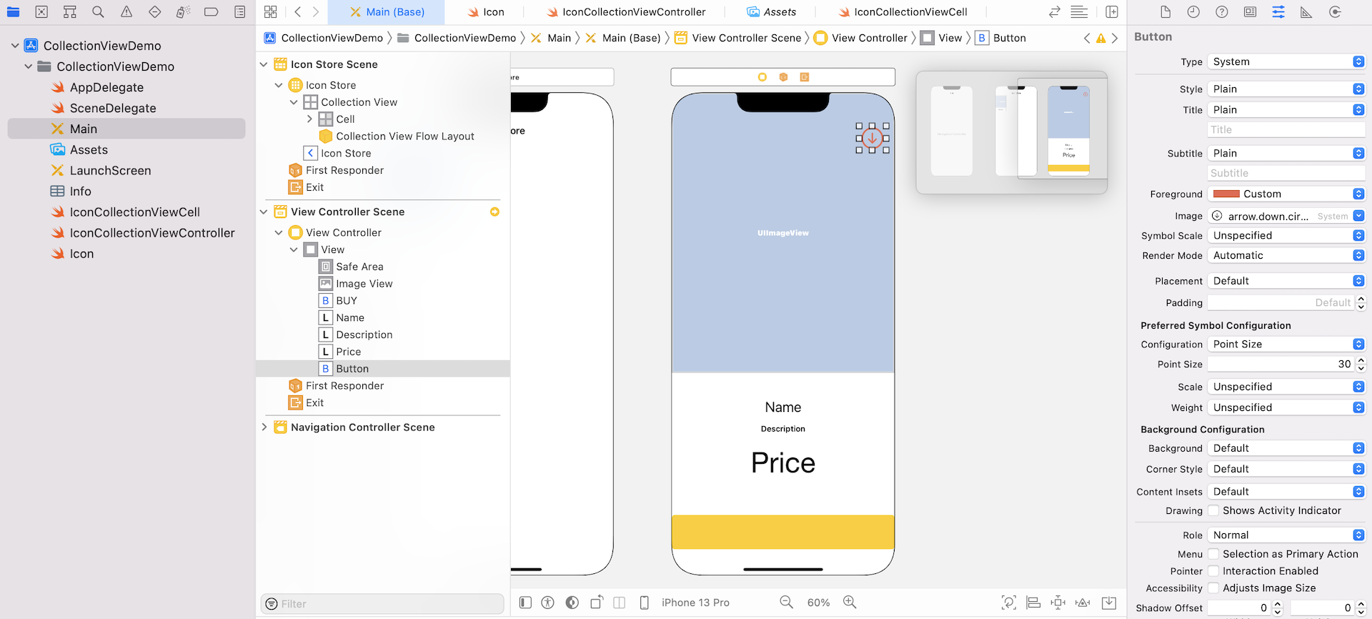
Lastly, drag another button object to the view, and place it near the top-right corner. This is the button for dismissing the view controller. Set its type to System, title to blank, and image to arrow.down.circle. You will have to resize the button a little bit. Change the Configuration option to Point Size and set its point size to 30. Also, set the foreground color to red.
Your UI design should be very similar to figure 19.2.
Now that we have completed the layout of the detail view controller, the next step is to add some layout constraints so that the view can fit different screen sizes.
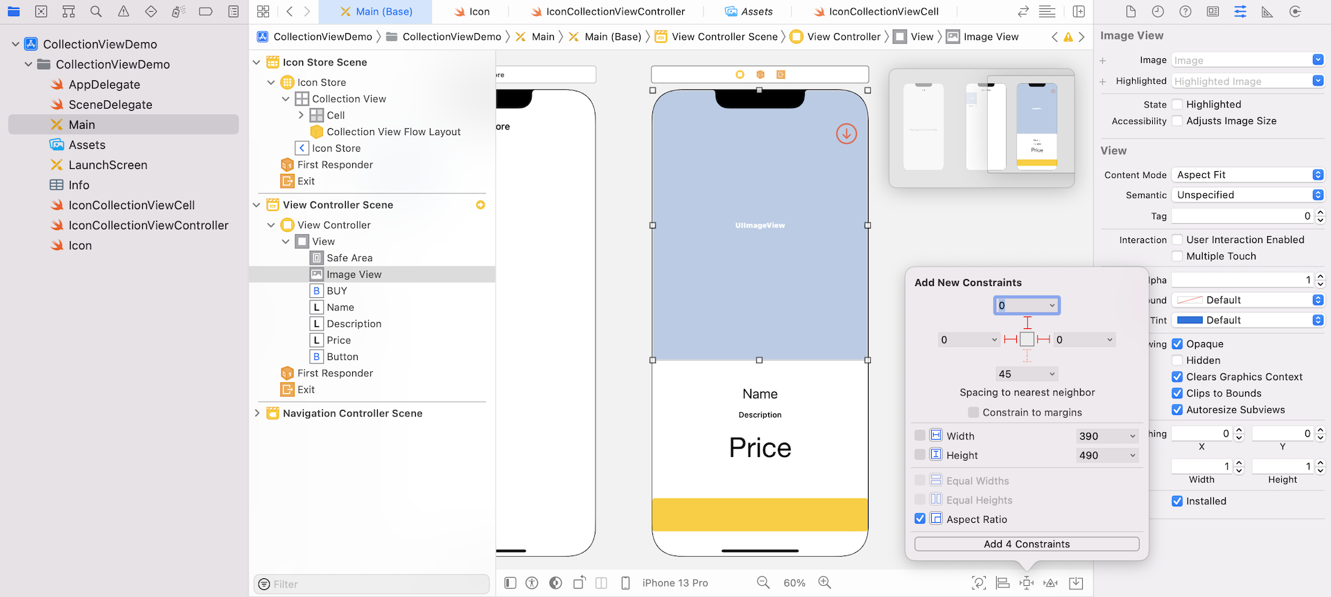
Let's begin with the image view. In Interface Builder, select the image view, and click the Add new constraints button to add the spacing and size constraints. Make sure the Constrain to margins is unchecked, and set the spacing value of the top, left and right sides to 0. The image should scale up/down without altering its aspect ratio. So check the Aspect Ratio option, and then click Add 4 Constraints. Then select the top spacing constraint. In the Size inspector, make sure the Second Item is set to Safe Area.Top. This ensures that the image will not be covered by the status bar.
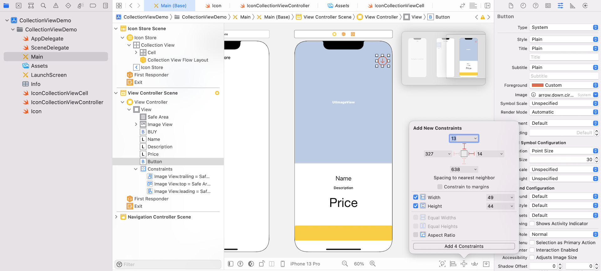
Next, select the close button at the top-right corner. Click the Add new constraints button. Add the spacing constraints for the top and right sides. Also, check both width and height options so that the image size will keep intact regardless of the screen size.
Next, let's move on to the Buy button. We want it to stick to the bottom of the view, and keep its height unchanged. So select the button and click the Add new constraints button. Set the spacing value of the left, right and bottom sides to 0. Check the height option to restrict its height, and click the Add 4 Constraints button to confirm.
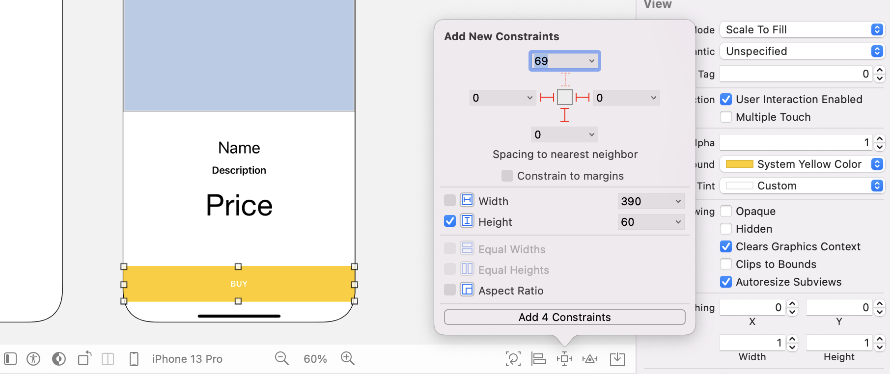
Now it comes to the labels. I prefer not to define the constraints of these labels one by one. Instead, I will use a stack view to embed them. Press and hold the command key, select the Name, Description, and Price labels. In the layout bar, click the Embed in button and choose Stack View to group them into a stack view. In the Attributes inspector, change the Distribution option of the stack view to Fill Proportionally.
Next, select the stack view and click the Add new constraints button. Define four spacing constraints for the stack view:
- Top side: 15 points
- Left/right side: 20 points
- Bottom side: 15 points
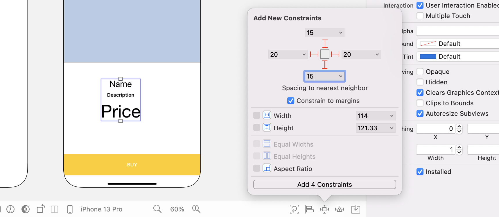
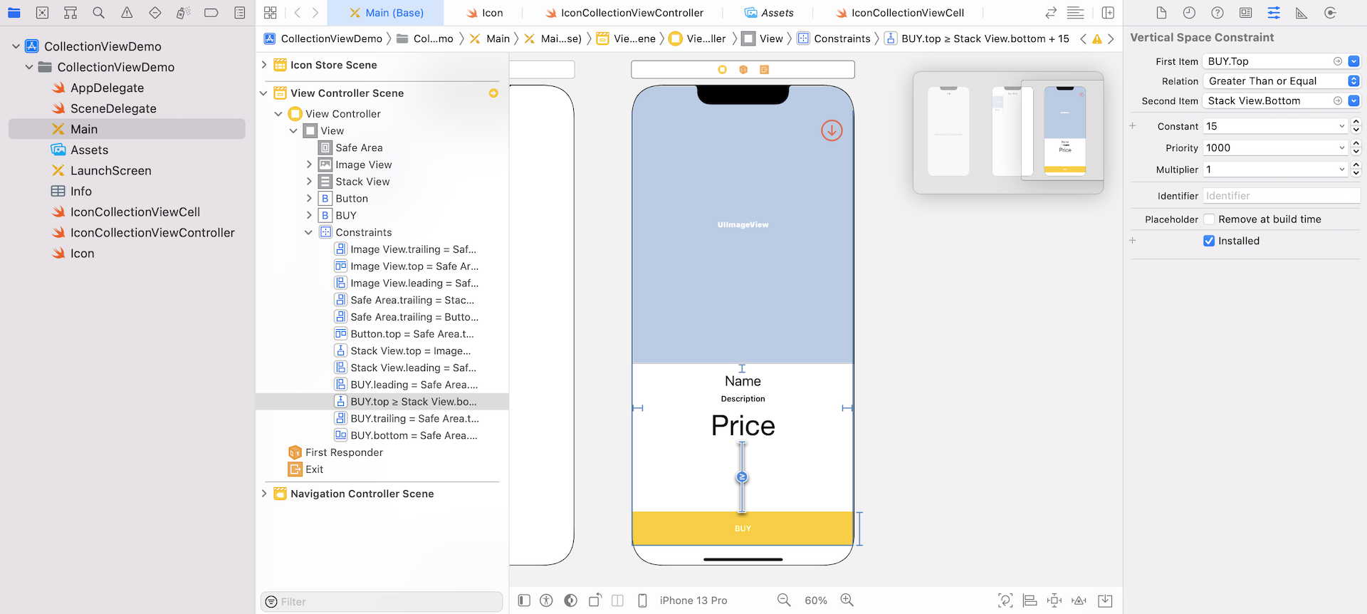
Once you add the constraints, select the bottom constraint of the stack view. Go to the Size inspector and change the Relation to Greater Than or Equal.
Connecting the Controllers Using Segues
Cool! You've finished the UI design of the detail view. Let's see how to bring up the detail view controller when a user selects an icon in the collection view controller.
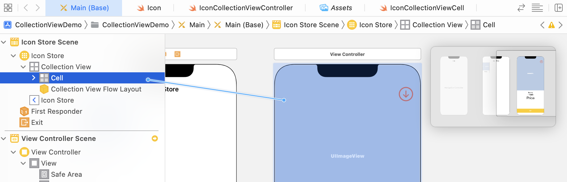
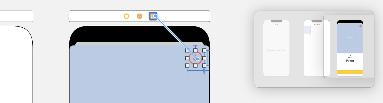
Since we want to display the view controller when a user taps any of the icons in the collection view, we have to connect the collection view with the view controller using a segue. Control-drag from the cell of the collection view in the Document Outline to the view controller we just added. Select Present Modally for the style and set the segue identifier to showIconDetail.
When the user taps the Close button in the detail view controller, the controller will be dismissed. In order to do that, we will add an unwind segue. In IconCollectionViewController.swift, insert the following unwind segue method:
@IBAction func unwindToHome(segue: UIStoryboardSegue) {
}
Go back to the storyboard. Control-drag from the Close button to the Exit icon of the scene dock. Select unwindToHomeWithSegue: segue when prompted. This creates an unwind segue. When the current view controller is dismissed, the user will be brought back to the collection view controller.
If you compile and run the app, you'll end up with an empty view when selecting any of the icons. Tapping the Close button will dismiss the view.
Creating a Custom Class for the Detail View Controller
Since we haven't written any code, the modal view controller knows nothing about the selected icon. We will create a custom class for the detail view controller and see how we can pass the selected icon to the detail view.
Create a new class and name it IconDetailViewController. Make it a subclass of UIViewController. Once created, add the following outlet variable in the IconDetailViewController class, and define a variable for the selected icon:
@IBOutlet var nameLabel: UILabel! {
    didSet {
        nameLabel.text = icon?.name
    }
}
@IBOutlet var descriptionLabel: UILabel! {
    didSet {
        descriptionLabel.text = icon?.description
        descriptionLabel.numberOfLines = 0
    }
}
@IBOutlet var iconImageView: UIImageView! {
    didSet {
        iconImageView.image = UIImage(named: icon?.imageName ?? "")
    }
}
@IBOutlet var priceLabel: UILabel! {
    didSet {
        if let icon = icon {
            priceLabel.text = "$\(icon.price)"
        }
    }
}

var icon: Icon?
In the above code, we use didSet to initialize the title of the labels and the image of the image view. You can do the same kind of initialization in the viewDidLoad method. But I prefer to use didSet as the code is more organised and readable.
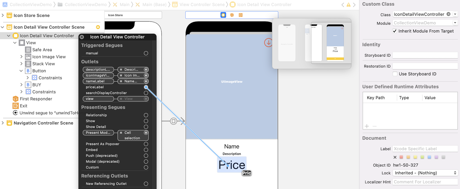
Now go back to Main storyboard. Select the detail view controller and set the custom class to IconDetailViewController in the Identity inspector. Then establish the connections for the outlet variables:
nameLabel: Connect it to the Name labeldescriptionLabel: Connect it to the Description labeliconImageView: Connect it to the image viewpriceLabel: Connect it to the Price label
Data Passing Between Controllers
In order to let other controllers pass the selected icon, we already added an icon property in the IconDetailViewController class:
var icon: Icon?
The question is: How can we identify the selected item of the collection view and pass the selected icon to the IconDetailViewController?
If you understand how data passing works via a segue, you know we must implement the prepare(for:sender:) method in the IconCollectionViewController class. Select IconCollectionViewController.swift and add the following code:
override func prepare(for segue: UIStoryboardSegue, sender: Any?) {
    if segue.identifier == "showIconDetail" {
        if let indexPaths = collectionView?.indexPathsForSelectedItems {
            let destinationController = segue.destination as! IconDetailViewController
            destinationController.icon = iconSet[indexPaths[0].row]
            collectionView?.deselectItem(at: indexPaths[0], animated: false)
        }
    }
}
Just like UITableView, the UICollectionView class provides the indexPathsForSelectedItems method that returns the index paths of the selected items. You may wonder why multiple index paths are returned. The reason is that UICollectionView supports multiple selections. Each of the index paths corresponds to one of the selected items. For this demo, we only have single item selection. Therefore, we just pick the first index path, retrieve the selected icon, and pass it to the detail view controller.
When a user taps a collection cell in the collection view, the cell changes to the highlighted state and then to the selected state. The last line of code is to deselect the selected item once the image is displayed in the modal view controller.
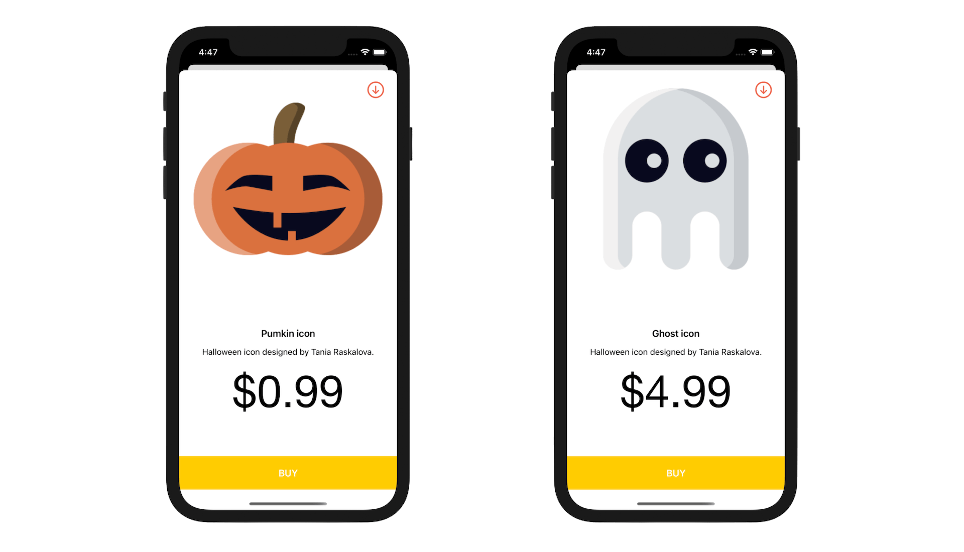
Now, let's build and run the app. After the app is launched, tap any of the icons. You should see a modal view showing the details of the icon.
Handling Multiple Selections
UICollectionView supports both single and multiple selections. By default, the app only allows users to select a single item. The allowsMultipleSelection property of the UICollectionView class controls whether multiple items can be selected simultaneously. To enable multiple selections, the trick is to set the property to true.
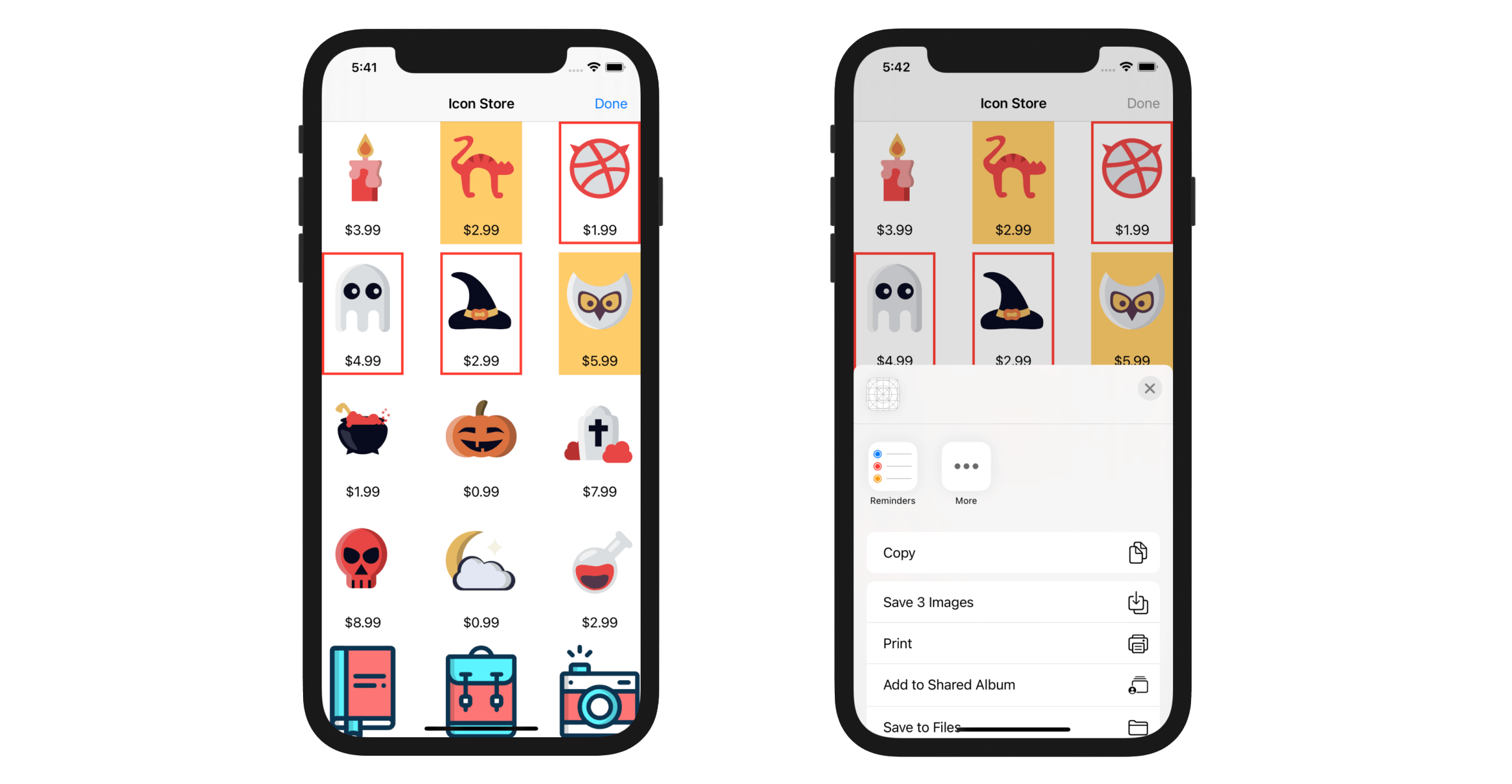
To give you a better idea of how multiple selections work, we'll continue to tweak the demo app. Users are allowed to select multiple icons and share them by bringing up the activity controller:
- A user taps the Share button in the navigation bar. Once the sharing starts, the button title is automatically changed to Done.
- The user selects the icons to share.
- After selection, the user taps the Done button. The app will take a snapshot of the selected icon and then bring up the activity controller for sharing the icons using AirDrop, Messages or whatever service available.
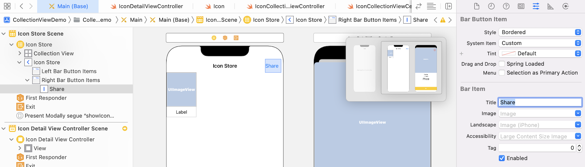
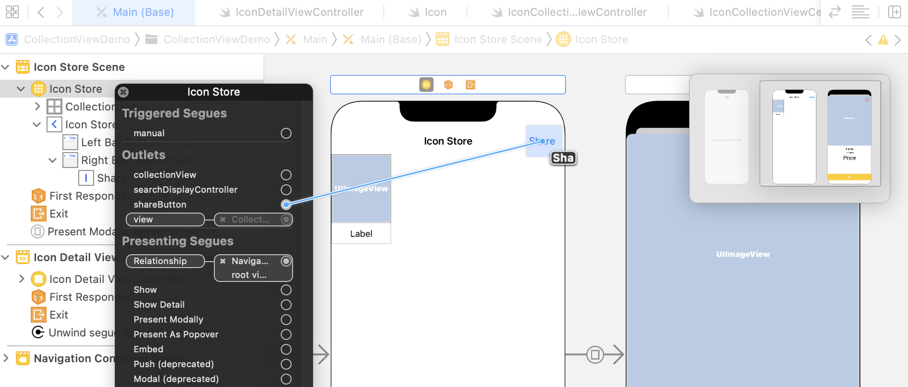
We'll first add the Share button in the navigation bar of Icon Collection View Controller. Go to Main storyboard, drag a Bar Button Item from the Object library, and put it in the navigation bar of Icon Collection View Controller. Set the title to Share.
In IconCollectionViewController.swift, insert an outlet variable for the Share button:
@IBOutlet var shareButton: UIBarButtonItem!
Also, add an action method:
@IBAction func shareButtonTapped(sender: AnyObject) {
}
As usual, go to Interface Builder. Establish a connection between the action button and the shareButtonTapped method. Also, associate it with the shareButton outlet.
The demo app now offers two modes: single selection and multiple selections. When a user taps the action button, the app goes into multiple selection mode. This allows users to select multiple icons for sharing. To support multiple selection mode, we'll add two variables in the IconCollectionViewController class:
shareEnabled– this is a boolean variable to indicate the selection mode. If it's set totrue, it indicates the Share button was tapped and multiple selection is enabled.selectedIcons– this is an array of tuples to store the selected icons. For each tuple, it stores the selected icon and the corresponding snapshot, which is an instance ofUIImage.
Your code should look like this:
private var shareEnabled = false
private var selectedIcons: [(icon: Icon, snapshot: UIImage)] = []
Let's first start with the snapshot. How can you take a snapshot of a cell?
A collection view cell is essentially a subclass of UIView. To empower a cell with the snapshot capability, let's create an extension for the UIView class. In the project navigator, right-click CollectionViewDemo to create a new group named Extension. Then right-click the Extension folder again to create a new Swift file. Name it UIView+Snapshot.swift. Once the file is created, replace its content with the following:
import UIKit

extension UIView {
    var snapshot: UIImage? {
        var image: UIImage? = nil
        UIGraphicsBeginImageContext(bounds.size)
        if let context = UIGraphicsGetCurrentContext() {
            self.layer.render(in: context)
            image = UIGraphicsGetImageFromCurrentImageContext()
        }
        UIGraphicsEndImageContext()

        return image
    }
}
We define a computed property named snapshot. In the code, we creates a bitmap-based graphics context with the view's size. Then we render the view's content over that graphics context and retrieve an image from it (i.e. UIGraphicsGetImageFromCurrentImageContext()). This is how we take the snapshot of a view or a collection view cell.
With the implementation of snapshots ready, let's continue to develop the Share feature.
The UICollectionViewDelegate protocol defines methods that allow you to manage the selection and highlight items in a collection view. When a user selects an item, the collectionView(_:didSelectItemAt:) method will be called. We will implement this method and add the selected items into the selectedIcons array. Create an extension and insert the following method:
extension IconCollectionViewController {

    override func collectionView(_ collectionView: UICollectionView, didSelectItemAt indexPath: IndexPath) {
        // Check if the sharing mode is enabled, otherwise, just leave this method
        guard shareEnabled else {
            return
        }

        // Determine the selected items by using the indexPath and take a snapshot
        if let selectedIcon = dataSource.itemIdentifier(for: indexPath) {
            if let snapshot = collectionView.cellForItem(at: indexPath)?.snapshot {
                // Add the selected item into the array
                selectedIcons.append((icon: selectedIcon, snapshot: snapshot))
            }
        }

    }
}
The code above is pretty straightforward. We find out the selected cell by calling the itemIdentifier method of the data source with the index path. Then we put the corresponding icon object and its snapshot in the selectedIcons array.
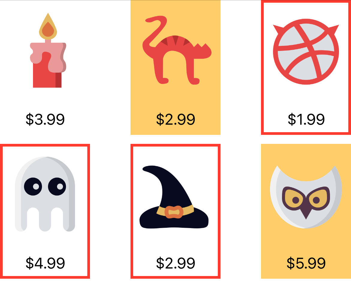
Next, how can we highlight the selected cell?
The UICollectionViewCell class provides a property named selectedBackgroundView for setting the background view of a selected item.
To indicate a selected item, we'll change the background view of a collection cell. Edit the configureDataSource() method and insert the following line of code before return cell:
let selectedBackground = UIView()
selectedBackground.layer.borderColor = UIColor.systemRed.cgColor
selectedBackground.layer.borderWidth = 3.0
cell.selectedBackgroundView = selectedBackground
We simply add a red border to highlight the selection. When a user selects an icon, the selected cell will look like this:
Not only do we have to handle item selection, we also need to account for deselection. A user may deselect an item from the collection view. When an item is deselected, it should be removed from the selectedIcons array.
Insert the following code in the IconCollectionViewController extension:
override func collectionView(_ collectionView: UICollectionView, didDeselectItemAt indexPath: IndexPath) {

    // Check if the sharing mode is enabled, otherwise, just leave this method
    guard shareEnabled else {
        return
    }

    if let deSelectedIcon = dataSource.itemIdentifier(for: indexPath) {

        // Find the index of the deselected icon. Here we use the index method and pass it
        // a closure. In the closure, we compare the name of the deselected icon with all
        // the items in the selected icons array. If we find a match, the index method will
        // return us the index for later removal.
        if let index = selectedIcons.firstIndex(where: { $0.icon.name == deSelectedIcon.name }) {
            selectedIcons.remove(at: index)
        }
    }
}
When an item in a collection view is deselected, the collectionView(_:didDeselectItemAt:) method of the UICollectionViewDelegate protocol is called. In the method, we identify the deselected icon, and then remove it from the selectedIcons array.
Next, we'll move onto the implementation of the shareButtonTapped method. The method is called when a user taps the Share button. Update the method to the following code:
@IBAction func shareButtonTapped(sender: AnyObject) {

    guard shareEnabled else {
        // Change shareEnabled to YES and change the button text to Done
        shareEnabled = true
        collectionView?.allowsMultipleSelection = true
        shareButton.title = "Done"
        shareButton.style = UIBarButtonItem.Style.plain

        return
    }

    // Make sure the user has selected at least one icon
    guard selectedIcons.count > 0 else {
        return
    }

    // Get the snapshots of the selected icons
    let snapshots = selectedIcons.map { $0.snapshot }

    // Create an activity view controller for sharing
    let activityController = UIActivityViewController(activityItems: snapshots, applicationActivities: nil)

    activityController.completionWithItemsHandler = { (activityType, completed, returnedItem, error) in

        // Deselect all selected items
        if let indexPaths = self.collectionView?.indexPathsForSelectedItems {
            for indexPath in indexPaths  {
                self.collectionView?.deselectItem(at: indexPath, animated: false)
            }
        }

        // Remove all items from selectedIcons array
        self.selectedIcons.removeAll(keepingCapacity: true)

        // Change the sharing mode to NO
        self.shareEnabled = false
        self.collectionView?.allowsMultipleSelection = false
        self.shareButton.title = "Share"
        self.shareButton.style = UIBarButtonItem.Style.plain
    }

    present(activityController, animated: true, completion: nil)

}
Let's take a look at the above code line by line.
We first check if the sharing mode is enabled. If not, we'll put the app into sharing mode and enable multiple selections. To enable multiple selections, all you need to do is set the allowsMultipleSelection property to true. Finally, we change the title of the button to Done.
When the app is in sharing mode (i.e. shareEnabled is set to true), we check if the user has selected at least one icon. If no icon is selected, we will not perform the sharing action.
Assuming the user has selected at least one icon, we'll bring up the activity view controller. I have covered this type of controller in chapter 17. You can refer to that chapter if you do not know how to use it. In brief, we pass an array of the snapshots to the controller for sharing.
The completionWithItemsHandler property takes in a closure which will be executed after the activity view controller is dismissed. The code in the closure is used to perform cleanup and revert the share button back to the original state.
Finally, we call up the present(_:animated:completion:) method to display the activity view controller on screen.
The app is almost ready. However, if you run the app now, you will end up with a bug. After switching to sharing mode, the modal view still appears when you select any of the icons - the result is not what we expected. The segue is invoked every time a collection view cell is tapped. Obviously, we don't want to trigger the segue when the app is in sharing mode. We only want to trigger the segue when it's in single selection mode.
The shouldPerformSegue(withIdentifier:sender:) method allows you to control the performance of a segue. Insert the following code snippet in IconCollectionViewController.swift:
override func shouldPerformSegue(withIdentifier identifier: String, sender: Any?) -> Bool {
    if identifier == "showIconDetail" {
        if shareEnabled {
            return false
        }
    }

    return true
}
Ready to Test Your App
Great! Now compile and run the app. Tap the Share button, select a few icons and tap the Done button to share them on Messages or any available app.
For reference, you can download the Xcode project from http://www.appcoda.com/resources/swift55/CollectionViewSelection.zip.