- Made by AppCoda
- Contact us / Support
- Tweet this book
- Preface
- 1. Building Adaptive User Interfaces
- 2. Creating Table View Sections and Index list with Diffable Data Source
- 3. Animating Table View Cells
- 4. Working with JSON and Codable
- 5. How to Integrate the Twitter and Facebook SDK for Social Sharing
- 6. Working with Email and Attachments
- 7. Sending SMS and MMS Using MessageUI Framework
- 8. How to Get Direction and Draw Route on Maps
- 9. Search Nearby Points of Interest Using Local Search
- 10. Audio Recording and Playback
- 11. Scan QR Code Using AVFoundation Framework
- 12. Working with URL Schemes
- 13. Building a Full Screen Camera with Gesture-based Controls
- 14. Video Capturing and Playback Using AVKit
- 15. Displaying Banner Ads using Google AdMob
- 16. Working with Custom Fonts
- 17. Working with AirDrop, UIActivityViewController and Uniform Type Identifiers
- 18. Building Grid Layouts Using Collection Views and Diffable Data Source
- 19. Interacting with Collection Views
- 20. Adaptive Collection Views Using UITraitCollection and Compositional Layout
- 21. Building a Weather Widget Using WidgetKit
- 22. Building Slide Out Sidebar Menus Using Objective-C Libraries
- 23. View Controller Transitions and Animations
- 24. Building a Slide Down Menu
- 25. Self Sizing Cells and Dynamic Type
- 26. XML Parsing, RSS and Expandable Table View Cells
- 27. Applying a Blurred Background Using UIVisualEffect
- 28. Using Touch ID and Face ID For Authentication
- 29. Building a Carousel-Like User Interface
- 30. Working with Parse
- 31. Parsing CSV and Preloading a SQLite Database Using Core Data
- 32. Connecting Multiple Annotations with Polylines and Routes
- 33. Using CocoaPods in Swift Projects
- 34. Building a Simple Sticker App
- 35. Building iMessage Apps Using Messages Framework
- 36. Building Custom UI Components Using IBDesignable and IBInspectable
- 37. Using Firebase for User Authentication
- 38. Google and Facebook Authentication Using Firebase
- 39. Using Firebase Database and Storage to Build an Instagram-like App
- 40. Building a Real-time Image Recognition App Using Core ML
- 41. Building AR Apps with ARKit and SpriteKit
- 42. Working with 3D Objects in Augmented Reality Using ARKit and SceneKit
- 43. Use Create ML to Train Your Own Machine Learning Model for Image Recognition
- 44. Building a Sentiment Classifier Using Create ML to Classify User Reviews
- 45. Working with Image Tracking Using ARKit
- Published with GitBook
Chapter 18
Building Grid Layouts Using Collection Views and Diffable Data Source
If you have no idea about what grid-like layout is, just take a look at the built-in Photos app. The app presents photos in grid format. Before Apple introduced UICollectionView, you had to write a lot of code or make use of third-party libraries to build a similar layout.
UICollectionView, in my opinion, is one of the most spectacular APIs in the iOS SDK. Not only can it simplify the way to arrange visual elements in a grid layout, it even lets developers customize the layout (e.g. circular, cover flow style layout) without changing the data.
In this chapter, we will build a simple app to display a collection of icons in grid layout. Here is what you're going to learn:
- An introduction to
UICollectionViewandUICollectionViewDiffableDataSource - How to use
UICollectionViewto build a simple grid-based layout - How to customize the background of a collection view cell
Let's get started.
Getting Started with UICollectionView and UICollectionViewController
UICollectionView operates pretty much like the UITableView class. While UITableView manages a collection of data items and displays them on screen in a single-column layout, the UICollectionView class offers developers the flexibility to present items using customizable layouts. You can present items in multi-column grids, tiled layout, circular layout, etc.
By default, the SDK comes with the UICollectionViewFlowLayout class that organizes items into a grid with optional header and footer views for each section. Later, we'll use the layout class to build the demo app.
The UICollectionView is composed of several components:
- Cells – instances of
UICollectionViewCell. LikeUITableViewCell, a cell represents a single item in the data collection. The cells are the main elements organized by the associated layout. IfUICollectionViewFlowLayoutis used, the cells are arranged in a grid-like format. - Supplementary views – Optional. It's usually used for implementing the header or footer views of sections.
- Decoration views – think of it as another type of supplementary view but for decoration purpose only. The decoration view is unrelated to the data collection. We simply create decoration views to enhance the visual appearance of the collection view.
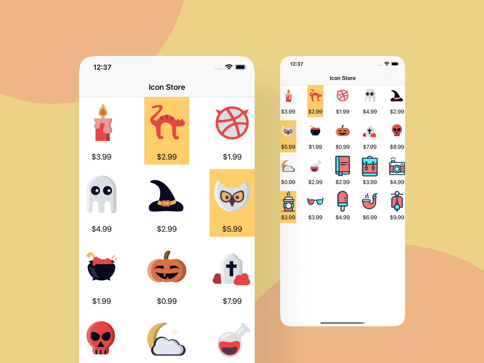
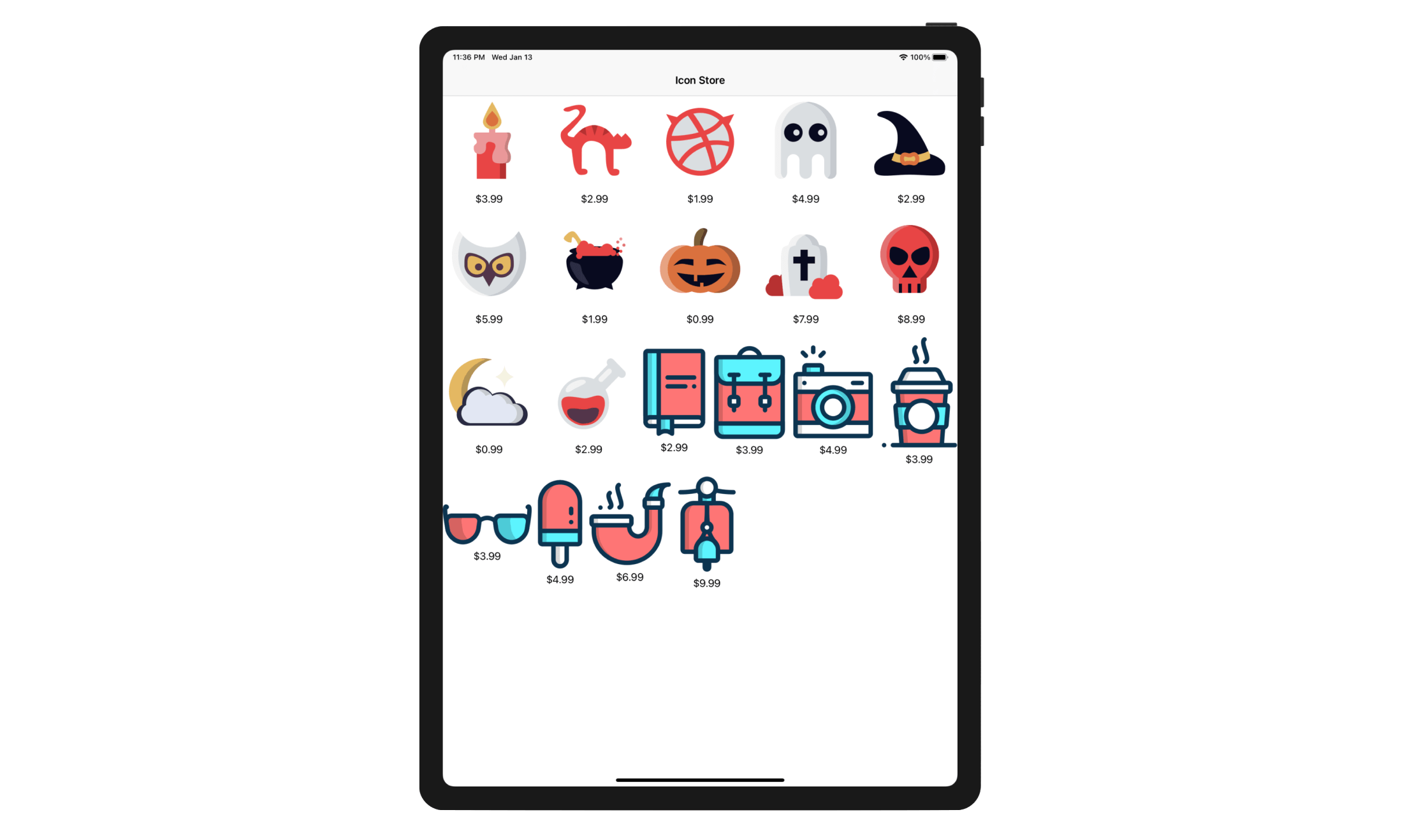
What we're going to do is to build an icon store app. When a user launches the app, it displays a set of icons (with price included) in grid form.
Creating a New Project
First, fire up Xcode and create a new project using the App template. Name the project CollectionViewDemo and make sure you select Swift for the programming language.
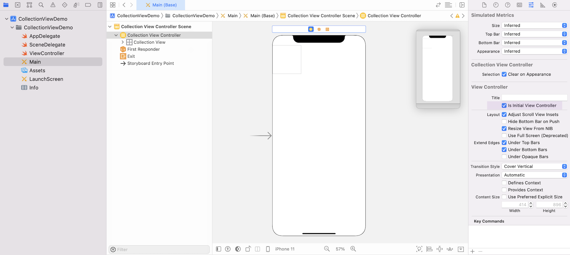
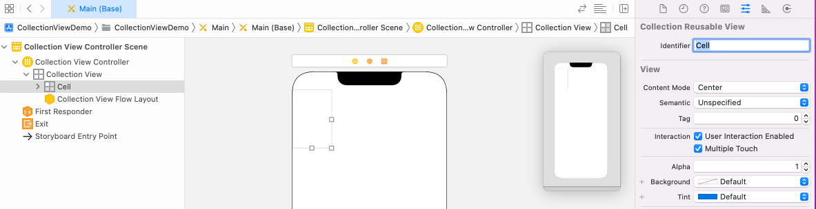
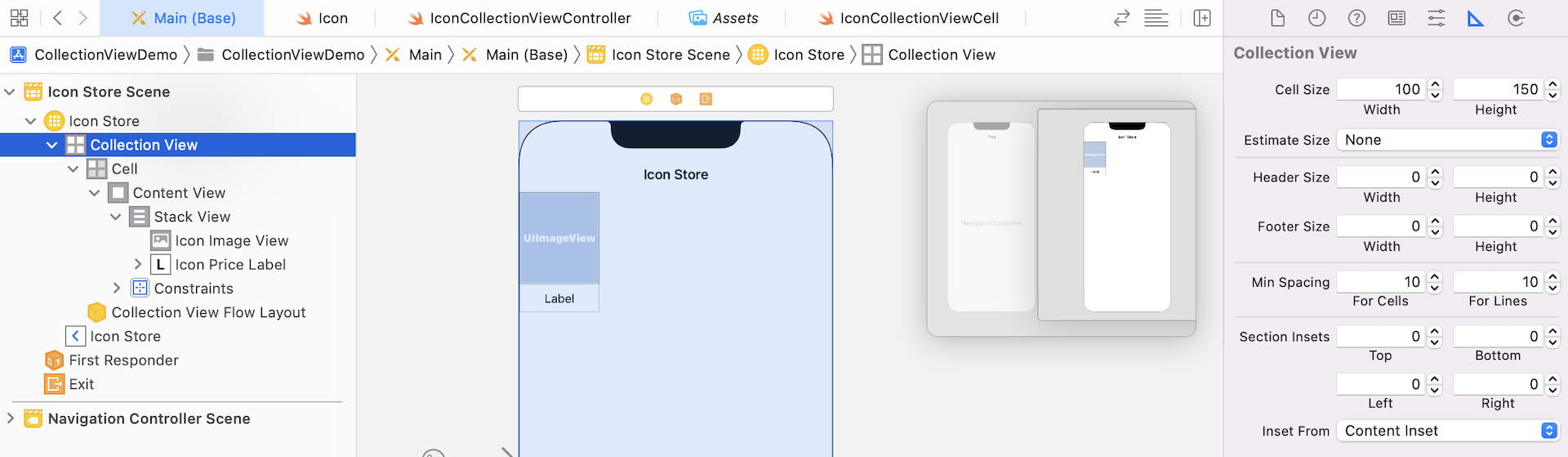
Once you've created the project, open Main storyboard in the project navigator. Delete the default view controller and drag a Collection View Controller from the Object library to the storyboard. The controller already has a collection view built-in. You should see a collection view cell in the controller, which is similar to the prototype cell of a table view.
Under the Attributes inspector, set the collection view controller as the initial view controller.
Click iPhone 11 in the configuration bar and change the device to iPhone 13 Pro. Open the Document Outline and select the collection view. Under the Size inspector, change the width and height of the cell to 100 points and 150 points respectively. Also, change the min spacing of both for cells and for lines to 10 points.
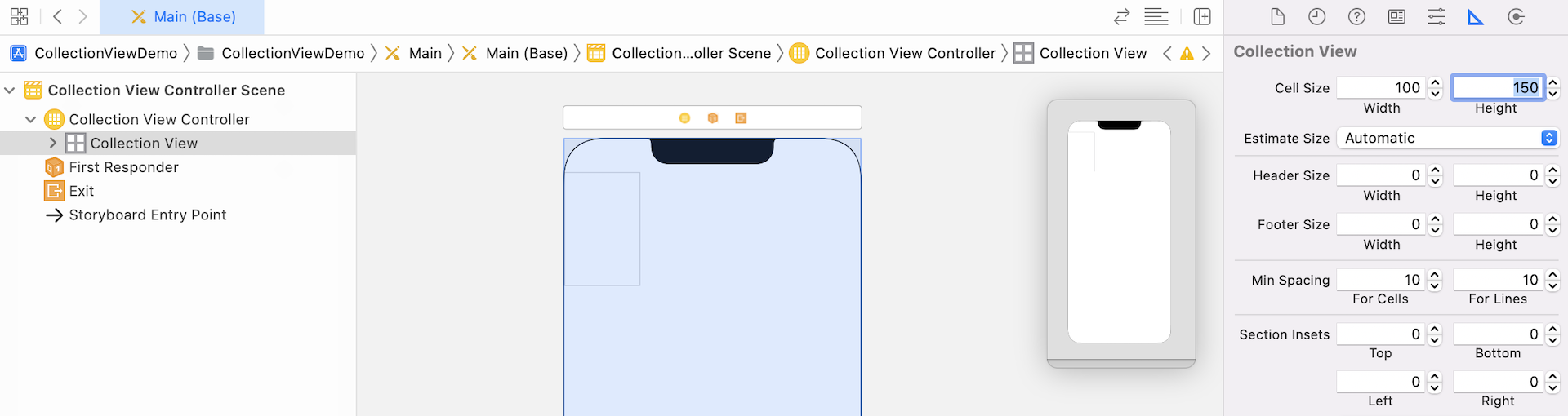
The for cells value defines the minimum spacing between items in the same row, while the for lines value defines the minimum spacing between successive rows.
Next, select the collection view cell and set the identifier to Cell in the Attribute inspector. This looks familiar, right?
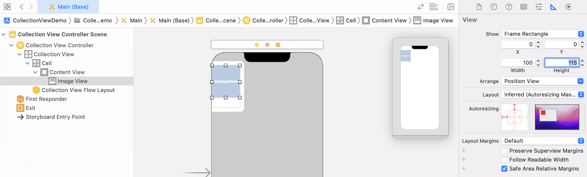
Now drag an image view from the Object library to the cell. You then manually resizes the image view such that its width is 100 points and its height is 115 points. Alternatively, you can go to the Size inspector and set its size (see figure below).
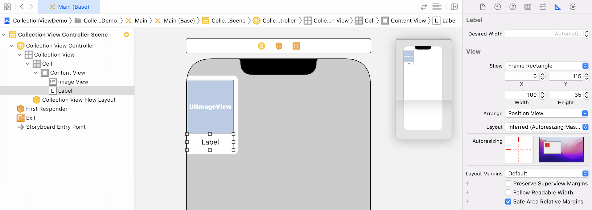
To display the price of an icon, we will add a label below the image view. Drag a label object from the Object library to the collection view cell. In the Size inspector, set X to 0, Y to 115, Width to 100, and Height to 35. In the Attributes inspector, change the alignment option to center, and the font size to 15 points. Your cell design should look similar to that in figure 18.6.
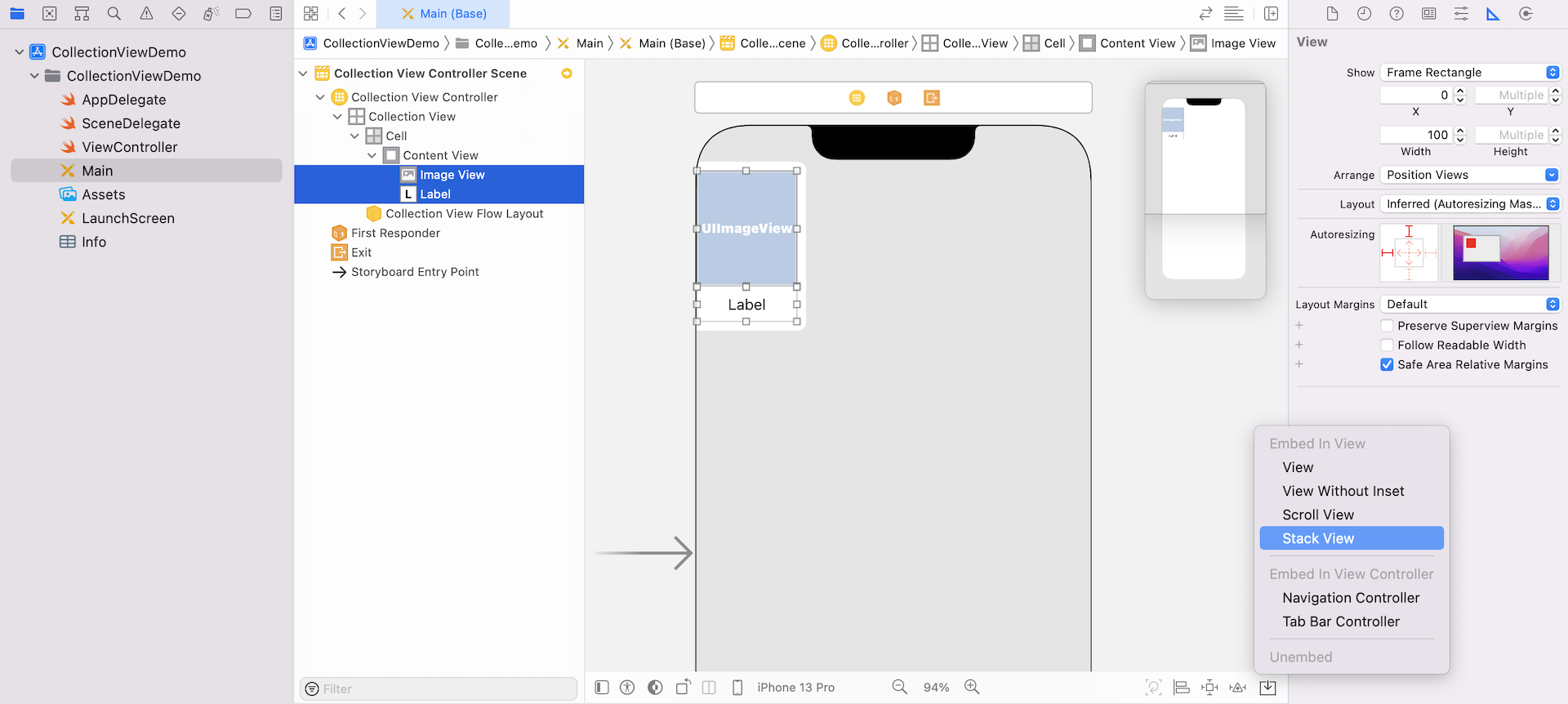
Next, select both the label and the image view. Click the Embed in button and choose Stack View to embed them in a stack view.
Next, select the stack view, and click the Add New Constraints button. Set the spacing value of all sides to 0. Click Add 4 Constraints to add the constraints.
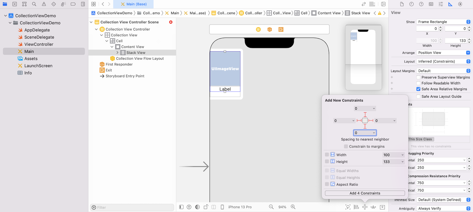
Next, select the label and click Add new constraints. Set the Height to 35 points and add the constraints.
Lastly, embed the collection view controller in a navigation controller. Go up to the Xcode menu, select Editor > Embed In > Navigation Controller. Set the title of the navigation bar to Icon Store.
That's it. We have completed the user interface design. The next step is to create the custom classes for the collection view controller and the collection view cell.
Creating Custom Classes for the Collection View
First, in the project navigator, delete ViewController.swift file that was generated by Xcode. We do not need it because we will create our own classes.
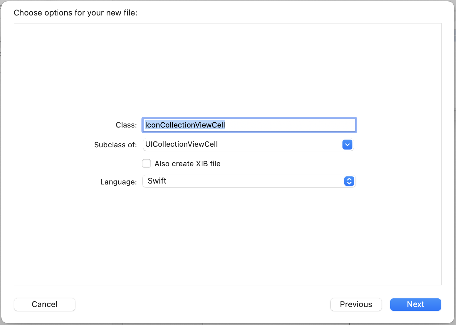
Similar to how you implement the table view cell, we have to create a custom class for a custom collection view cell. Right click the CollectionViewDemo folder and select New File.... Create a new class using the Cocoa Touch Class template. Name the class IconCollectionViewCell and set the subclass to UICollectionViewCell.
Repeat the process to create another class for the collection view controller. Name the new class IconCollectionViewController and set the subclass to UICollectionViewController.
Let's start with IconCollectionViewCell.swift. The cell has an image view and a label. So, we will create two outlet variables in the class.
Now open the IconCollectionViewCell.swift file and insert the following line of code to declare an outlet variable for the image view. Your class should look like this:
class IconCollectionViewCell: UICollectionViewCell {
    @IBOutlet weak var iconImageView: UIImageView!
    @IBOutlet weak var iconPriceLabel: UILabel!
}
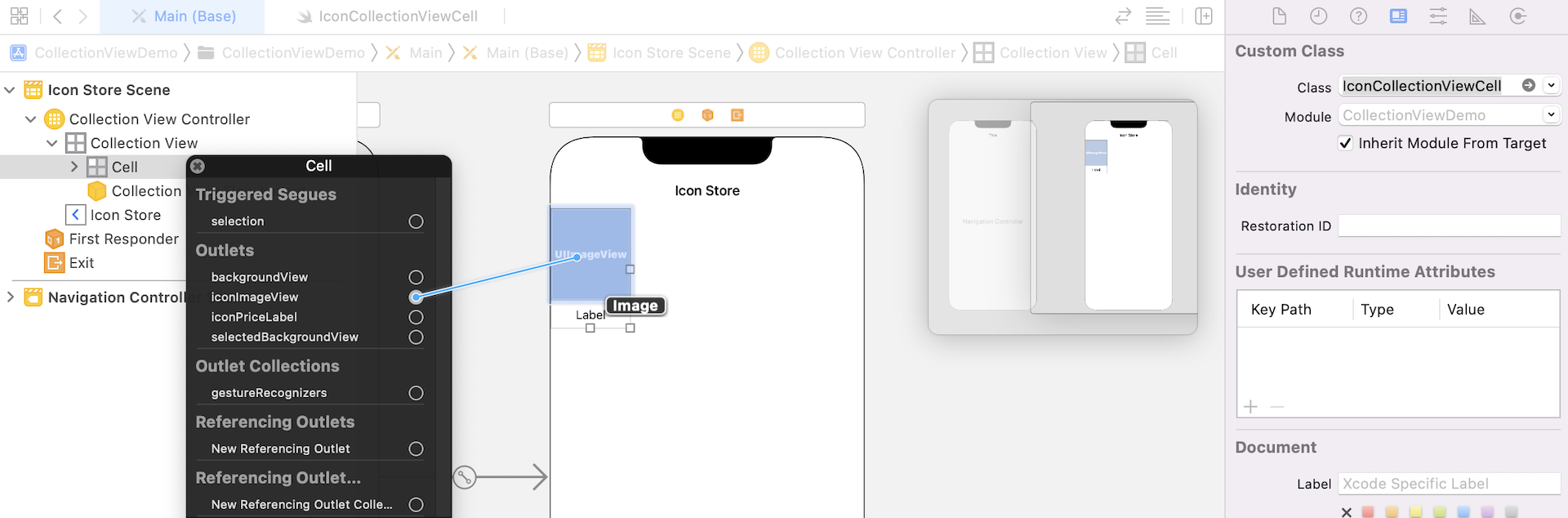
Go back to storyboard and select the collection view cell. Under the Identity inspector, change the custom class to IconCollectionViewCell. Then right click the cell and connect the outlet variable with the image view.
Next, select the collection view controller. Under the Identity inspector, set the custom class to IconCollectionViewController.
Preparing the Data and Images
First, download this image pack (http://www.appcoda.com/resources/swift4/IconStoreImage.zip), unzip it and add all the images to the image asset.
Note: The icon images are courtesy of Tania Raskalova and Marin Begović.Next, create a new Swift file and name it
Icon.swift. In the file, we define an Icon structure with three properties:
- name - the image name of the icon
- price - the price of the icon
- isFeatured - indicates if the icon is featured on the store
Your Icon.swift file should look like this:
import Foundation

struct Icon {
    var name: String = ""
    var price: Double = 0.0
    var isFeatured: Bool = false

    init(name: String, price: Double, isFeatured: Bool) {
        self.name = name
        self.price = price
        self.isFeatured = isFeatured
    }
}
Now let's move on to the implementation of the IconCollectionViewController class. In the class, declare an iconSet array and initialize it with the set of icon images. For demo purpose in the later section, we have set the isFeatured property of some Icon objects to true.
private var iconSet: [Icon] = [ Icon(name: "candle", price: 3.99, isFeatured: false),
                                Icon(name: "cat", price: 2.99, isFeatured: true),
                                Icon(name: "dribbble", price: 1.99, isFeatured: false),
                                Icon(name: "ghost", price: 4.99, isFeatured: false),
                                Icon(name: "hat", price: 2.99, isFeatured: false),
                                Icon(name: "owl", price: 5.99, isFeatured: true),
                                Icon(name: "pot", price: 1.99, isFeatured: false),
                                Icon(name: "pumkin", price: 0.99, isFeatured: false),
                                Icon(name: "rip", price: 7.99, isFeatured: false),
                                Icon(name: "skull", price: 8.99, isFeatured: false),
                                Icon(name: "sky", price: 0.99, isFeatured: false),
                                Icon(name: "toxic", price: 2.99, isFeatured: false),
                                Icon(name: "ic_book", price: 2.99, isFeatured: false),
                                Icon(name: "ic_backpack", price: 3.99, isFeatured: false),
                                Icon(name: "ic_camera", price: 4.99, isFeatured: false),
                                Icon(name: "ic_coffee", price: 3.99, isFeatured: true),
                                Icon(name: "ic_glasses", price: 3.99, isFeatured: false),
                                Icon(name: "ic_ice_cream", price: 4.99, isFeatured: false),
                                Icon(name: "ic_smoking_pipe", price: 6.99, isFeatured: false),
                                Icon(name: "ic_vespa", price: 9.99, isFeatured: false)]
Using Diffable Data Source
UICollectionView operates very similarly to UITableView. Traditionally, to populate data in a collection view, you need to implement two required methods of the UICollectionViewDataSource protocol:
func collectionView(_ collectionView: UICollectionView, numberOfItemsInSection section: Int) -> Intfunc collectionView(_ collectionView: UICollectionView, cellForItemAt indexPath: IndexPath) -> UICollectionViewCell
Starting from iOS 13, Apple introduced a new approach known as Diffable Data Sources to manage data for a collection view. This approach replaces the old approach which uses the UICollectionViewDataSource protocol. You no longer need to deal with all the methods above. Instead, we have to create a UICollectionViewDiffableDataSource object to configure the collection view cell. Then we create a NSDiffableDataSourceSnapshot object to tell the collection what data to display.
If you've read the beginner book before, you should already know how to use diffable data source to populate data in a table view. The procedures are quite similar for filling a collection view with data:
- Connect a diffable data source to your collection view.
- Implement a cell provider to configure the cell of your collection view.
- Generate the current state of the data
- Display the data in the UI
By default, Xcode generates a statement in the viewDidLoad method to register a collection view cell for reuse purpose. Since we already use a prototype cell in storyboard, this line of code is no longer required. Before implementing the diffable data source, let's delete the following statement from the viewDidLoad method:
self.collectionView!.register(UICollectionViewCell.self, forCellWithReuseIdentifier: reuseIdentifier)
As we are going to use the diffable data source approach, you can also remove the following methods:
override func numberOfSections(in collectionView: UICollectionView) -> Int {
    // #warning Incomplete implementation, return the number of sections
    return 0
}


override func collectionView(_ collectionView: UICollectionView, numberOfItemsInSection section: Int) -> Int {
    // #warning Incomplete implementation, return the number of items
    return 0
}

override func collectionView(_ collectionView: UICollectionView, cellForItemAt indexPath: IndexPath) -> UICollectionViewCell {
    let cell = collectionView.dequeueReusableCell(withReuseIdentifier: reuseIdentifier, for: indexPath)

    // Configure the cell

    return cell
}
To use the UICollectionDiffableDataSource object, we need to specify the number of sections and the cell configuration of each section. For this demo app, we only have a single section. So, declare an enum variable in the IconCollectionViewController class like this:
enum Section {
    case all
}
We use enum to define a new Section type. In the enumeration, it only has one case because the table has a single section. I name the case all, which means all records. But you can actually name it to whatever name you like. Anyway, let's keep it to all.
Now that we have defined the section, the next step is to create an instance of UICollectionViewDiffableDataSource. We will write a new function called configureDataSource() for this purpose. Insert the following code in the class:
func configureDataSource() -> UICollectionViewDiffableDataSource<Section, Icon> {

    let dataSource = UICollectionViewDiffableDataSource<Section, Icon>(collectionView: collectionView) { (collectionView, indexPath, icon) -> UICollectionViewCell? in

        let cell = collectionView.dequeueReusableCell(withReuseIdentifier: reuseIdentifier, for: indexPath) as! IconCollectionViewCell
        cell.iconImageView.image = UIImage(named: icon.name)
        cell.iconPriceLabel.text = "$\(icon.price)"

        return cell
    }

    return dataSource
}
In the code above, the function returns an instance of UICollectionViewDiffableDataSource<Section, Icon>, which comes with a closure that creates and configures each of the cells for the collection view. This closure is referred as the cell provider.
What's Section and Icon here?
UICollectionViewDiffableDataSource is a generic object which is capable to handle different types of section and item of a collection view. The type Section and Icon inside the angle bracket indicated that we use the Section type for the section. And, since we are going to display the data stored in iconSet, the Icon type is used for the cell data.
Meanwhile, you should notice an error indicating that the type Icon doesn't conform to protocol Hashable. To use UICollectionViewDiffableDataSource, the type of the item (i.e. Icon) is required to conform the Hashable protocol. Switch over to Icon.swift and declare the conformance like this:
struct Icon: Hashable {
  .
  .
  .
}
Now that we have created the function for configuring the data source, declare the following variable in IconCollectionViewController to use it:
lazy var dataSource = configureDataSource()
And, we need to connect this data source with the collection view. Insert the following code in the viewDidLoad() method:
collectionView.dataSource = dataSource
You may wonder why we add a modifier lazy before the variable declaration. If you try to omit the lazy keyword, Xcode will show you the following message:
"Cannot use instance member 'configureDataSource' within property initializer; property initializers run before 'self' is available"
In this case, you must declare the variable with the lazy modifier because its initial value cannot be retrieved until after the instance initialization completes.
We still have one more step to implement before the data shows up in the collection view. Create a new method called updateSnapshot like this:
func updateSnapshot(animatingChange: Bool = false) {

    // Create a snapshot and populate the data
    var snapshot = NSDiffableDataSourceSnapshot<Section, Icon>()
    snapshot.appendSections([.all])
    snapshot.appendItems(iconSet, toSection: .all)

    dataSource.apply(snapshot, animatingDifferences: false)
}
To display the data in the collection view, the final step is to create a snapshot of the data. The snapshot is an instance of NSDiffableDataSourceSnapshot. In the code above, we created an empty snapshot using the section identifier type Section and item identifier type Icon. With the empty snapshot, we call appendSections to add a section to the snapshot. Then we call appendItems to add all items in the iconSet array to the .all section. Lastly, we apply the snapshot to the data source.
Don't forget to insert the following line of code in the viewDidLoad() method to make the call:
updateSnapshot()
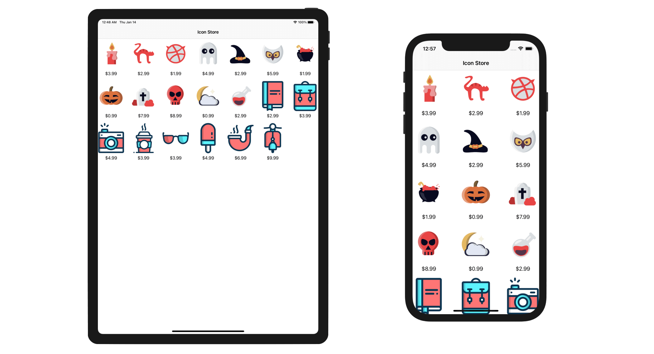
Now compile and run the app using the iPhone 13 Pro simulator. You should have a grid-based Icon Store app like this.
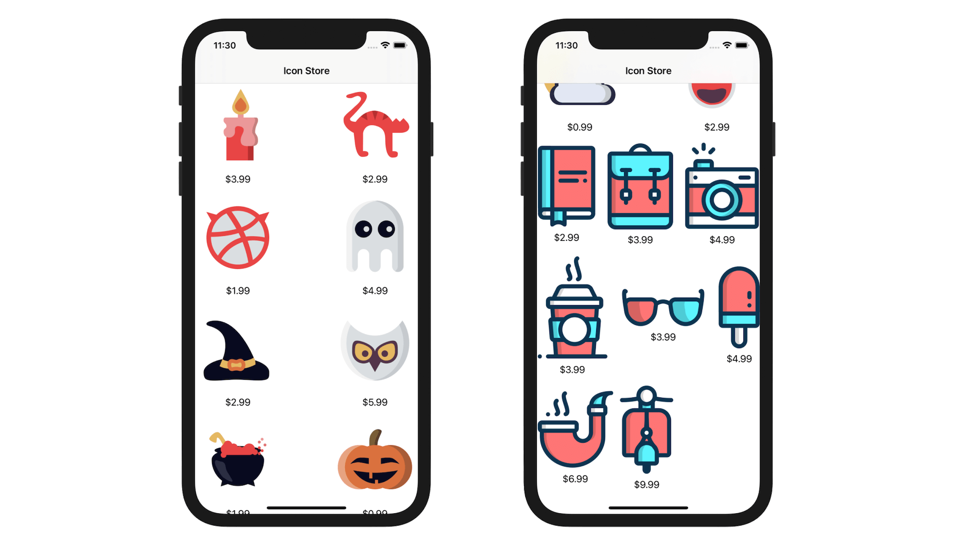
Depending on the image size, the app arranges the grid in two or three columns. If you try to run the app on iPad Pro, you will achieve a grid layout with even more columns.
Understanding FlowLayout
As mentioned at the beginning of the chapter, the default layout of a collection view is Flow Layout. You can open Main storyboard again and choose the collection view. You can then reveal the layout settings in the Attributes inspector. By default, it is set to Flow. The other option is Custom, which means you build your own collection view layout.
For a flow layout, items in the collection view flow from one row or column (depending on the scrolling direction) to the next. The cell size can be varied such that each row can contain as many cells as fit. This explains why the demo app displays different number of columns in each row.
So, can we fix the size of the cell? Recalled that we set the size of the collection view cell to 100x150 points in the storyboard, why did the collection view ignore this setting?
Let's switch over to Main storyboard to take another look. Select the collection view and open the Size inspector. There is an option called Estimate Size, which is now set to Automatic. When this setting is used, the collection view will compute the actual size of the cell. Here it depends on the image's size and layout constraints. Again, this is the reason why some rows contain more items than the others.
To fix the size of the cells, one simple trick is to change the Estimate Size option from automatic to None. The collection view will no longer calculate the actual size of the cell, but uses the one you specify in the storyboard.
Once you made the change, test the app again. All of your cells should have the same size.
You don't have to configure the settings using Storyboard. If you place the following code in viewDidLoad(), you will achieve the same result:
if let layout = collectionViewLayout as? UICollectionViewFlowLayout {
    layout.itemSize = CGSize(width: 100, height: 150)
    layout.estimatedItemSize = .zero
}
By varing the size of the items and interspacing, you can easily create a different grid layout. Try to use the following code and see what you will achieve.
if let layout = collectionViewLayout as? UICollectionViewFlowLayout {
    layout.itemSize = CGSize(width: 50, height: 100)
    layout.estimatedItemSize = .zero
    layout.minimumInteritemSpacing = 20
}
The default scroll direction of a collection view is set to vertical. If you want to change it to a horizontal-scrolling collection view, you can change the scrollingDirection property:
layout.scrollDirection = .horizontal
Customizing the Collection Cell Background
Cool, right? With a few lines of code, you can create a grid-based app. What if you want to highlight some of the featured icons? Like other UI elements, UICollectionViewCell lets developers easily customize its background.
A collection view cell is comprised of three different views including background, selected background and content view:
- Background View – background view of the cell
- Selected Background View – the background view when the cell is selected. When the user selects the cell, this selected background view will be layered above the background view.
- Content View – obviously, it's the cell content.
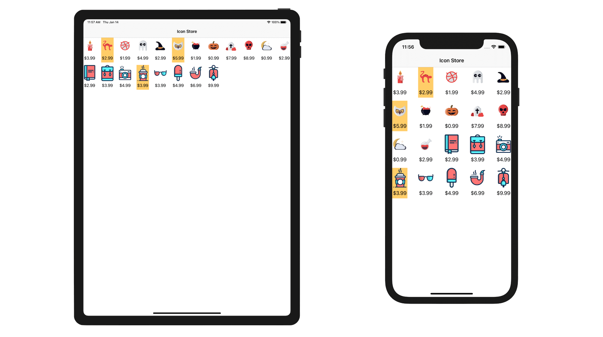
We have used the content view to display the icon image. What we are going to do is use the background view to display a background image. In the image pack you downloaded earlier, it includes a file named feature-bg.png, which is the background image.
For those Icon objects that are featured, the isFeatured property is set to true. I want to highlight these icons with a bright color background.
Let's see how to do it.
Go back to the IconCollectionViewController.swift file. In the configureDataSource() method, insert the following line of code before return cell:
cell.backgroundView = (icon.isFeatured) ? UIImageView(image: UIImage(named: "feature-bg")) : nil
We simply load the background image and set it as the background view of the collection view cell when the icon is featured. Now compile and run the app again. Your app now displays a background image for those featured icons.
For reference, you can download the Xcode project from http://www.appcoda.com/resources/swift55/CollectionViewDemo.zip.