- Made by AppCoda
- Contact us / Support
- Tweet this book
- Preface
- 1. Building Adaptive User Interfaces
- 2. Creating Table View Sections and Index list with Diffable Data Source
- 3. Animating Table View Cells
- 4. Working with JSON and Codable
- 5. How to Integrate the Twitter and Facebook SDK for Social Sharing
- 6. Working with Email and Attachments
- 7. Sending SMS and MMS Using MessageUI Framework
- 8. How to Get Direction and Draw Route on Maps
- 9. Search Nearby Points of Interest Using Local Search
- 10. Audio Recording and Playback
- 11. Scan QR Code Using AVFoundation Framework
- 12. Working with URL Schemes
- 13. Building a Full Screen Camera with Gesture-based Controls
- 14. Video Capturing and Playback Using AVKit
- 15. Displaying Banner Ads using Google AdMob
- 16. Working with Custom Fonts
- 17. Working with AirDrop, UIActivityViewController and Uniform Type Identifiers
- 18. Building Grid Layouts Using Collection Views and Diffable Data Source
- 19. Interacting with Collection Views
- 20. Adaptive Collection Views Using UITraitCollection and Compositional Layout
- 21. Building a Weather Widget Using WidgetKit
- 22. Building Slide Out Sidebar Menus Using Objective-C Libraries
- 23. View Controller Transitions and Animations
- 24. Building a Slide Down Menu
- 25. Self Sizing Cells and Dynamic Type
- 26. XML Parsing, RSS and Expandable Table View Cells
- 27. Applying a Blurred Background Using UIVisualEffect
- 28. Using Touch ID and Face ID For Authentication
- 29. Building a Carousel-Like User Interface
- 30. Working with Parse
- 31. Parsing CSV and Preloading a SQLite Database Using Core Data
- 32. Connecting Multiple Annotations with Polylines and Routes
- 33. Using CocoaPods in Swift Projects
- 34. Building a Simple Sticker App
- 35. Building iMessage Apps Using Messages Framework
- 36. Building Custom UI Components Using IBDesignable and IBInspectable
- 37. Using Firebase for User Authentication
- 38. Google and Facebook Authentication Using Firebase
- 39. Using Firebase Database and Storage to Build an Instagram-like App
- 40. Building a Real-time Image Recognition App Using Core ML
- 41. Building AR Apps with ARKit and SpriteKit
- 42. Working with 3D Objects in Augmented Reality Using ARKit and SceneKit
- 43. Use Create ML to Train Your Own Machine Learning Model for Image Recognition
- 44. Building a Sentiment Classifier Using Create ML to Classify User Reviews
- 45. Working with Image Tracking Using ARKit
- Published with GitBook
Chapter 29
Building a Carousel-Like User Interface with Paging Support
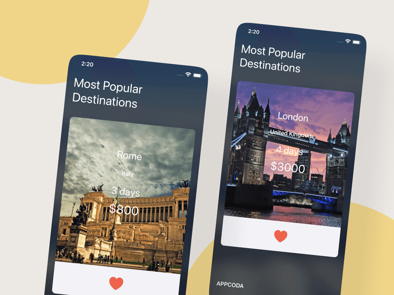
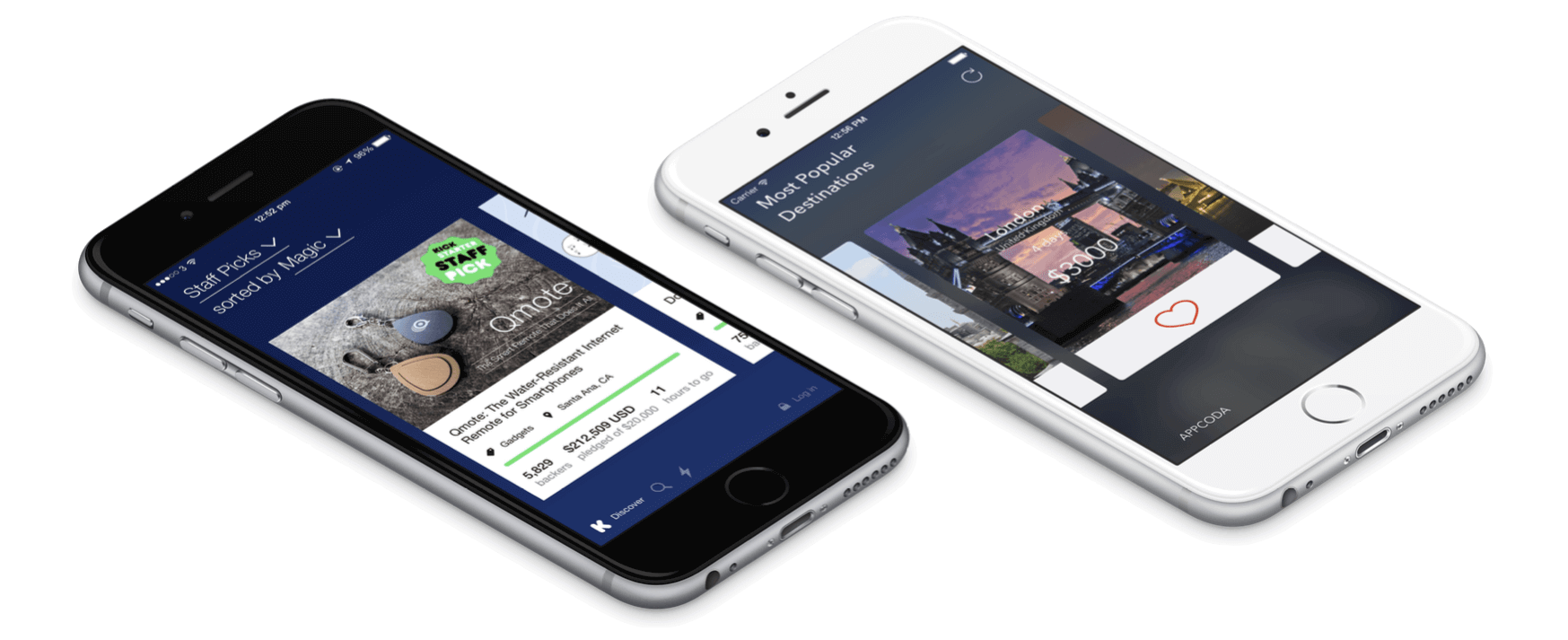
Kickstarter is one of my favorite crowdfunding services. The current version of the app uses a table view to list all the crowdfunding projects. Before the revamp of its user interface, it displayed all featured projects in a carousel, with which you could flick left or right through the cards to discover more Kickstarter projects. Themed with vivid colors, the carousel design of the app looks plain awesome.
Carousel is a popular way to showcase a variety of featured content. Not only can you find carousel design in mobile apps, but it has also been applied to web applications for many years. A carousel arranges a set of items horizontally, where each item usually includes a thumbnail. Users can scroll through the list of items by flicking left or right.
In this chapter, I will show you how to build a carousel in iOS apps. It's not as hard as you might think. All you need to do is to implement a UICollectionView. If you do not know how to create a collection view, I recommend you take a look at chapter 18. As usual, to walk you through the feature we will build a demo app with a simple carousel that displays a list of trips.
Designing the Storyboard
To begin with, you can first download the project template named TripCard from http://www.appcoda.com/resources/swift55/TripCardStarter.zip. After the download, compile it and have a trial run of the project using the built-in simulator. You should have an app showing a blurred background (if you want to learn how to apply a blurring effect, check out chapter 27). The template already incorporates the necessary resources including images and icons. We will build upon the template by adding a collection view for it.
Okay, go to Main storyboard. Drag a collection view from the Object library to the view controller. Resize its width to 390 points and height to 540 points. Place it at the center of the view controller.
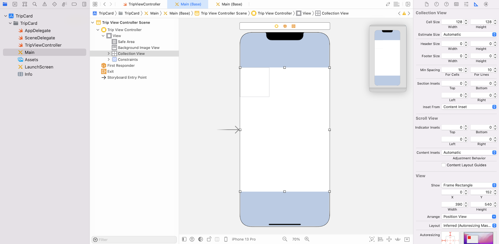
Your storyboard should look similar to the screenshot above. Now select the collection view cell and go to the Attributes inspector, set the identifier of the cell to cell.
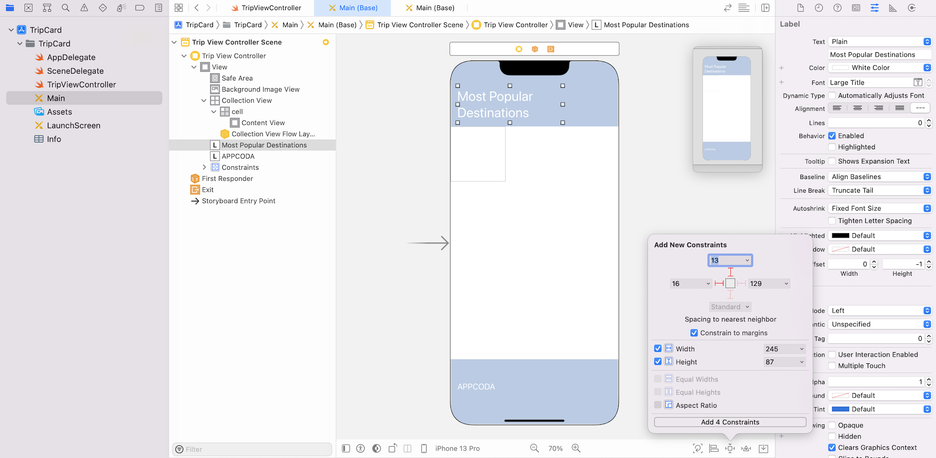
Next, drag a label to the view controller and place it at the top-left corner of the view. Set the text to Most Popular Destinations and the color to white. Change to your preferred font style (e.g. Large Title). Also, set the number of lines to 0. Then, add another label to the view controller but put it below the view controller. Change its text to APPCODA or whatever you prefer. Your view controller will look similar to this:
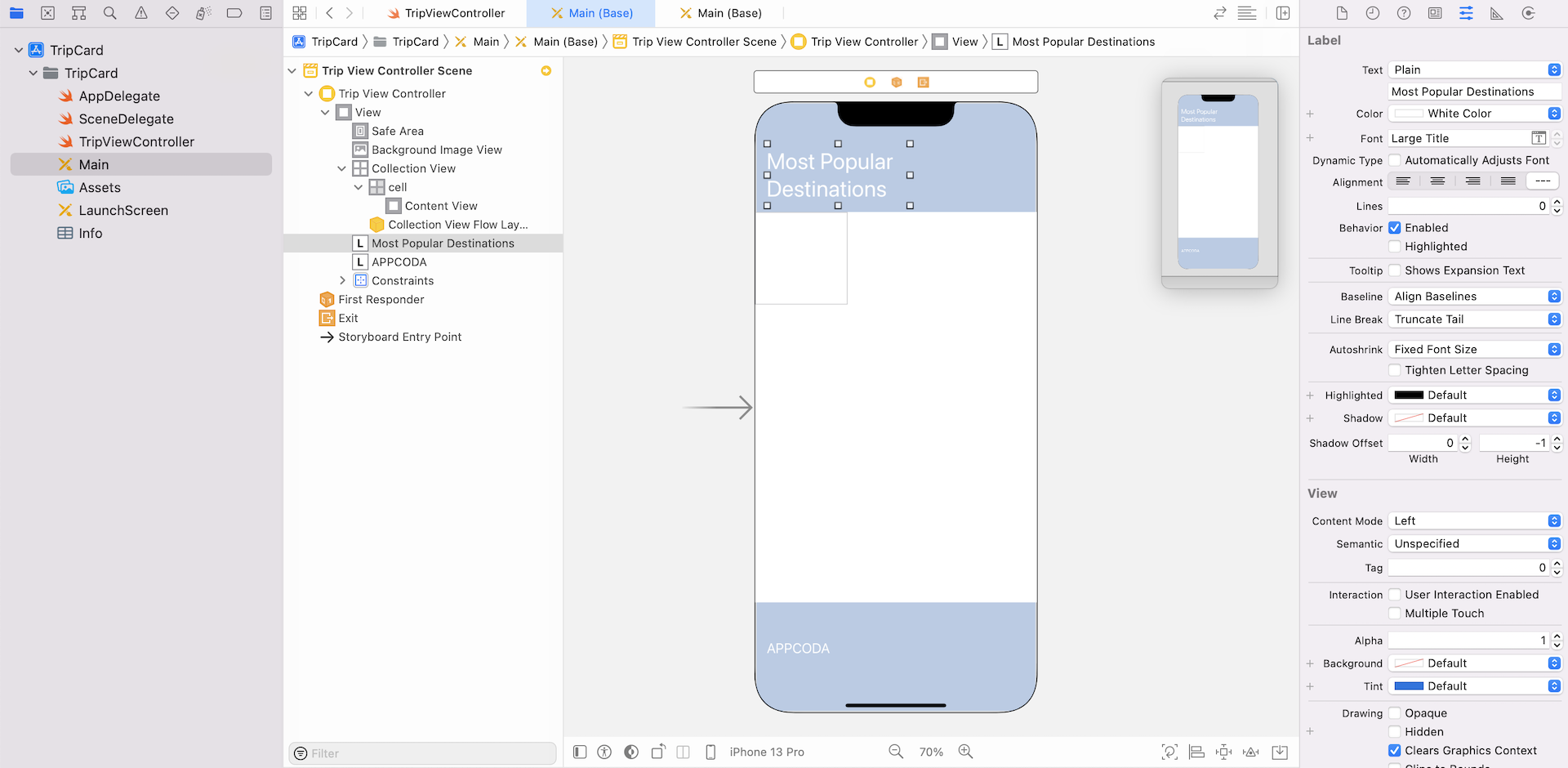
So far we haven't configured any auto layout constraint. First, select the Most Popular Destinations label. Click the Add New Constraint button to add a couple of spacing and size constraints. Select the left and top bar, and check both width and height checkboxes. Click Add 4 Constraints to add the constraints.
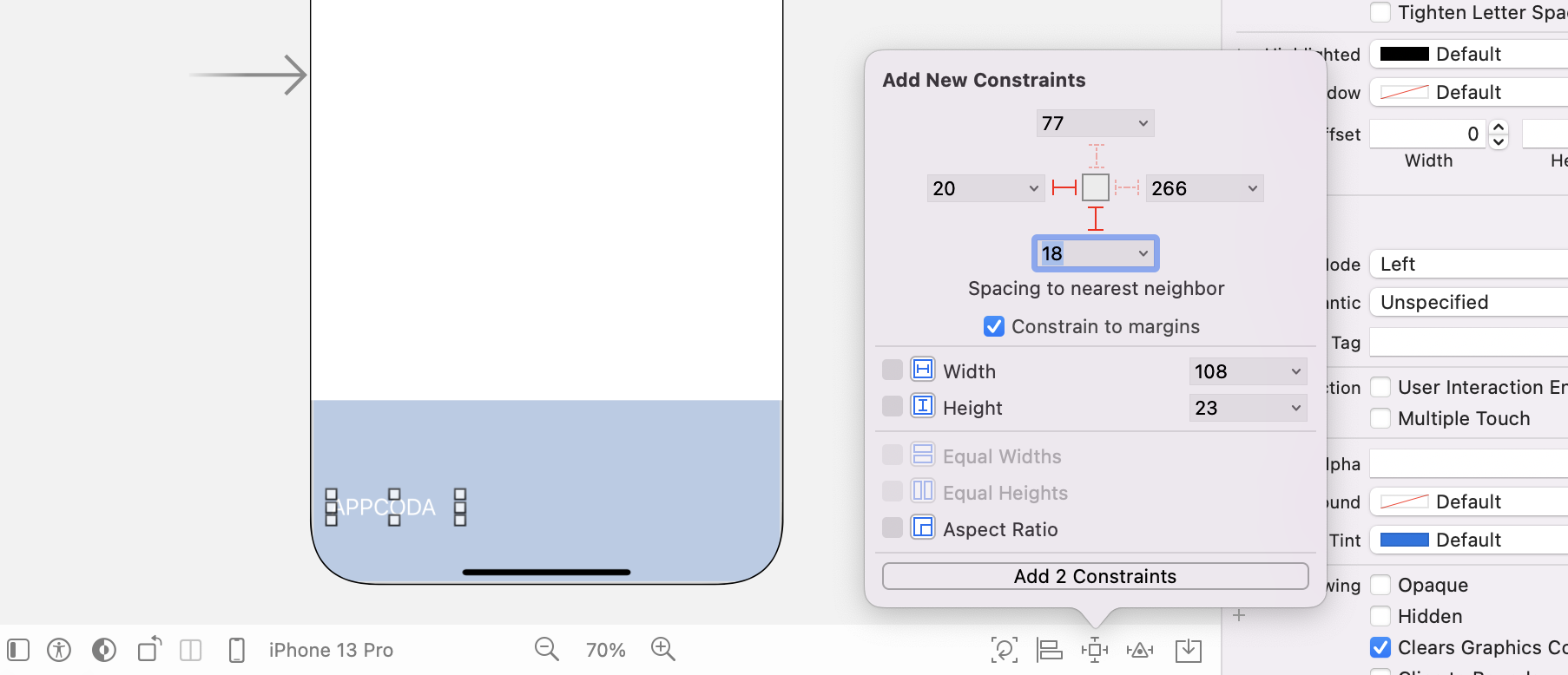
For the bottom label, click Add New Constraints button to add two spacing constraints. Click the bar of both left and bottom sides, and then click Add 2 Constraints.
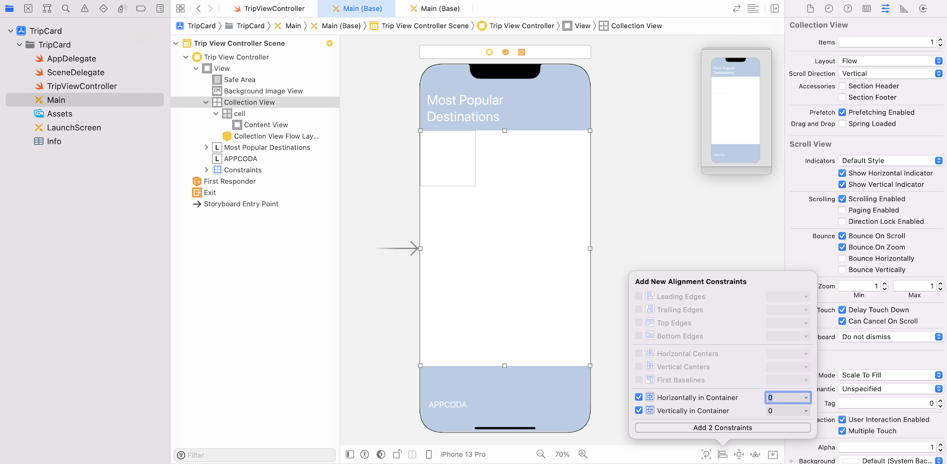
Now let's add a few layout constraints to the collection view. Select the collection view and click the Align button of the auto layout bar. Check both the Horizontal Center in Container and Vertical Center in Container options, and click Add 2 Constraints. This will align the collection view to the center of the view.
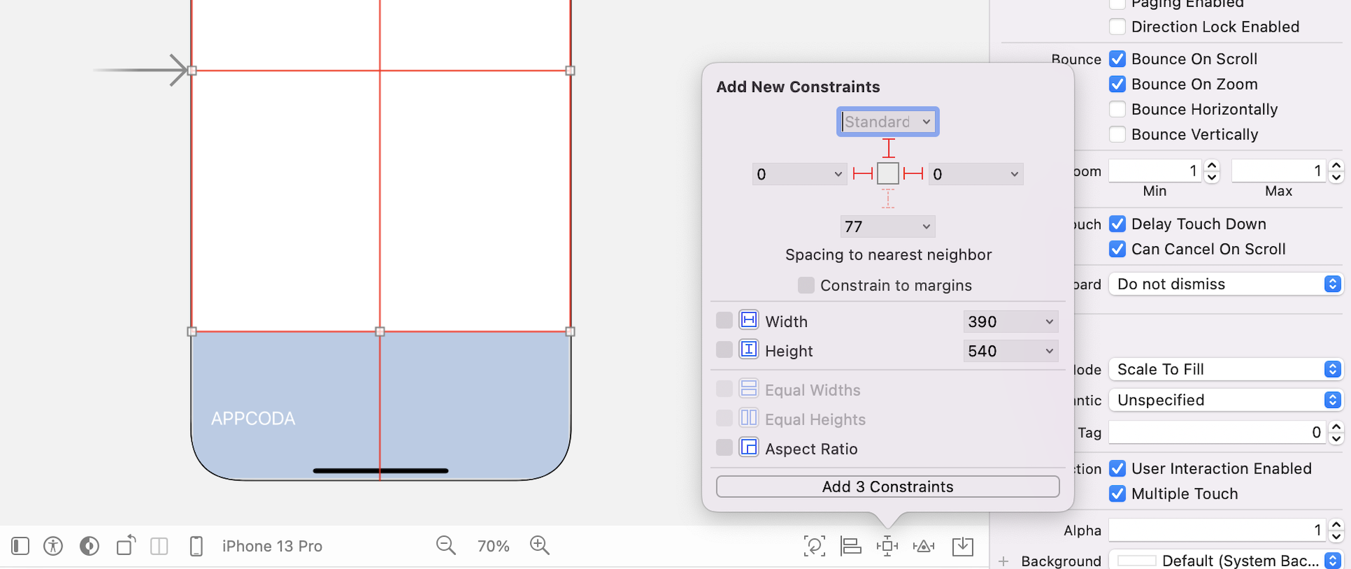
Xcode should indicate some missing constraints. Click the Add New Constraints button and select the dashed red line corresponding to the top, left and right sides. Uncheck the Constrain to margins option and click Add 3 Constraints. This ensures that the left and right sides of the collection view align perfectly with the background image view. Also, the collection view is several points away from the title label.
Now that you have created the skeleton of the collection view, let's configure the cell content, which will be used to display trip information. First, select Collection View and go to the Size inspector. Set the cell's width and height to 300 and 400 respectively. This is not the final size of the cell. We will adjust it later in code. By making it a bit larger, it will be easier for arranging the UI components in the cell.
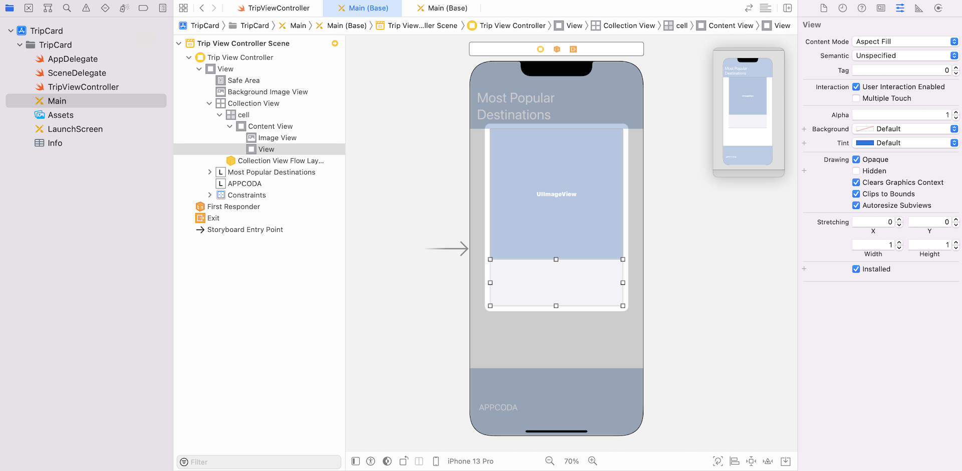
Next, select the cell and change its background to System Gray 6 Color. Then drag an image view to the cell and resize it like that shown in figure 29.8.
Next, drag a view from the Object Library and place it right below the image view. In the Attributes inspector, change its background color to Default, set the mode to Aspect Fill and enable the Clip to Bounds option. This view serves as a container to hold other UI elements. Sometimes it is good to use a view to group multiple UI elements together so that it is easier for you to define the layout constraints later.
If you follow the procedures correctly, your storyboard should look similar to this:
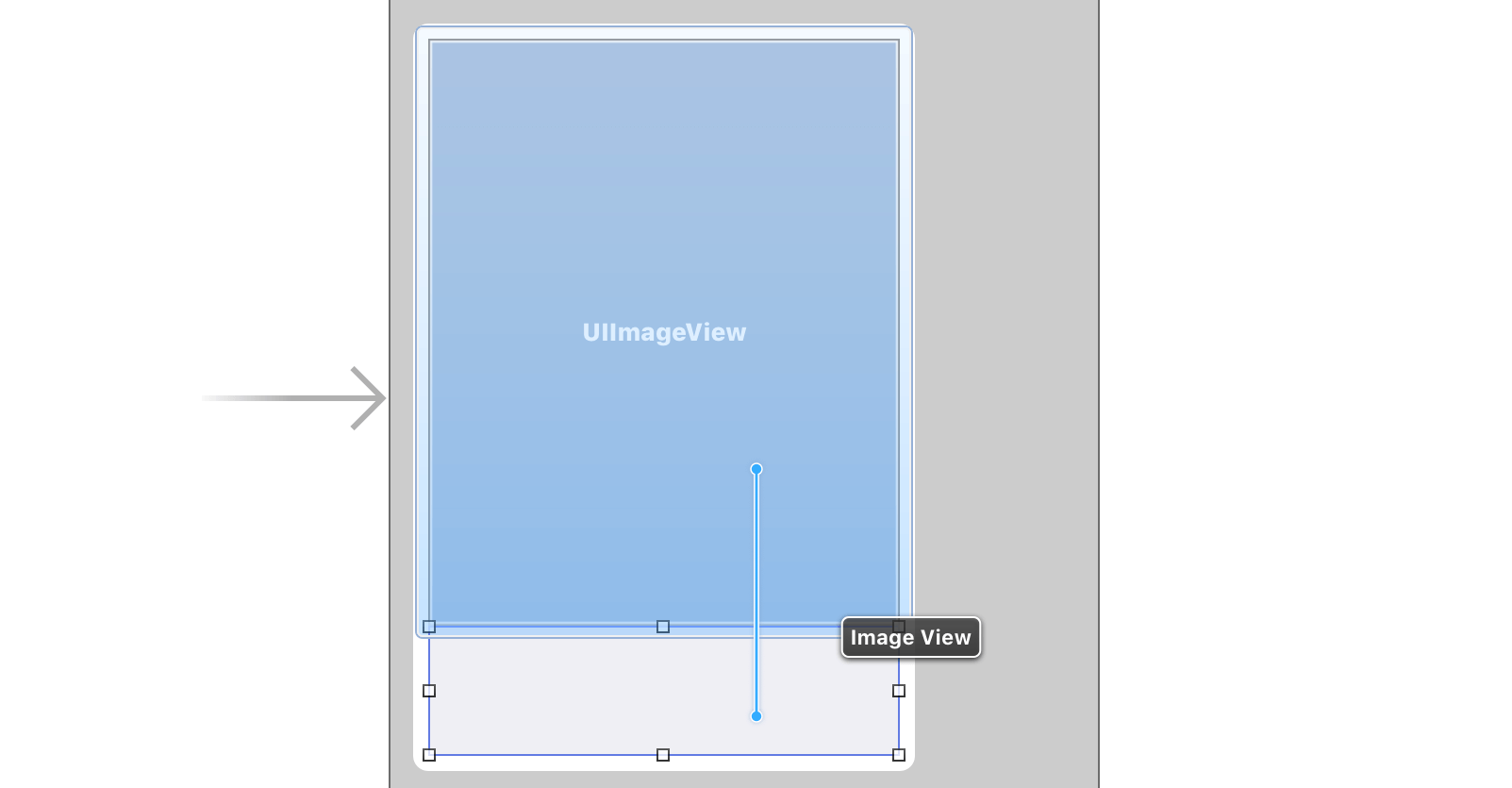
Later, we will change the size of the collection view with reference to the screen height. But I still want to keep the height of the image view and the view inside the cell proportional. To do that, control-drag from the image view to the view and select Equal Heights.
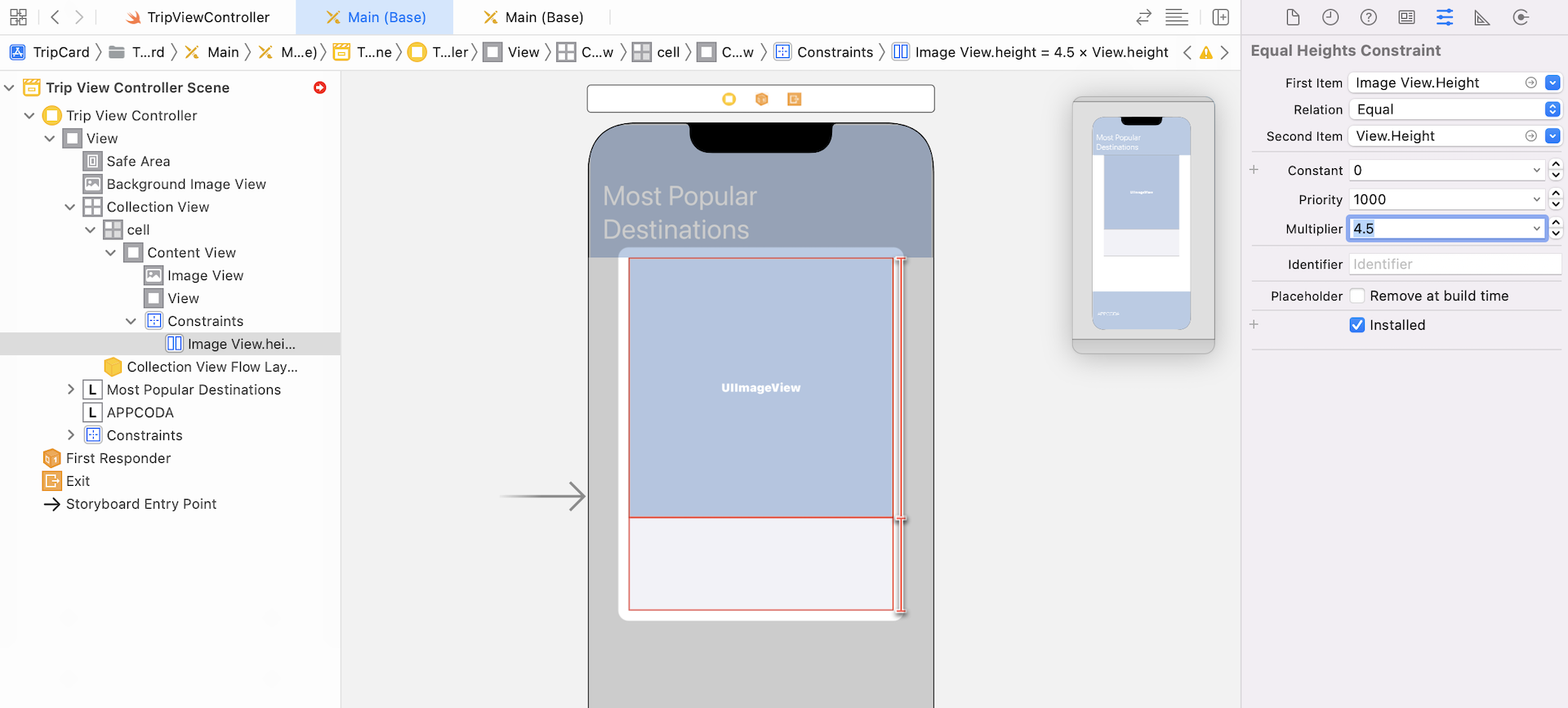
Next, select the constraint just created and go to the Size inspector. Change the multiplier from 1 to 4.5. Make sure the first and second items are set to Image View.height and View.height respectively. This defines a constraint so that the height of the image view is always 4.5 times taller than the view.
Now select the image view and define the spacing constraints. Click the Add New Constraints button and select the dashed red lines of all sides. Click the Add 4 Constraints button to define the layout constraints.
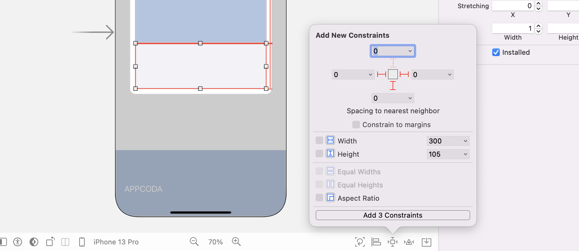
Select the view inside the collection view cell and click the Add New Constraints button. Click the dashed red lines that correspond to the left, right and bottom sides.
If you follow every step correctly, you've defined all the required constraints for the image view and the internal view. It's now time to add some UI elements to the image view for displaying the trip information.
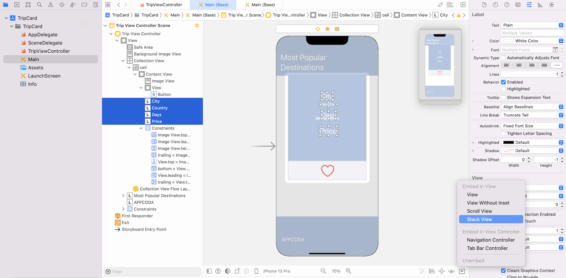
- First, add a label to the image view of the cell. Name it City and change its color to
white. You may change its font and size. - Second, drag another label to the image view. Name it Country and set the color to
white. Again, change its font to whatever you like - Next, add another label to the image view. Name it Days and set the color to white. Change the font to whatever you like (e.g. Title1), but make it larger than the other two labels.
- Drag another label to the image view. Name it Price and set the color to
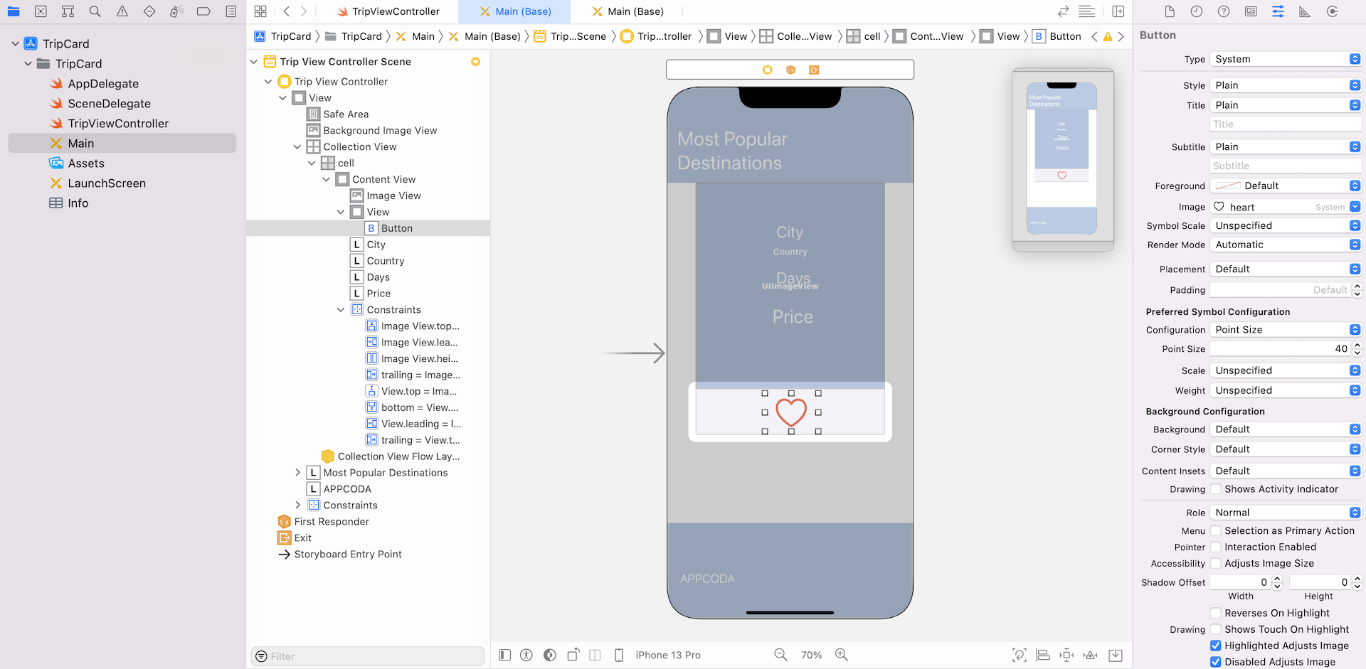
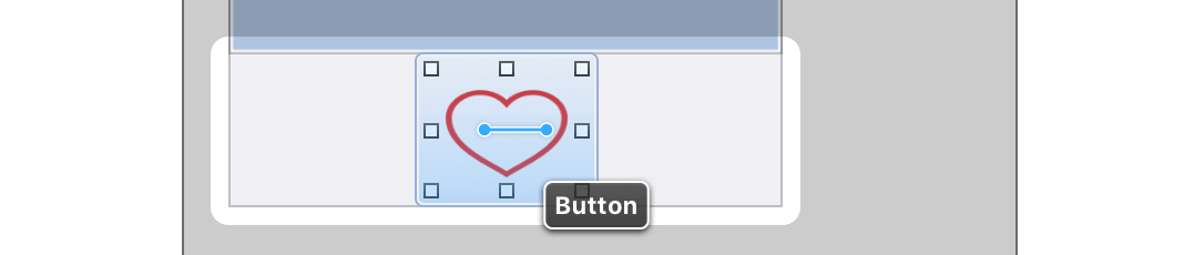
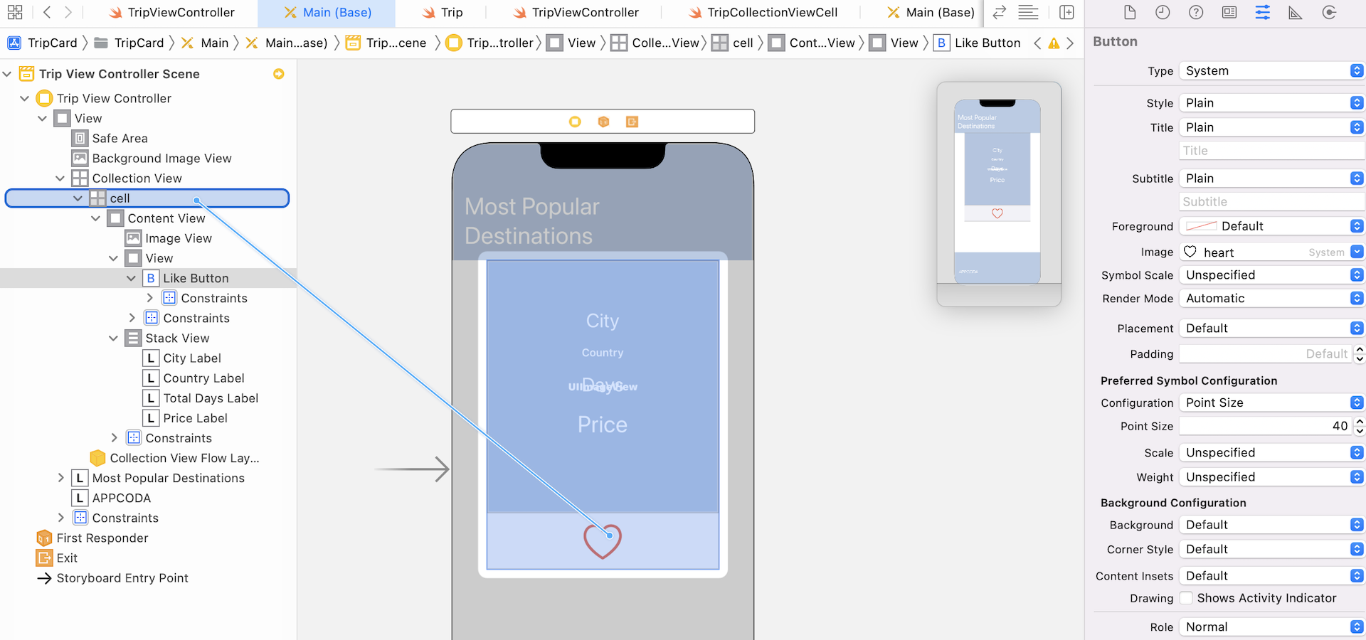
white. Change its size such that it is larger than the rest of the labels. - Finally, add a button object to the view (below the image view) and place it at the center of the view. In the Attributes inspector, change its title to blank and set the image to
heart. Also change its tint color tored. In the Default Symbol Configuration section, set the configuration option toPoint Sizeand the point size option to40. This will make the heart image large.
The UI design is almost complete. We simply need to add a few layout constraints for the elements we just added. First, select all label objects that you just added. In the layout configuration bar, click Embed in and then select Stack View.
Next, click the Add new constraints button to add a spacing constraint for the top side. And choose the Align option to center the stack view horizontally.
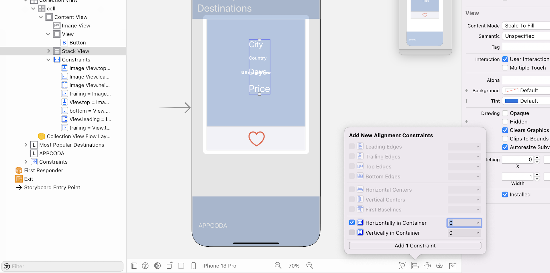
For the heart button, I want it to be a fixed size. Control-drag to the right (see below) and set the Width constraint. Next, control-drag vertically to set the Height constraint for the button.
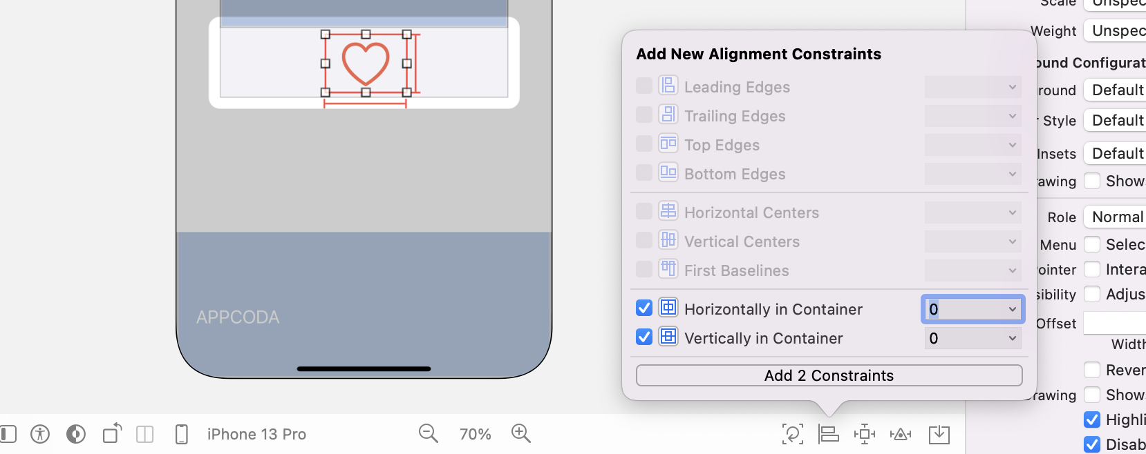
To ensure the heart button is always displayed at the center of the view, click the Align button and select Horizontal Center in Container and Vertical Center in Container.
Great! You have completed the UI design. Now we will move onto the coding part.
Creating a Custom Class for the Collection View Cell
As the collection view cell is customized, we will first create a custom class for it. In the Project Navigator, right-click the TripCard folder and select New File.... Choose the Cocoa Touch Class template and proceed.
Name the class TripCollectionViewCell and set it as a subclass of UICollectionViewCell. Once the class is created, open up TripCollectionViewCell.swift and update the code to the following:
class TripCollectionViewCell: UICollectionViewCell {
    @IBOutlet var imageView: UIImageView!
    @IBOutlet var cityLabel: UILabel!
    @IBOutlet var countryLabel: UILabel!
    @IBOutlet var totalDaysLabel: UILabel!
    @IBOutlet var priceLabel: UILabel!
    @IBOutlet var likeButton: UIButton!

    var isLiked:Bool = false  {
        didSet {
            if isLiked {
                likeButton.setImage(UIImage(systemName: "heart.fill"), for: .normal)
            } else {
                likeButton.setImage(UIImage(systemName: "heart"), for: .normal)
            }
        }
    }
}
The above lines of code should be very familiar to you. We simply define the outlet variables to associate with the labels, image view and button of the collection view cell in storyboard. The isLiked variable is a boolean to indicate whether a user favors a trip or not. In the above code, we declare a didSet observer for the isLiked property. If this is the first time you have heard of property observer, it is a great feature of Swift. When the isLiked property is stored, the didSet observer will be called immediately. Here we simply set the image of the like button according to the value of isLiked.
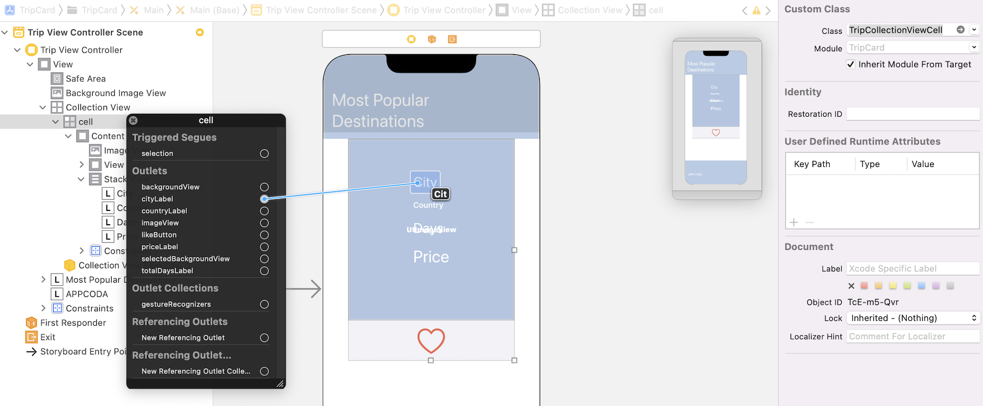
Now go back to the storyboard and select the collection view cell. In the Identity inspector, set the custom class to TripCollectionViewCell. Right click the Cell in Document Outline. Connect each of the outlet variables to the corresponding visual element.
Creating the Model Class
Before we implement the TripViewController class to populate the data, we will create a model class named Trip to represent a trip. Create a new file using the Swift File template and name the class Trip. Proceed to create and save the Trip.swift file.
Open Trip.swift and update the code to the following:
import UIKit

struct Trip: Hashable {
    var tripId: String = ""
    var city: String = ""
    var country: String = ""
    var featuredImage: UIImage?
    var price: Int = 0
    var totalDays: Int = 0
    var isLiked: Bool = false
}
The Trip structure contains a few properties for holding the trip data including ID, city, country, featured image, price, total number of days and isLiked. Other than the ID and isLiked properties, the rest of the properties are self-explanatory. Regarding the trip ID property, it is used for holding a unique ID of a trip. isLiked is a boolean variable that indicates whether a user favors the trip.
Populating the Collection View
Now we are ready to populate the collection view with some trip data. I assume you know how to use diffable data source with collection views. If not, please refer to chapter 18.
Declare an outlet variable for the collection view in TripViewController.swift:
@IBOutlet var collectionView: UICollectionView!
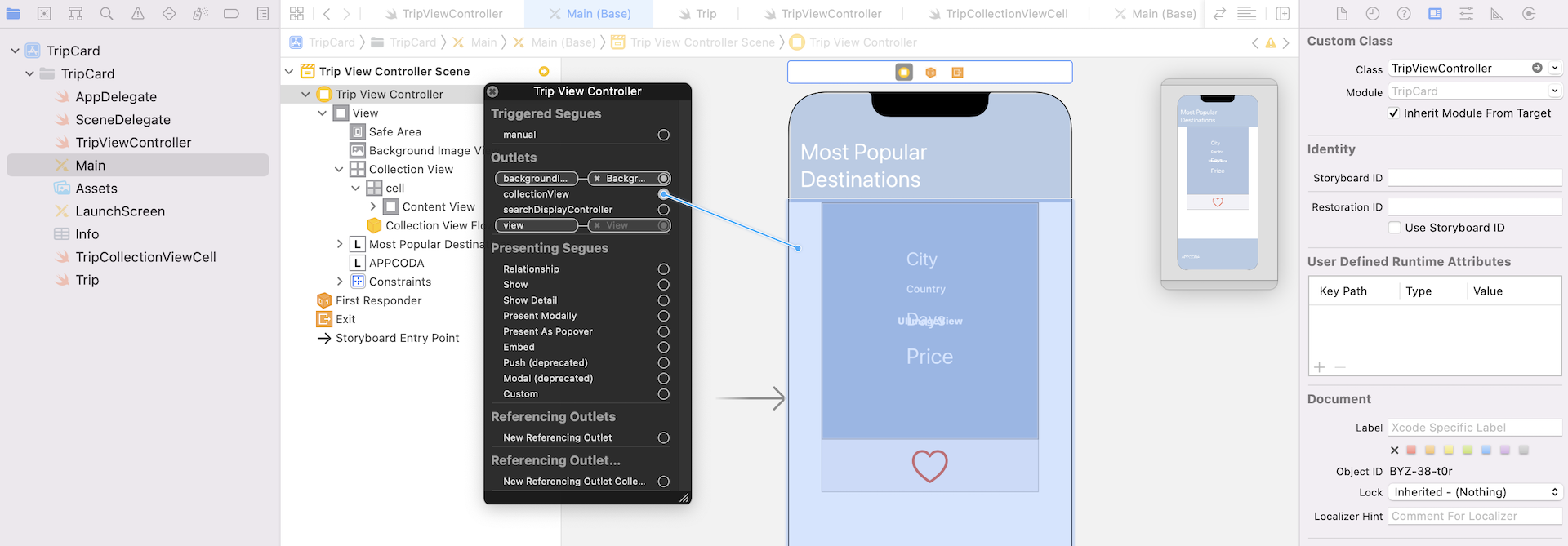
Go to the storyboard. In the Document Outline, right click Trip View Controller. Connect collectionView outlet variable with the collection view.
Now switch back to TripViewController.swift. To keep things simple, we will just put the trip data into an array. Declare the following variable in TripViewController.swift:
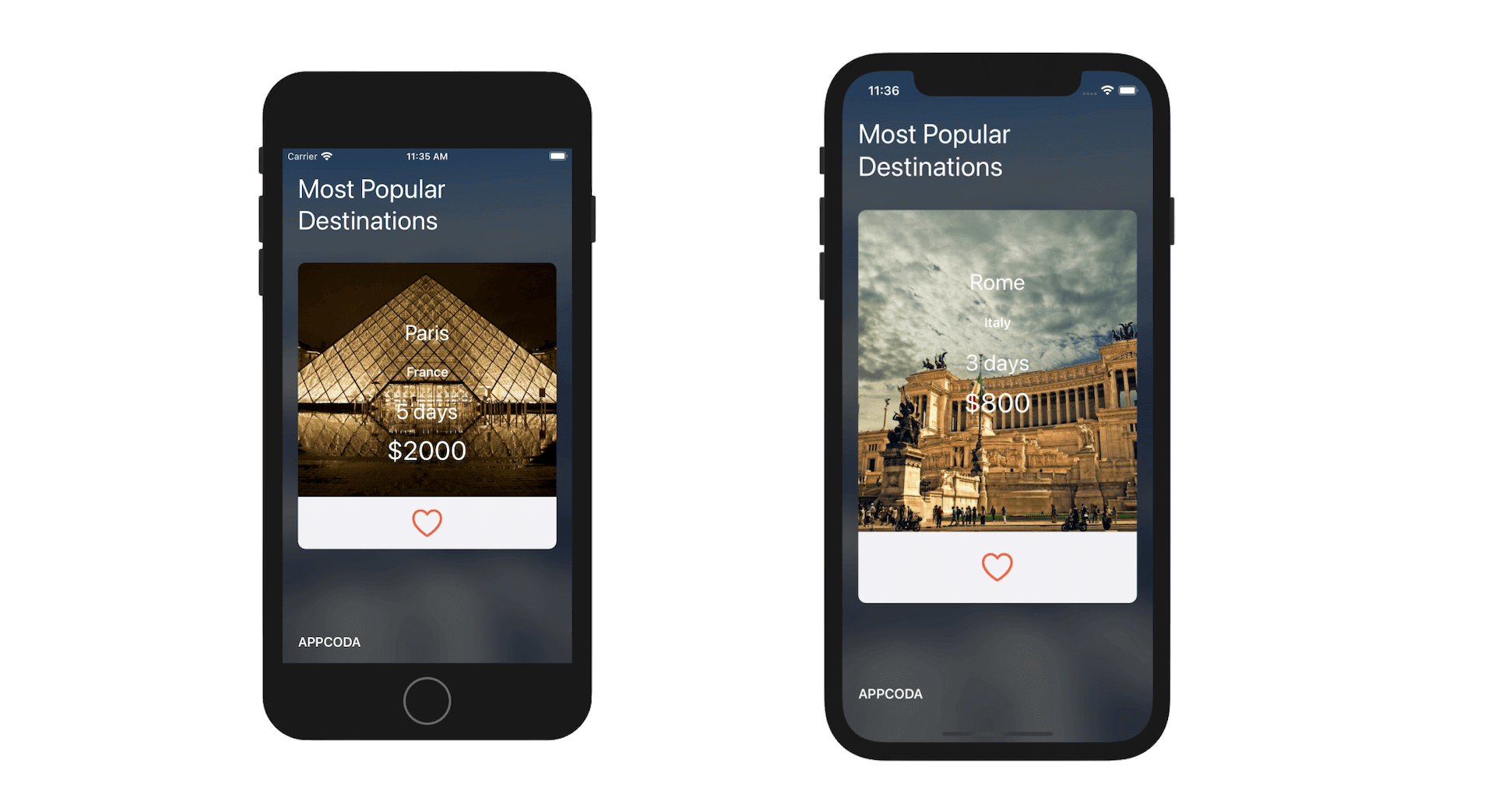
private var trips = [Trip(tripId: "Paris001", city: "Paris", country: "France", featuredImage: UIImage(named: "paris"), price: 2000, totalDays: 5, isLiked: false),
    Trip(tripId: "Rome001", city: "Rome", country: "Italy", featuredImage: UIImage(named: "rome"), price: 800, totalDays: 3, isLiked: false),
    Trip(tripId: "Istanbul001", city: "Istanbul", country: "Turkey", featuredImage: UIImage(named: "istanbul"), price: 2200, totalDays: 10, isLiked: false),
    Trip(tripId: "London001", city: "London", country: "United Kingdom", featuredImage: UIImage(named: "london"), price: 3000, totalDays: 4, isLiked: false),
    Trip(tripId: "Sydney001", city: "Sydney", country: "Australia", featuredImage: UIImage(named: "sydney"), price: 2500, totalDays: 8, isLiked: false),
    Trip(tripId: "Santorini001", city: "Santorini", country: "Greece", featuredImage: UIImage(named: "santorini"), price: 1800, totalDays: 7, isLiked: false),
    Trip(tripId: "NewYork001", city: "New York", country: "United States", featuredImage: UIImage(named: "newyork"), price: 900, totalDays: 3, isLiked: false),
    Trip(tripId: "Kyoto001", city: "Kyoto", country: "Japan", featuredImage: UIImage(named: "kyoto"), price: 1000, totalDays: 5, isLiked: false)
]
To apply diffable data source for managing the data in the collection view, we will create two methods for configuring the data source and updating the snapshot. Insert the following code in TripViewController.swift:
extension TripViewController {

    func configureDataSource() -> UICollectionViewDiffableDataSource<Section, Trip> {

        let dataSource = UICollectionViewDiffableDataSource<Section, Trip>(collectionView: collectionView) { (collectionView, indexPath, imageName) -> UICollectionViewCell? in

            let cell = collectionView.dequeueReusableCell(withReuseIdentifier: "cell", for: indexPath) as! TripCollectionViewCell

            if let trip = self.dataSource.itemIdentifier(for: indexPath) {
                cell.cityLabel.text = trip.city
                cell.countryLabel.text = trip.country
                cell.totalDaysLabel.text = "\(trip.totalDays) days"
                cell.priceLabel.text = "$\(String(trip.price))"
                cell.imageView.image = trip.featuredImage
            }

            // Add rounded corner
            cell.layer.cornerRadius = 10.0

            return cell
        }

        return dataSource
    }

    func updateSnapshot(animatingChange: Bool = false) {

        // Create a snapshot and populate the data
        var snapshot = NSDiffableDataSourceSnapshot<Section, Trip>()
        snapshot.appendSections([.all])
        snapshot.appendItems(trips, toSection: .all)

        dataSource.apply(snapshot, animatingDifferences: false)
    }
}
The configureDataSource() method prepares the diffable data and configures the cell for presenting the trip data. The updateSnapshot method creates the snapshot and populate the data to display in the collection view.
I will not go into the details of the implementation as you should be very familiar with the methods. Next, declare the Section enum and the dataSource variables in the TripViewController class:
lazy var dataSource = configureDataSource()

enum Section {
    case all
}
Next, create a method to create the compositional layout:
private func createLayout() -> UICollectionViewLayout {

    let itemSize = NSCollectionLayoutSize(widthDimension: .fractionalWidth(1.0),heightDimension: .fractionalHeight(1.0))
    let item = NSCollectionLayoutItem(layoutSize: itemSize)
    item.contentInsets = NSDirectionalEdgeInsets(top: 20, leading: 20, bottom: 20, trailing: 20)

    let groupSize = NSCollectionLayoutSize(widthDimension: .fractionalWidth(1.0),heightDimension: .fractionalHeight(1.0))

    let group = NSCollectionLayoutGroup.horizontal(layoutSize: groupSize, subitems: [item])

    let section = NSCollectionLayoutSection(group: group)
    section.orthogonalScrollingBehavior = .continuous

    let layout = UICollectionViewCompositionalLayout(section: section)

    return layout

}
If you've read chapter 20 about compositional layout, you should be very familar with the code. We define the item size and group size with fraction width and height to 1.0. This means we use the available area of the collection view. By default, the collection view supports vertical scrolling. To switch to horizontal scrolling, we set the orthogonalScrollingBehavior property of the section object to .continuous. Optionally, if you want to enable paging, you can set the value to .paging.
Finally, insert these lines of code in the viewDidLoad method to configure the collection view:
collectionView.dataSource = dataSource
collectionView.collectionViewLayout = createLayout()
collectionView.backgroundColor = UIColor.clear

updateSnapshot()
Now it's time to test the app. Hit the Run button, and you should have a carousel showing a list of trips.
Handling the Like Button
In chapter 19, I showed you how to interact with collection views. You can apply the same techniques to handle the cell selections. However, it is a bit different for the TripCard app. We only want to toggle the heart button when a user taps on it. We don't want to toggle it when a user taps on the featured image or the price label.
To fit the requirement, we are going to use a delegate pattern to do the data passing. First, define a new protocol named TripCollectionCellDelegate in the TripCollectionViewCell class:
protocol TripCollectionCellDelegate {
    func didLikeButtonPressed(cell: TripCollectionViewCell)
}
Next, declare a variable in the class to hold the delegate object:
var delegate: TripCollectionCellDelegate?
In the protocol, we define a method called didLikeButtonPressed, which will be invoked when the heart button is tapped. The object that implements the delegate protocol is responsible for handling the button press.
Add the following action method, which is triggered when a user taps the heart button:
@IBAction func likeButtonTapped(sender: AnyObject) {
    delegate?.didLikeButtonPressed(cell: self)
}
Now go back to the storyboard to associate the heart button with this method. Control-drag from the heart button to the cell object in the document outline. Select likeButtonTappedWithSender: when the popover appears.
Now open TripViewController.swift. It is the object that adopts the TripCollectionCellDelegate protocol. Let's create an extension to implement the protocol:
extension TripViewController: TripCollectionCellDelegate {

    func didLikeButtonPressed(cell: TripCollectionViewCell) {
        if let indexPath = collectionView.indexPath(for: cell) {
            trips[indexPath.row].isLiked = trips[indexPath.row].isLiked ? false : true
            cell.isLiked = trips[indexPath.row].isLiked
        }
    }

}
When the heart button is tapped, the didLikeButtonPressed method is called, along with the selected cell. Based on selected cell, we can determine the index path using the indexPath(for:) method and toggle the status of isLiked accordingly.
Recall that we have defined a didSet observer for the isLiked property of TripCollectionViewCell. The heart button will change its images according to the value of isLiked. For instance, the app displays an empty heart if isLiked is set to false.
Lastly, insert a line of code in the configureDataSource() method to set the cell's delegate:
cell.delegate = self
Okay, let's test the app again. When it launches, tapping the heart button of a trip can now favor the trip.
For reference, you can download the final project from http://www.appcoda.com/resources/swift55/TripCard.zip.