- Made by AppCoda
- Contact us / Support
- Tweet this book
- Preface
- 1. Building Adaptive User Interfaces
- 2. Creating Table View Sections and Index list with Diffable Data Source
- 3. Animating Table View Cells
- 4. Working with JSON and Codable
- 5. How to Integrate the Twitter and Facebook SDK for Social Sharing
- 6. Working with Email and Attachments
- 7. Sending SMS and MMS Using MessageUI Framework
- 8. How to Get Direction and Draw Route on Maps
- 9. Search Nearby Points of Interest Using Local Search
- 10. Audio Recording and Playback
- 11. Scan QR Code Using AVFoundation Framework
- 12. Working with URL Schemes
- 13. Building a Full Screen Camera with Gesture-based Controls
- 14. Video Capturing and Playback Using AVKit
- 15. Displaying Banner Ads using Google AdMob
- 16. Working with Custom Fonts
- 17. Working with AirDrop, UIActivityViewController and Uniform Type Identifiers
- 18. Building Grid Layouts Using Collection Views and Diffable Data Source
- 19. Interacting with Collection Views
- 20. Adaptive Collection Views Using UITraitCollection and Compositional Layout
- 21. Building a Weather Widget Using WidgetKit
- 22. Building Slide Out Sidebar Menus Using Objective-C Libraries
- 23. View Controller Transitions and Animations
- 24. Building a Slide Down Menu
- 25. Self Sizing Cells and Dynamic Type
- 26. XML Parsing, RSS and Expandable Table View Cells
- 27. Applying a Blurred Background Using UIVisualEffect
- 28. Using Touch ID and Face ID For Authentication
- 29. Building a Carousel-Like User Interface
- 30. Working with Parse
- 31. Parsing CSV and Preloading a SQLite Database Using Core Data
- 32. Connecting Multiple Annotations with Polylines and Routes
- 33. Using CocoaPods in Swift Projects
- 34. Building a Simple Sticker App
- 35. Building iMessage Apps Using Messages Framework
- 36. Building Custom UI Components Using IBDesignable and IBInspectable
- 37. Using Firebase for User Authentication
- 38. Google and Facebook Authentication Using Firebase
- 39. Using Firebase Database and Storage to Build an Instagram-like App
- 40. Building a Real-time Image Recognition App Using Core ML
- 41. Building AR Apps with ARKit and SpriteKit
- 42. Working with 3D Objects in Augmented Reality Using ARKit and SceneKit
- 43. Use Create ML to Train Your Own Machine Learning Model for Image Recognition
- 44. Building a Sentiment Classifier Using Create ML to Classify User Reviews
- 45. Working with Image Tracking Using ARKit
- Published with GitBook
Chapter 36
Building Custom UI Components Using IBDesignable and IBInspectable
Some developers prefer not to use Interface Builder to design the app UI. Everything should be written in code, even for the UIs. Personally, I prefer to mix both storyboards and code together to layout the app.
But when it comes to teaching beginners how to build apps, Interface Builder is a no-brainer. Designing app UIs using Interface Builder is pretty intuitive, even for people without much iOS programming experience. One of the best features is that you can customize a UI component (e.g. button) without writing a line of code. For example, you can change the background color or font size in the Attributes inspector. You can easily turn a default button into something more visually appealing by customizing the attributes.
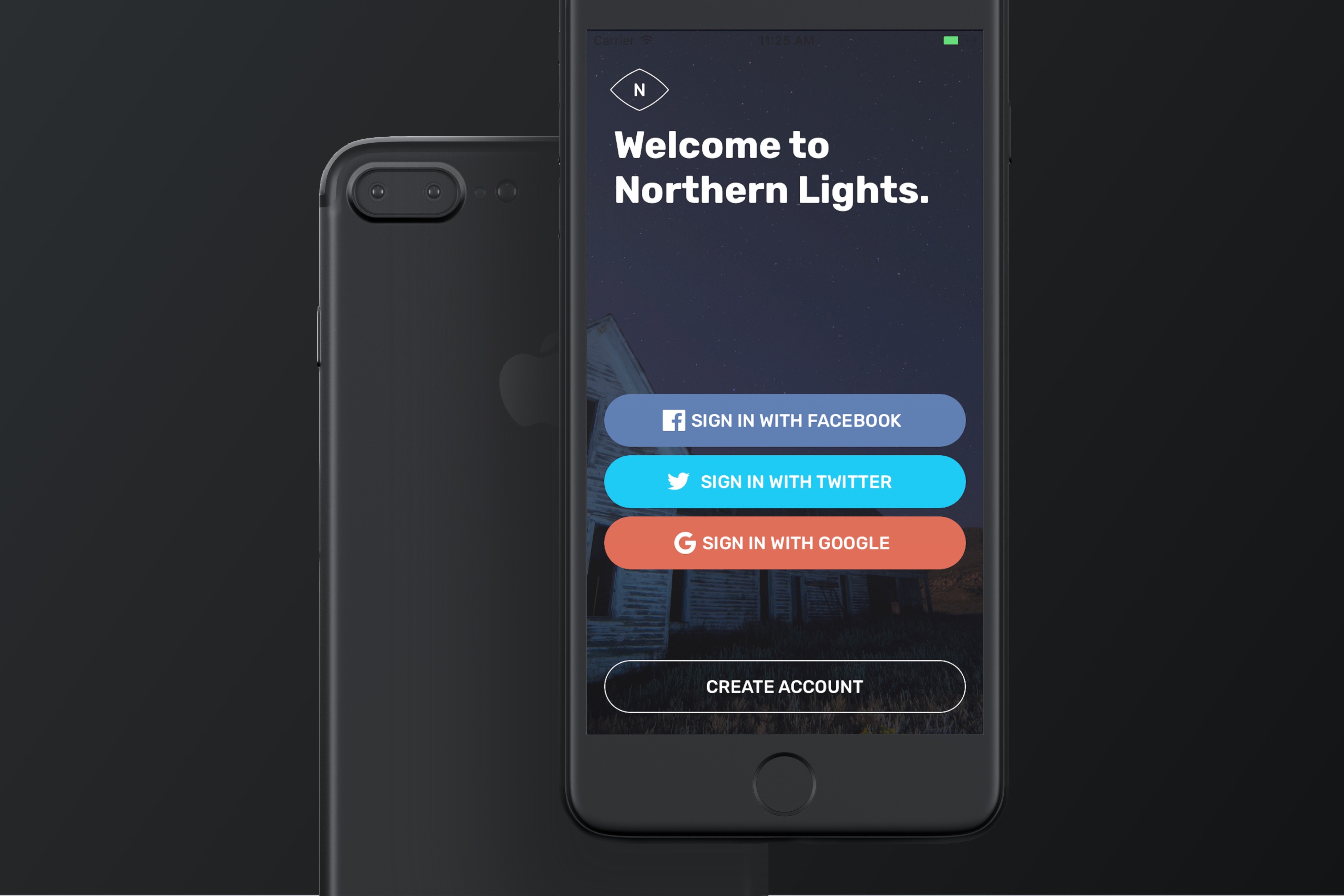
That said, Interface Builder has its own limitation - not all attributes of a UI object are available for configuration. Let me ask you, can you create a button like this by using Interface Builder?

To create a custom button like that, you still need to write code, or even develop your own class. This shouldn't be a big issue. But wouldn't it be great if you can design that button right in Interface Builder and view the result in real time?
IBInspectable and IBDesignable are the two keywords that make such thing possible. And, in this chapter, I will give you an introduction to both attributes and show you how to make use of them to create custom UI components.
Understanding IBInspectable and IBDesignable
In brief, IBInspectable allows you to add extra options in the Attributes inspector of Interface Builder, By indicating a class property of a UIView as IBInspectable, the property is then exposed to the Attributes inspector as an option. And, if you indicate a UIView class as IBDesignable, Interface Builder renders the custom view in real time. This means you can see how the custom view looks like as you edit the options.
To better understand IBInspectable and IBDesignable, let me give you an example.

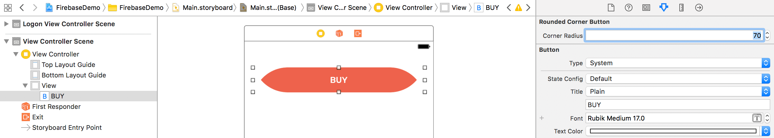
You may be very familiar with the implementation of a rounded corner button. In case you have no idea about it, you can modify the layer's property to achieve that. Every view object is backed by a CALayer. To round the corners of a button, you set the cornerRadius property of the layer programmatically like this:
button.layer.cornerRadius = 5.0
button.layer.masksToBounds = true
A positive value of corner radius would cause the layer to draw rounded corners on its background. An alternative way to achieve the same result is to set the user defined runtime attributes in the Identity inspector.
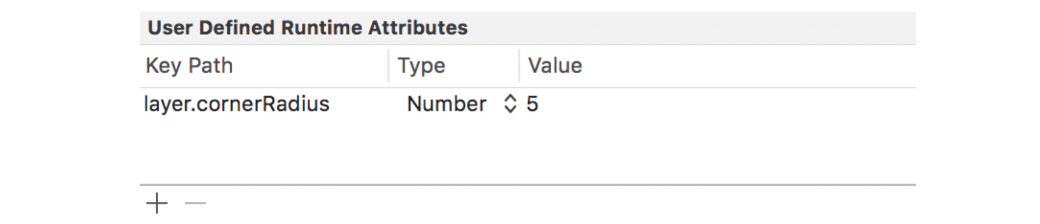
User defined runtime attributes is already a powerful feature of Interface Builder that lets you configure the properties of a view. However, it is still not very intuitive. You have to remember each property of a view or look up the documentation for the required property.
IBInspectable was introduced in Xcode 6 to make view customization even better. It doesn't mean you do not need to write code. You still have to do it. But you are given the power to expose the properties to the Attributes inspector. To create a rounded corner button, you may declare a class like this and mark the cornerRadius property using @IBInspectable:
class RoundedCornerButton: UIButton {
    @IBInspectable var cornerRadius: CGFloat = 0.0 {
        didSet {
            layer.cornerRadius = cornerRadius
            layer.masksToBounds = cornerRadius > 0
        }
    }
}
Now, when you create a RoundedCornerButton object in the storyboard, Interface Builder adds an extra option named Corner Radius in the Attributes inspector, and make its value configurable.
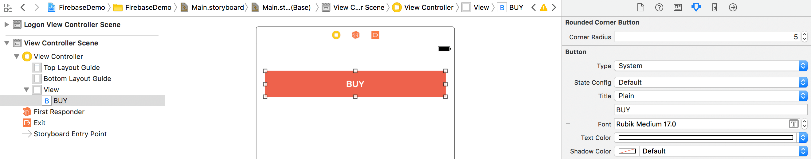
If you take a closer look at the name of the option, Xcode automatically converts the property name from cornerRadius to Corner Radius. It is a minor feature but this makes every option more readable.
The cornerRadius property has a type CGFloat. Interface Builder displays the Corner Radius option as a numeric stepper. Not all properties can be added in the Attributes inspector, according to Apple's documentation, IBInspector supports the following types:
- Int
- CGFloat
- Double
- String
- Bool
- CGPoint
- CGSize
- CGRect
- UIColor
- UIImage
If you declare a property as IBInspectable but out of the supported type, Interface Builder will not generate the option in the Attributes inspector.
While the keyword @IBInspectable allows developers to expose any of the view properties to Interface Builder, you cannot see the result on the fly. Every time you modify the value of corner radius, you will need to run the project before you can see how the button looks on screen.
IBDesignable further takes view customizations to another level. You can now mark a UIView class with the keyword @IBDesignable so as to let Interface Builder know that the custom view can be rendered in real time.
@IBDesignable class RoundedCornerButton: UIButton {
    @IBInspectable var cornerRadius: CGFloat = 0.0 {
        didSet {
            layer.cornerRadius = cornerRadius
            layer.masksToBounds = cornerRadius > 0
        }
    }
}
Using the same example as shown above (but with the keyword @IBDesignable), Interface Builder now renders the button on the fly for any property changes.
Creating a Fancy Button
Now that you should have some ideas about IBInspectable and IBDesignable, let's see how we can apply it in our daily work. The figure below displays a standard system button, and the fancy buttons which we are going to build.
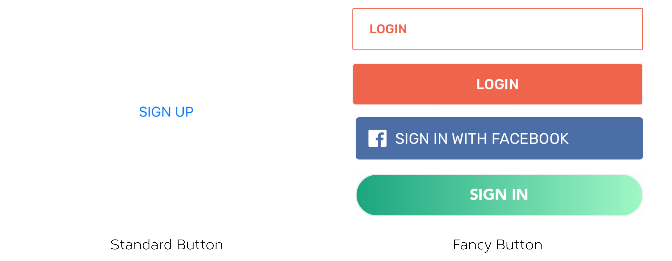
Since iOS 7, stock buttons are pretty much like a label but tappable. We plan to create a fancy button that is customizable through the Attributes inspector, and you can view the changes right in Interface Builder. This fancy button supports the following customizations:
- Corner radius
- Border width
- Border color
- Title padding for left, right, top and bottom sides
- Image padding for left, right, top and bottom sides
- Left/right image alignment
- Gradient color
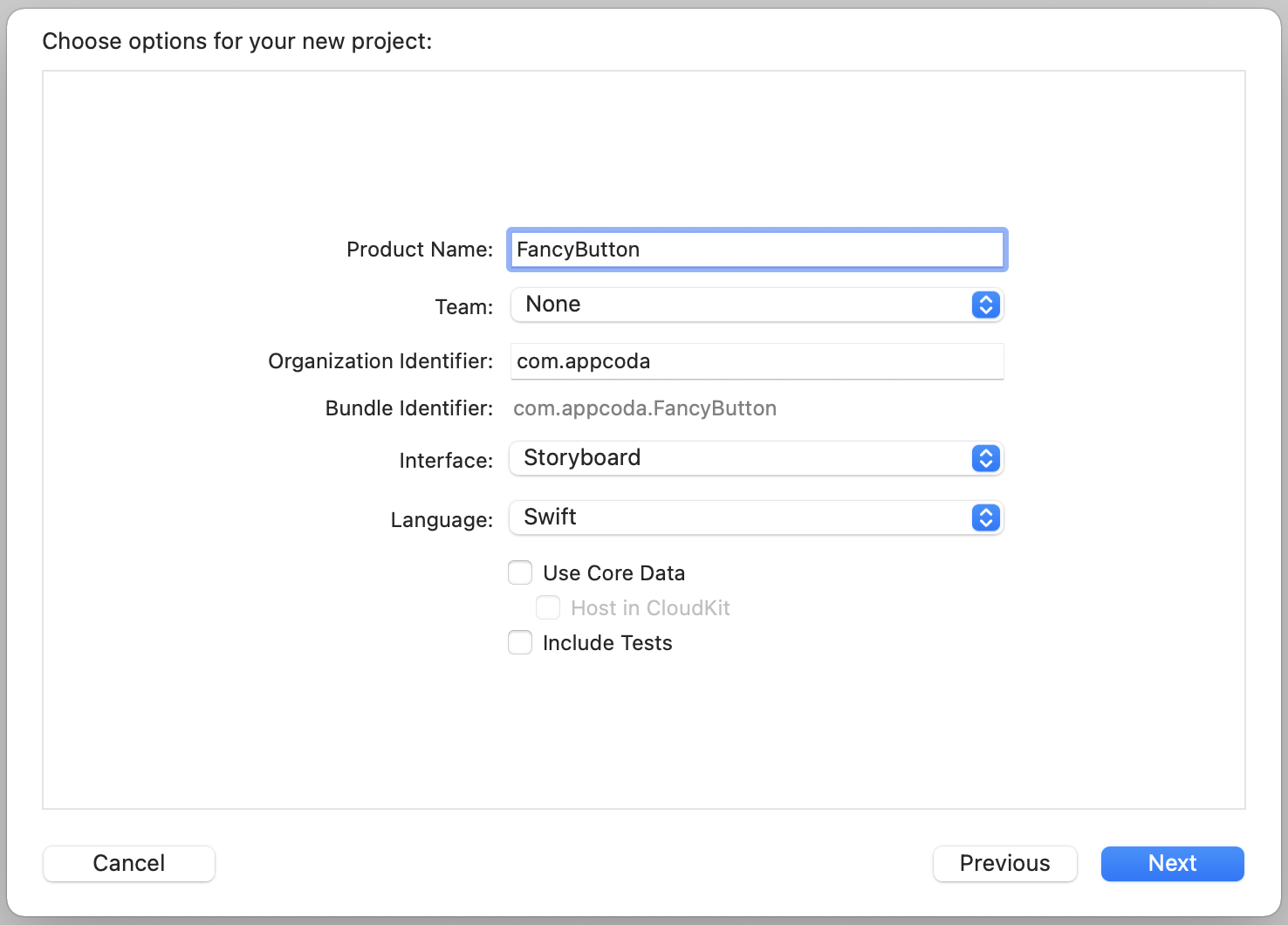
Let's get started. First, create a new project using the Single View Application template and name it FancyButton.
After creating the project, download this image pack, and add all the icons to the asset catalog.
Okay, we have the project configured. It is time to create the fancy button. We will create a custom class for this button. So right click the FancyButton folder in the project navigator and select New File…. Choose the Cocoa Touch Class template. Name the new class FancyButton and set its subsclass to UIButton.
Corner Radius, Border Width and Border Color
Let's start with corner radius, border width and border color. Update the FancyButton class like this:
import UIKit

@IBDesignable
class FancyButton: UIButton {

    @IBInspectable var cornerRadius: CGFloat = 0.0 {
        didSet {
            layer.cornerRadius = cornerRadius
            layer.masksToBounds = cornerRadius > 0
        }
    }

    @IBInspectable var borderWidth: CGFloat = 0.0 {
        didSet {
            layer.borderWidth = borderWidth
        }
    }

    @IBInspectable var borderColor: UIColor = .black {
        didSet {
            layer.borderColor = borderColor.cgColor
        }
    }

}
We tell Interface Builder that FancyButton should be rendered in real time by adding the @IBDesignable keyword. And, we declare three properties (cornerRadius, borderWidth and borderColor) and make them IBInspectable.
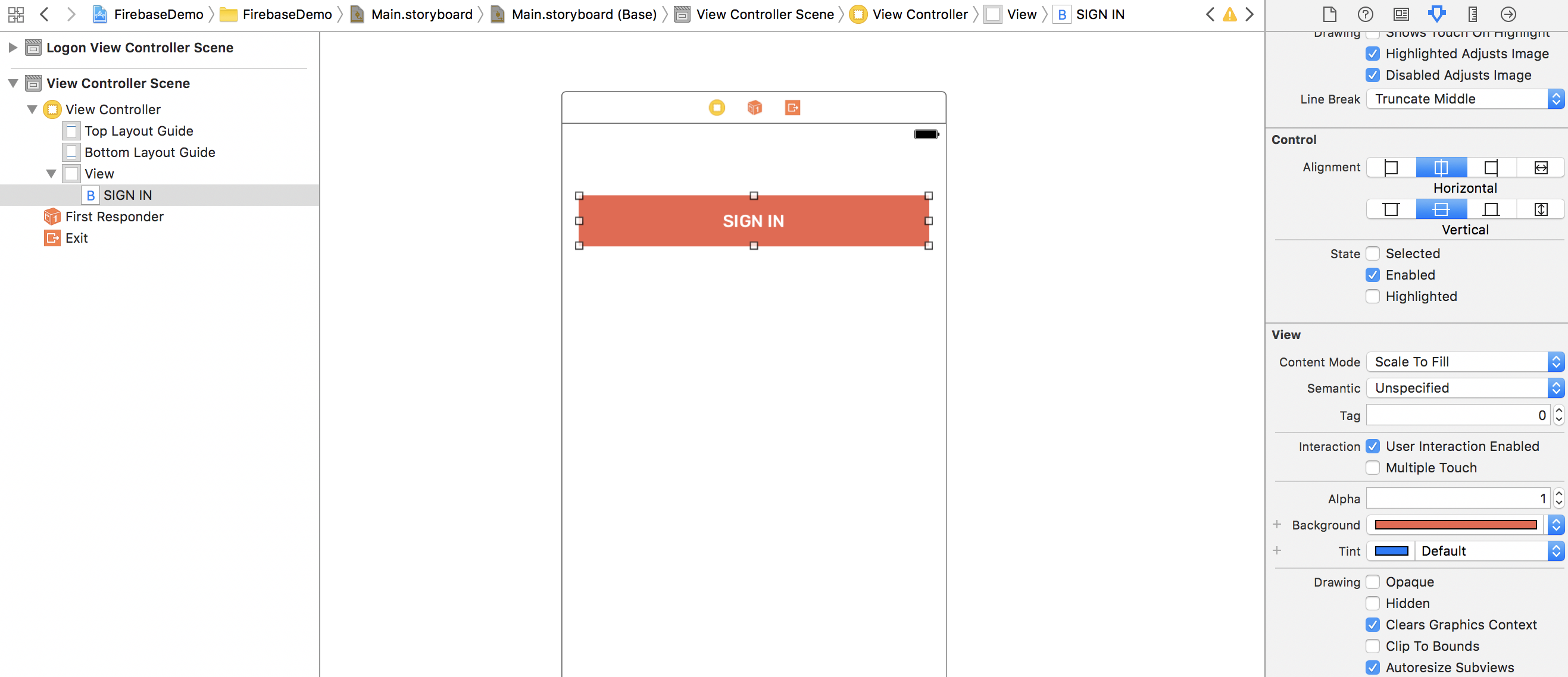
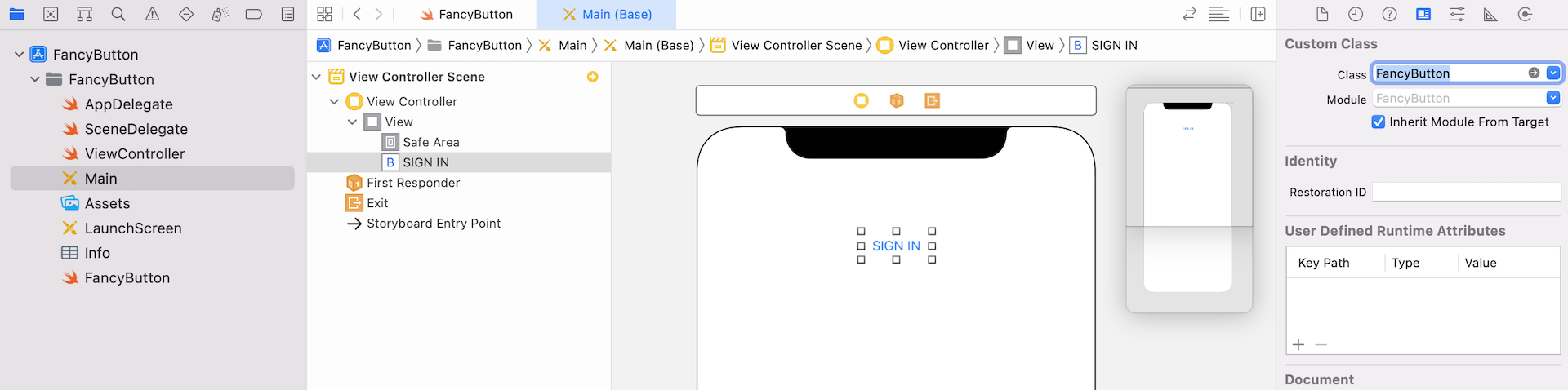
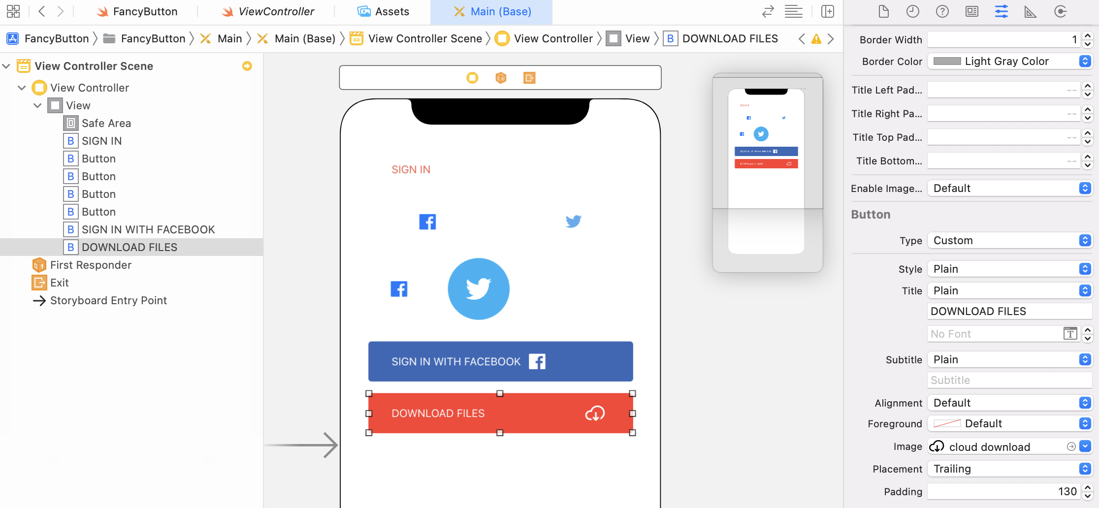
Now open the Main storyboard to switch to Interface Builder. We will add a button to test out the FancyButton class. Drag a button object from the Object library to view controller, and change its title to SIGN IN (or whatever title you like). In the Identity inspector, change the custom class from default to FancyButton.
It's time to see the magic happen! Go to the Attributes inspector, and you'll see a new section named Fancy Button with three options (including Corner Radius, Border Width and Border Color).
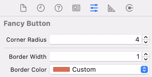
You can now easily create a button like that shown in the figure below. If you want to create the same button. Resize it to 343 by 50 points. Set the corner radius to 4, border width to 1, and border color to red. Also, you need to set the tint color to red. You can try out other combinations to modify the look & feel of the button in real time.

Title and Image Padding
Now let's try to change the horizontal alignment of the control from Centre to Left, and see how it looks.
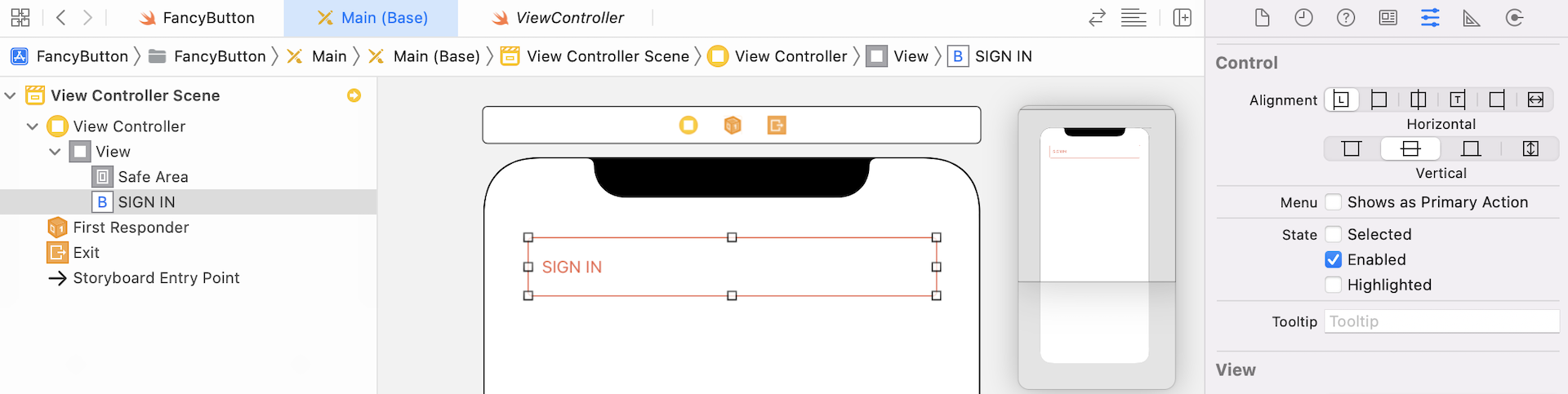
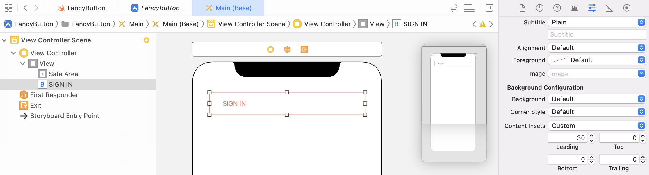
As you can see in the figure above, there is no space between the title label and the left edge. How do you add paddings to the title label? In iOS 15, Apple introduced a new configuration API for buttons.To add some paddings to the title label, you can go to the Attributes inspector. Under Background Configuration, change the Content Insets option to Custom and then update the value of Leading to 30.
If you're using iOS 14 (or older), however, you can insert the following code in FancyButton:
@IBInspectable var titleLeftPadding: CGFloat = 0.0 {
    didSet {
        titleEdgeInsets.left = titleLeftPadding
    }
}

@IBInspectable var titleRightPadding: CGFloat = 0.0 {
    didSet {
        titleEdgeInsets.right = titleRightPadding
    }
}

@IBInspectable var titleTopPadding: CGFloat = 0.0 {
    didSet {
        titleEdgeInsets.top = titleTopPadding
    }
}

@IBInspectable var titleBottomPadding: CGFloat = 0.0 {
    didSet {
        titleEdgeInsets.bottom = titleBottomPadding
    }
}
By changing the titleEdgeInsets, you can add paddings to the title label.
Buttons with Images
UIButton allows you to replace a title label with an image. You can set the title to blank and change the image option to facebook (which is the image you imported earlier). By varying the corner radius and border options, you can easily create buttons like this:
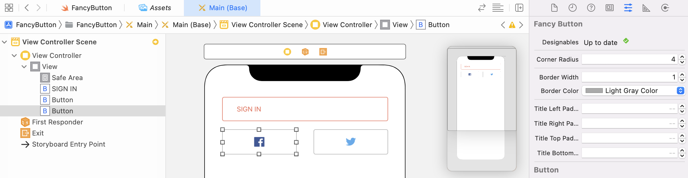
With a configurable button component, you can create different button designs by applying different values. Let's say, you want to create a circular button with borders and an image. You can set the corner radius to half of the button's width, and set the border width to a positive value (say, 5). Figure 36.15 shows the sample buttons.
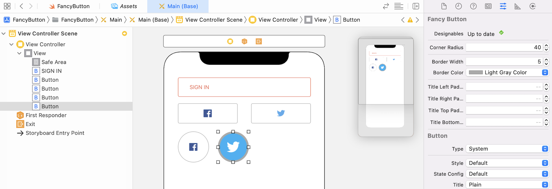
Image Padding
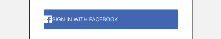
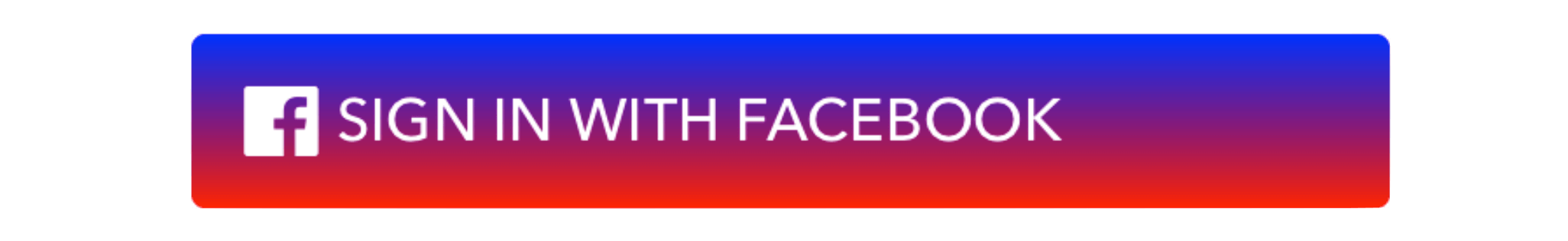
In some cases, you want to include both title and images in the button. Let's say, you want to create a Sign in with Facebook button and the Facebook icon. You can set the button's title to SIGN IN WITH FACEBOOK and image to Facebook. The image is automatically placed to the left of the title.
As a side note, the facebook icon is in blue. If you want to change its color, you will need to change the button's type from Custom to System. Also, modify the facebook image in the asset catalog and set it as a template image in the Render as option. The image will then be treated as a template image and you can alter its color by changing the Tint option.
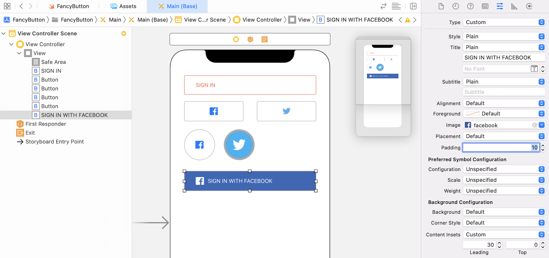
By default, there is no space between the Facebook image and the left edge of the button. Also, there is no space between the image and the title label.
To insert a padding for the image, you can set the Content Insets option to Custom and set the value of Leading to 30. For the spacing between the image and the title label, you can set the Padding option of the button to 10.
The procedures above works for device running iOS 15 (or up). If you need to support older versions of iOS, UIButton has another property named imageEdgeInsets for you to add padding around the image. Open FancyButton.swift and insert the following IBInspectable property to the class:
@IBInspectable var imageLeftPadding: CGFloat = 0.0 {
    didSet {
        imageEdgeInsets.left = imageLeftPadding
    }
}

@IBInspectable var imageRightPadding: CGFloat = 0.0 {
    didSet {
        imageEdgeInsets.right = imageRightPadding
    }
}

@IBInspectable var imageTopPadding: CGFloat = 0.0 {
    didSet {
        imageEdgeInsets.top = imageTopPadding
    }
}

@IBInspectable var imageBottomPadding: CGFloat = 0.0 {
    didSet {
        imageEdgeInsets.bottom = imageBottomPadding
    }
}
After the changes, go back to the Interface Builder. You can now add a space between the image and the edge of the button's view by setting the value of Image Left Padding.
Aligning the Image to the Right of the Title
By default, the image is aligned to the left of the button's title. What if you want to align the image to the right of the title? How can you do that?
In iOS 15, it is very easy to configure the placement of the image. Go to the Attributes inspector, set the Placement option to Trailing. This will align the image to the right of the title.
For iOS 14 or lower version, you have to perform a bit of works. You can make use of the imageEdgeInsets.left property to achieve that.
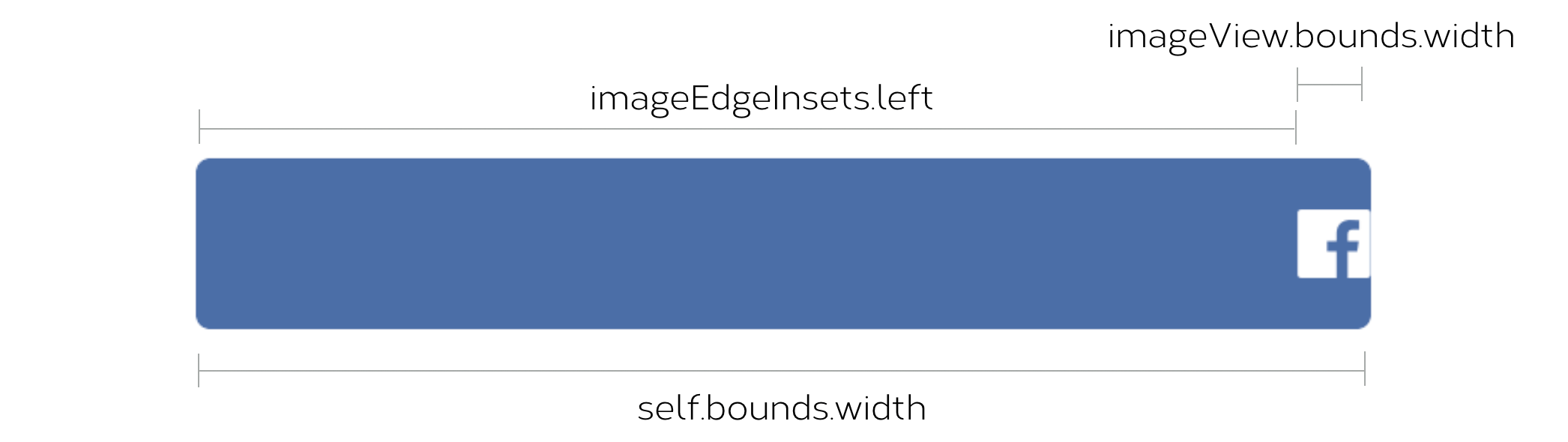
Take a look at the above figure. To move the image view of a button to the right edge of the button, you can set the value of imageEdgeInsets.left to the following:
imageEdgeInsets.left = self.bounds.width - imageView.bounds.width
However, the above calculation doesn't include the right padding of the image view.
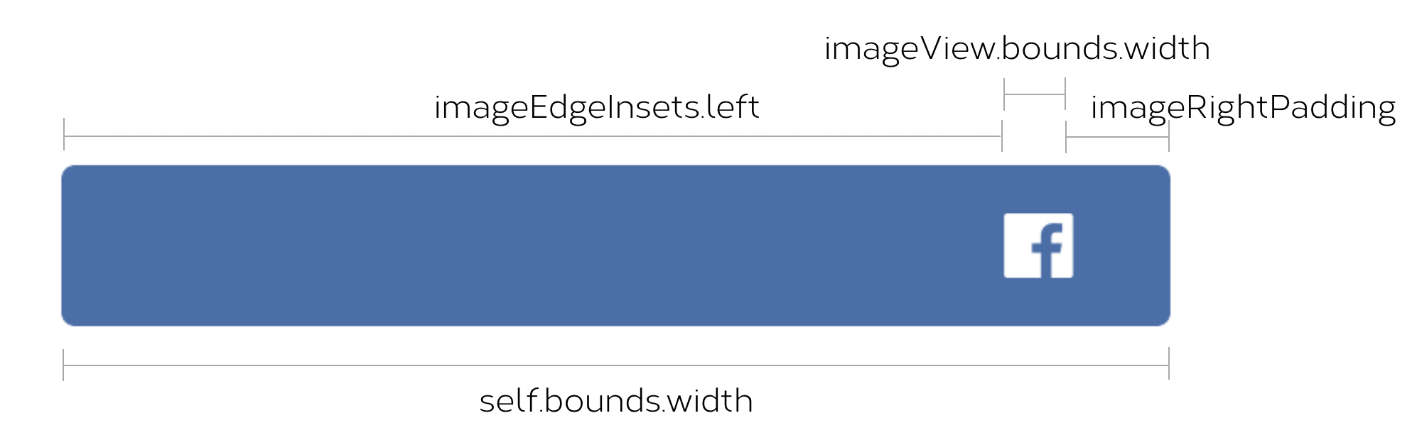
If we want to align the button's image like that shown in the figure, we have to change the formula like this:
imageEdgeInsets.left = self.bounds.width - imageView.bounds.width - imageRightPadding
Now let's dive into the implementation. Insert the following code in the FancyButton class:
@IBInspectable var enableImageRightAligned: Bool = false

override func layoutSubviews() {
    super.layoutSubviews()

    if enableImageRightAligned,
        let imageView = imageView {
        imageEdgeInsets.left = self.bounds.width - imageView.bounds.width - imageRightPadding
    }
}
We add a property called enableImageRightAligned to indicate if the image should be right aligned. Later when you access the Attributes inspector, you will see an ON/OFF switch for you to choose.
Since we calculate the left padding (i.e. imageEdgeInsets.left) base on the the button's width (i.e. self.bounds.width) , we need to override the layoutSubviews() method and update the property there.
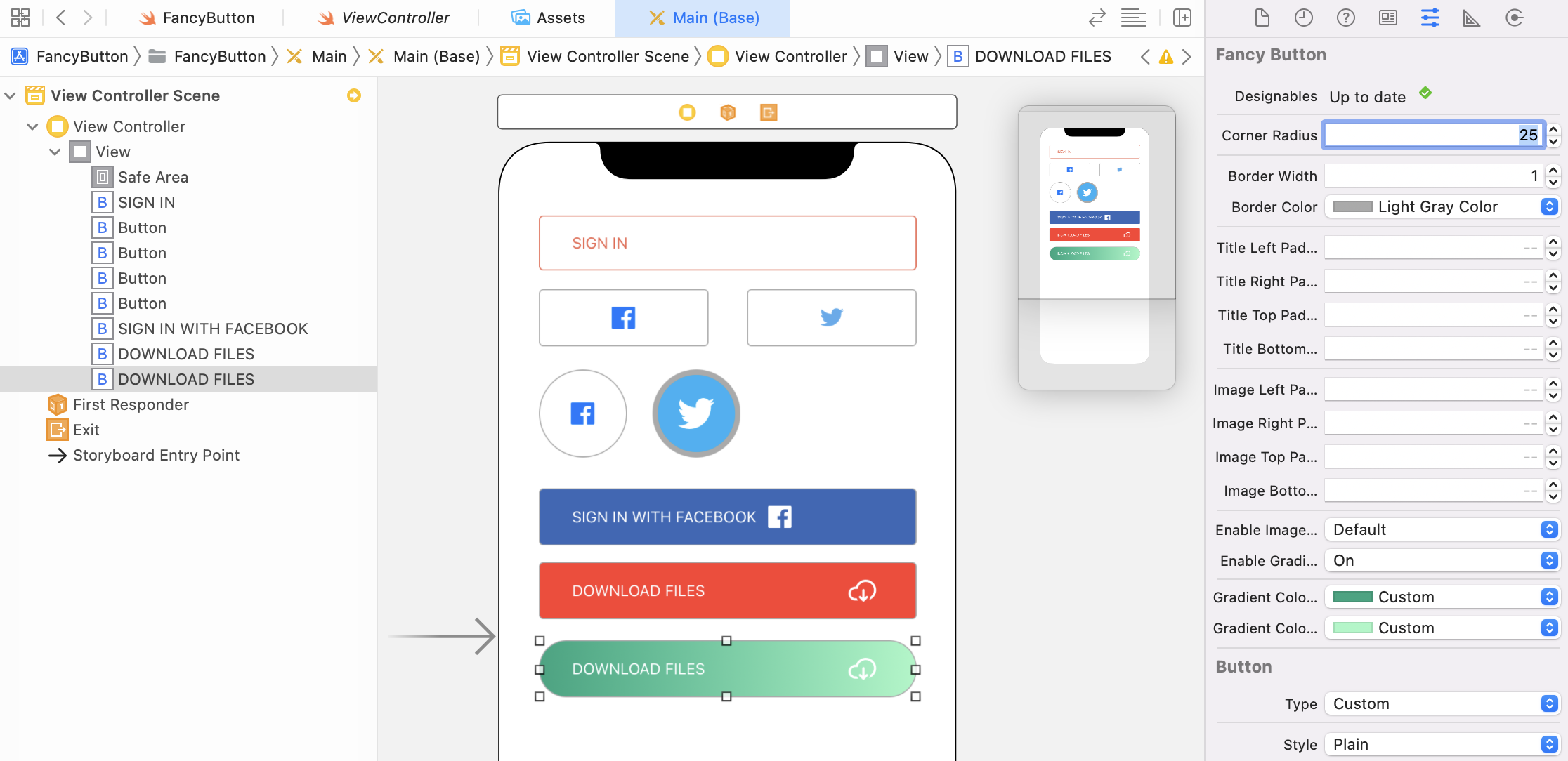
After applying the code changes, switch back to the storyboard and create another button using FancyButton. Now you can create a button like this by setting Enable Image Right Aligned to ON, and Image Right Padding to 20.
Color Gradient
A button can't be said as fancy if it doesn't support color gradient, right? So the last thing we will implement is to create an IBInspectable option for the FancyButton class.
So how can you create a gradient effect quickly and painlessly?
The iOS SDK has a class named CAGradientLayer that draws a color gradient over its background color. It is a subclass of CALayer, and allows developers to generate color gradients with a few lines of code like this:
let gradientLayer = CAGradientLayer()
gradientLayer.frame = self.bounds
gradientLayer.colors = [UIColor.blue, UIColor.red]
self.layer.insertSublayer(gradientLayer, at: 0)
A CAGradientLayer object has various properties for configuring the gradient effects. However, you basically need to provide two colors for the API to create the color gradient. In the above code, we set the first color to blue and the second color to red. If you put the code snippet in the layoutSubviews() method, you will see the result like this:
By default, as you can see, the direction of the gradient is from the top to the bottom. If you want to change the gradient direction to horizontal (say, from left to right), you can modify the startPoint and endPoint property like this:
gradientLayer.startPoint = CGPoint(x: 0.0, y: 0.5)
gradientLayer.endPoint = CGPoint(x: 1.0, y: 0.5)
Now that I have walked you through the basics of color gradient, let's modify the FancyButton class to support color gradient. Insert three new properties in the FancyButton class, and update the layoutSubview() method like below:
@IBInspectable var enableGradientBackground: Bool = false

@IBInspectable var gradientColor1: UIColor = UIColor.black

@IBInspectable var gradientColor2: UIColor = UIColor.white

override func layoutSubviews() {
    super.layoutSubviews()

    if enableImageRightAligned,
        let imageView = imageView {
        imageEdgeInsets.left = self.bounds.width - imageView.bounds.width - imageRightPadding
    }

    if enableGradientBackground {
        let gradientLayer = CAGradientLayer()
        gradientLayer.frame = self.bounds
        gradientLayer.colors = [gradientColor1.cgColor, gradientColor2.cgColor]
        gradientLayer.startPoint = CGPoint(x: 0.0, y: 0.5)
        gradientLayer.endPoint = CGPoint(x: 1.0, y: 0.5)
        self.layer.insertSublayer(gradientLayer, at: 0)
    }
}
The enableGradientBackground property indicates whether if you want to apply a gradient effect on the button. The other two properties let you define the colors of the gradient.
If the button is enabled with gradient, we create the CAGradientLayer object and apply the gradient effect using the given colors.
Now you're ready to test it in Interface Builder. You can enable the gradient option in Attributes inspector, set the two color options. Please make sure you change the Enable Gradient Background option to ON to enable the gradient effect.
Summary
Isn't the Fancy Button cool? You now have a FancyButton class that can be reused in any Xcode projects. Or if you work in a team, you may share the class with other developers. They can start using it to build a fancy button right in storyboards and see the changes in real time.
IBInspectable and IBDesignable can be applied most view objects. As an exercise, try to create another customizable object and let developers configure its properties in Interface Builder.
For reference, you can download the demo project from http://www.appcoda.com/resources/swift55/FancyButtonDemo.zip.