- Made by AppCoda
- Contact us / Support
- Tweet this book
- Preface
- 1. Building Adaptive User Interfaces
- 2. Creating Table View Sections and Index list with Diffable Data Source
- 3. Animating Table View Cells
- 4. Working with JSON and Codable
- 5. How to Integrate the Twitter and Facebook SDK for Social Sharing
- 6. Working with Email and Attachments
- 7. Sending SMS and MMS Using MessageUI Framework
- 8. How to Get Direction and Draw Route on Maps
- 9. Search Nearby Points of Interest Using Local Search
- 10. Audio Recording and Playback
- 11. Scan QR Code Using AVFoundation Framework
- 12. Working with URL Schemes
- 13. Building a Full Screen Camera with Gesture-based Controls
- 14. Video Capturing and Playback Using AVKit
- 15. Displaying Banner Ads using Google AdMob
- 16. Working with Custom Fonts
- 17. Working with AirDrop, UIActivityViewController and Uniform Type Identifiers
- 18. Building Grid Layouts Using Collection Views and Diffable Data Source
- 19. Interacting with Collection Views
- 20. Adaptive Collection Views Using UITraitCollection and Compositional Layout
- 21. Building a Weather Widget Using WidgetKit
- 22. Building Slide Out Sidebar Menus Using Objective-C Libraries
- 23. View Controller Transitions and Animations
- 24. Building a Slide Down Menu
- 25. Self Sizing Cells and Dynamic Type
- 26. XML Parsing, RSS and Expandable Table View Cells
- 27. Applying a Blurred Background Using UIVisualEffect
- 28. Using Touch ID and Face ID For Authentication
- 29. Building a Carousel-Like User Interface
- 30. Working with Parse
- 31. Parsing CSV and Preloading a SQLite Database Using Core Data
- 32. Connecting Multiple Annotations with Polylines and Routes
- 33. Using CocoaPods in Swift Projects
- 34. Building a Simple Sticker App
- 35. Building iMessage Apps Using Messages Framework
- 36. Building Custom UI Components Using IBDesignable and IBInspectable
- 37. Using Firebase for User Authentication
- 38. Google and Facebook Authentication Using Firebase
- 39. Using Firebase Database and Storage to Build an Instagram-like App
- 40. Building a Real-time Image Recognition App Using Core ML
- 41. Building AR Apps with ARKit and SpriteKit
- 42. Working with 3D Objects in Augmented Reality Using ARKit and SceneKit
- 43. Use Create ML to Train Your Own Machine Learning Model for Image Recognition
- 44. Building a Sentiment Classifier Using Create ML to Classify User Reviews
- 45. Working with Image Tracking Using ARKit
- Published with GitBook
Chapter 20
Adaptive Collection Views Using UITraitCollection and Compositional Layout
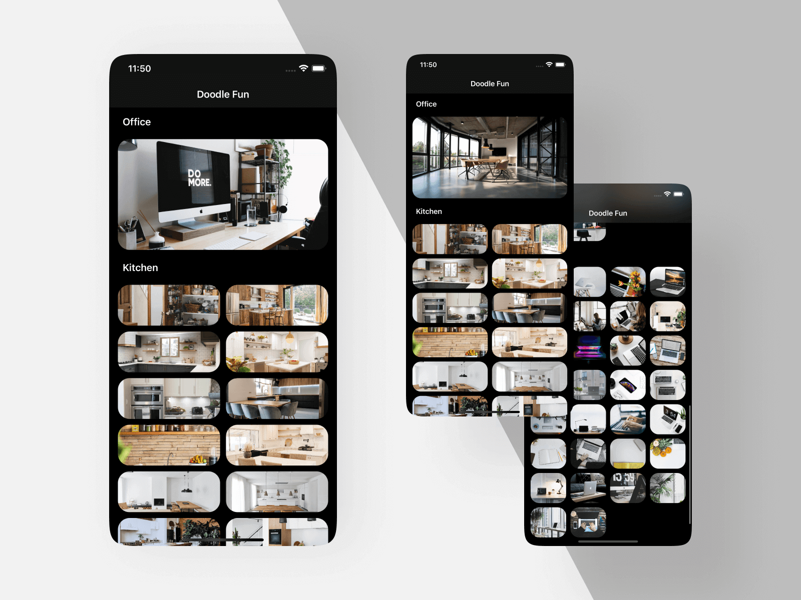
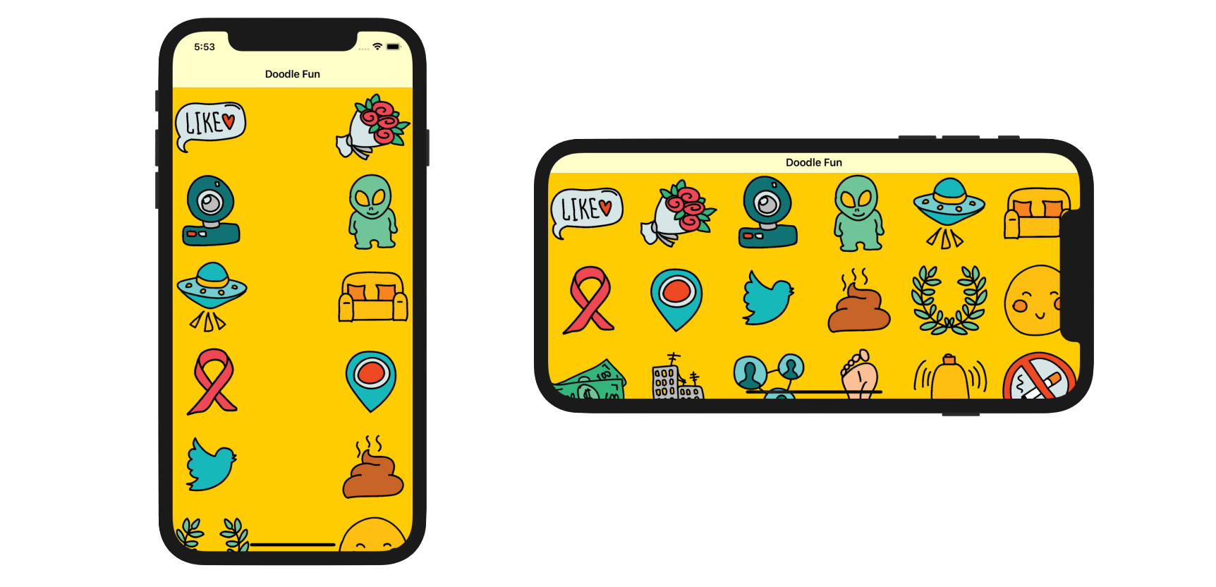
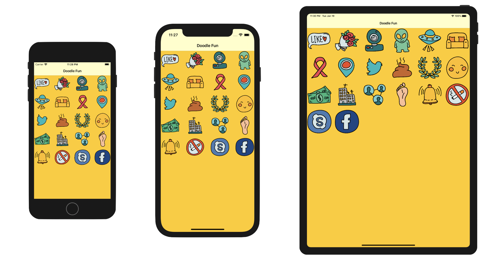
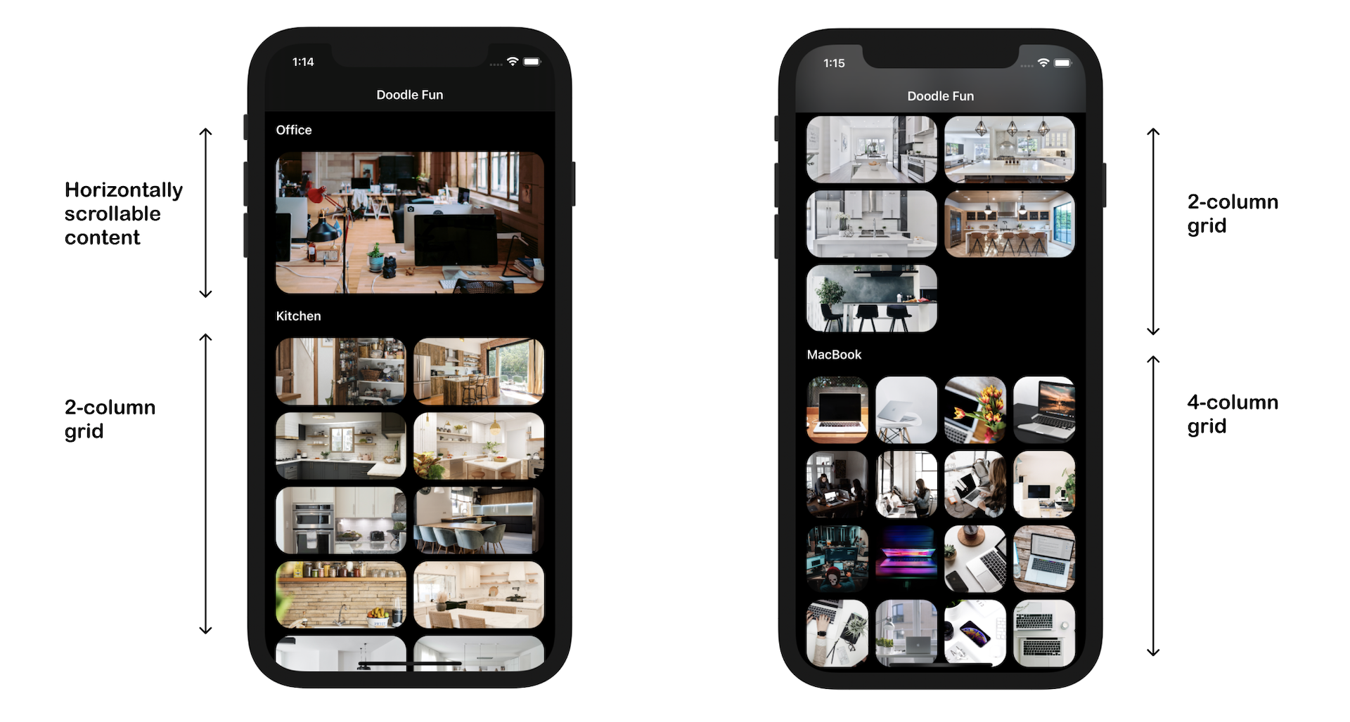
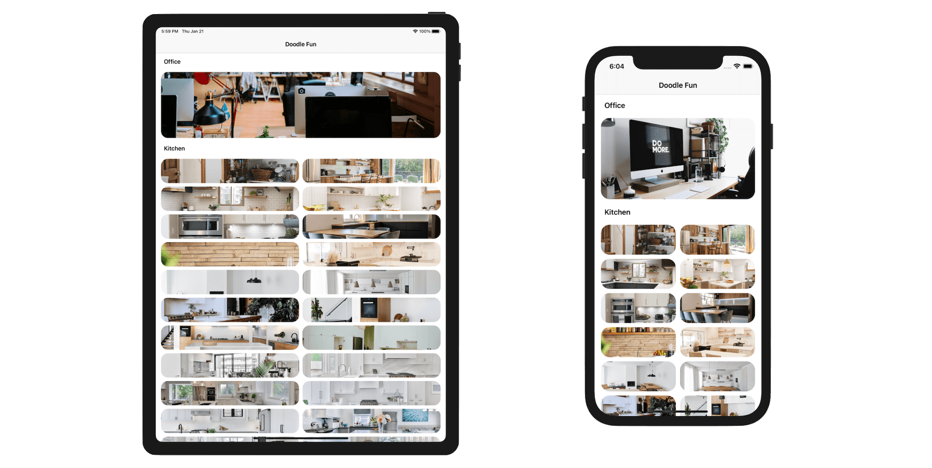
In the previous two chapters, you learned to build a demo app using a collection view. In this chapter, we will dive even deeper into collection views. There are two core topics I want to discuss with you. First, it's about a concept called Adaptive User Interfaces. We will make use of Size Classes and UITraitCollection to adapt the collection view to a particular device and device orientation. In the second part of the chapter, we will introduce a powerful feature called Compositional Layout. You will learn how to build complex layout of collection views using compositional layouts and diffable data sources. Figure 1 should give you some ideas about the complex layout we will create. In case you don't aware of it, you can scroll the whole content vertically but all photos under the office section can be scrolled horizontally. Looks great, right?
Note: If you haven't read Chapter 1, I would recommend you to take a pause here and go back to the first chapter. Everything I will cover here is based on the material covered in the very beginning of the book.
As usual, we will walk you through the technical concept by building some demo apps . First, you are going to create an app similar to the one before but with the following changes:
- The cell is adaptive - The size of the collection view cell changes according to a particular device and orientation. You will learn how to use size classes and UITraitCollection to make the collection view adaptive.
- We will use
UICollectionView- Instead of usingUICollectionViewController, you will learn how to useUICollectionViewto build a similar UI.
Once we built the first demo, we will move onto building another demo app. This UI layout of this app will be more complicated, as displayed in figure 1. We will apply a new way of layout technique called compositional layouts, which was introduced in iOS 13, to create the UI. Once you understand how composition layouts work, you will be able to build more advanced layouts for collection views.
Enhancing the Doodle Fun App
Okay, let's begin with the first demo. To get started, download the project template called DoodleFun from http://www.appcoda.com/resources/swift55/DoodleFunStarter.zip. I have included a set of Doodle images (provided by the team at RoundIcons) and prebuilt the storyboard for you.
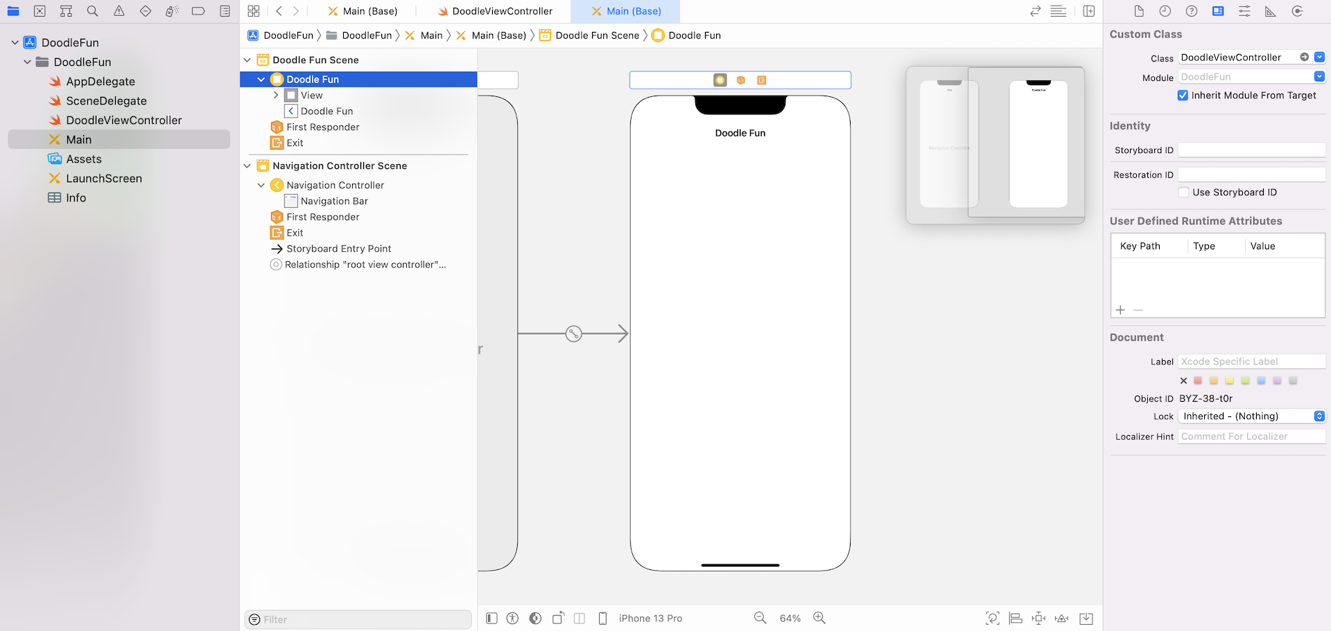
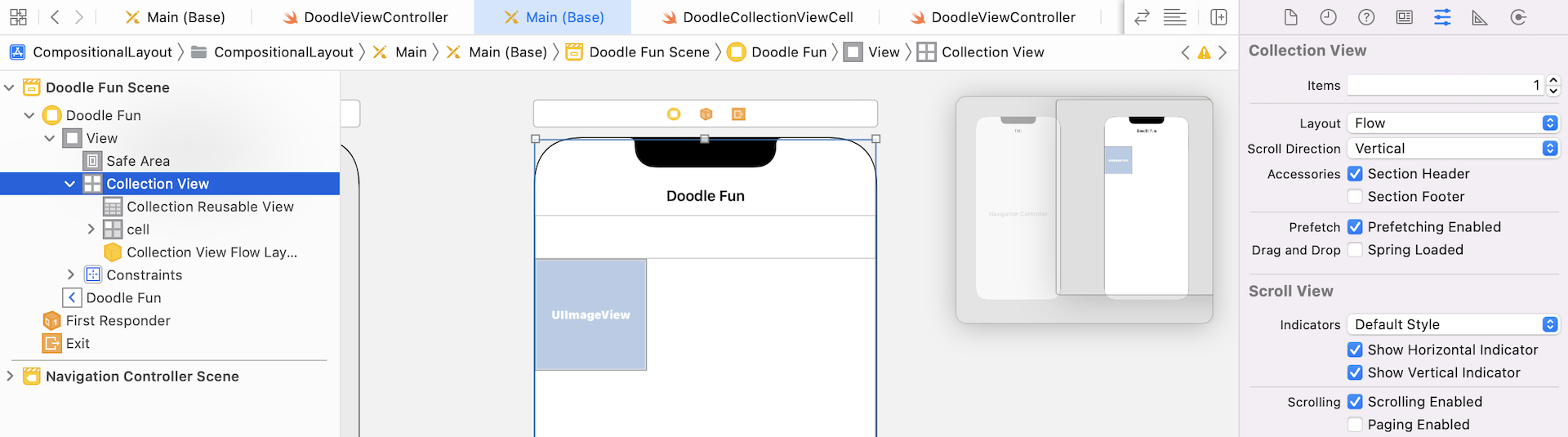
If you open the Main storyboard file, you should find an empty view controller, embedded in a navigation controller. This is our starting point. We're going to design the collection view and create a grid view like the one implemented in earlier chapter. However, instead of using a collection view controller, we will use a collection view.
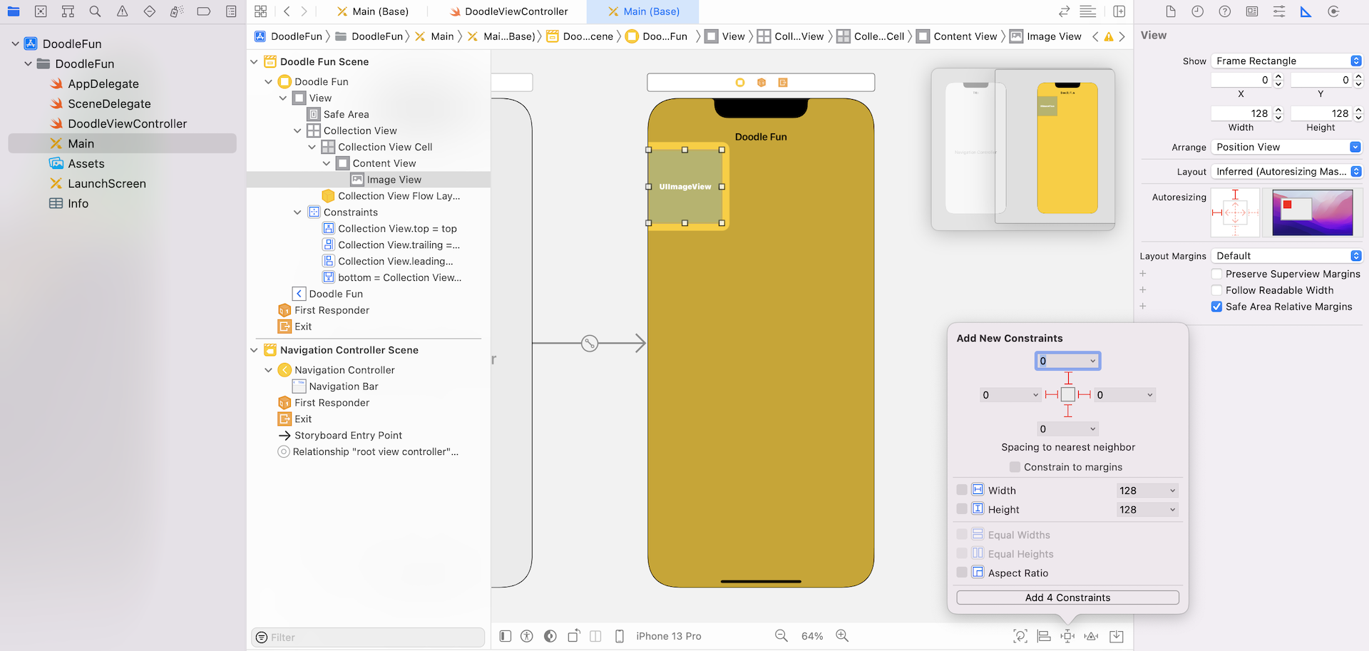
Drag a Collection View object from the Object library to the View Controller. Resize it to make it fit the whole view. In the Attributes inspector, change the background color to yellow. Next, go to the Size inspector. Set the cell size to 128 by 128. If everything is configured correctly, your screen should look like figure 20.3.
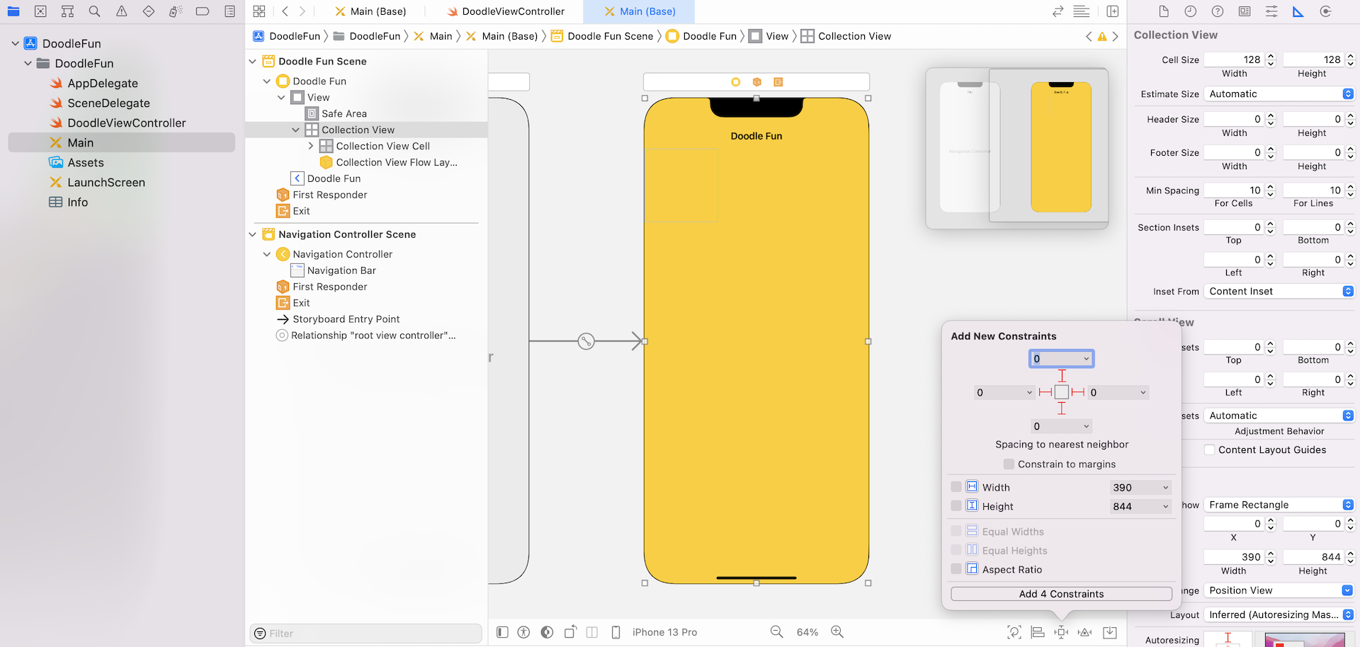
Because we are using a Collection View instead of Collection View Controller, we have to deal with auto layout constraints on our own. Click the Add New Constraints button in the layout bar. Define four spacing constraints for the top, left, right and bottom sides of the collection view. Make sure you uncheck the Constrain to margins and set the spacing values for all sides to 0. For the spacing constraint of the bottom side, please set its Second Item to Superview.Bottom instead of Safe Area.bottom. I want to extend the collection view to full screen.
Next, add an image view to the cell for displaying an image. Select the collection view cell and set its identifier to cell under the Attributes inspector. Again, you will need to add a few layout constraints for the image view. Click the Add New Constraints button, and define the spacing constraints for the top, left, right and bottom sides of the image view.
Diving into the Code
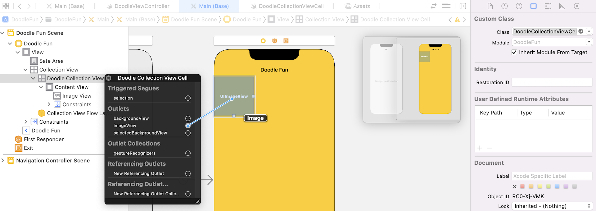
Now that you've created the collection view in the storyboard, let's move on to the coding part. First, create a new file named DoodleCollectionViewCell and set it as a subclass of UICollectionViewCell.
Once the file was created, declare an outlet variable for the image view:
class DoodleCollectionViewCell: UICollectionViewCell {
    @IBOutlet var imageView: UIImageView!
}
Switch to the storyboard. Select the collection view cell and change its custom class (under the Identity inspector) to DoodleCollectionViewCell. Then right-click the cell and connect the imageView outlet variable with the image view.
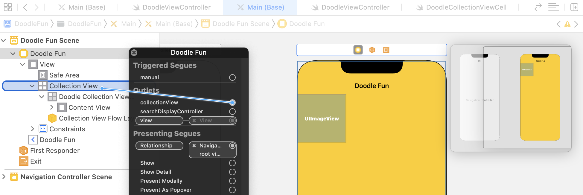
The DoodleViewController class is now associated with the view controller in the storyboard. As we want to present a set of images using the collection view, declare an array for the images and an outlet variable for the collection view:
private var doodleImages = (1...20).map { "DoodleIcons-\($0)" }

@IBOutlet var collectionView: UICollectionView!
Switch over to Main storyboard and connect the collection view object to the collectionView variable.
To populate data in the collection view using diffable data source, create a enum to define the sections:
enum Section {
    case all
}
Since we only have one section in the table, I just define a case and name it all. You are free to change the name of the section if you want. Next, create the configureDataSource() method to create an instance of UICollectionViewDiffableDataSource. To better organize the code, let's create the method in an extension like this:
extension DoodleViewController {

    func configureDataSource() -> UICollectionViewDiffableDataSource<Section, String> {

        let dataSource = UICollectionViewDiffableDataSource<Section, String>(collectionView: collectionView) { (collectionView, indexPath, imageName) -> UICollectionViewCell? in

            let cell = collectionView.dequeueReusableCell(withReuseIdentifier: "cell", for: indexPath) as! DoodleCollectionViewCell
            cell.imageView.image = UIImage(named: imageName)

            return cell
        }

        return dataSource
    }
}
The method returns an instance of UICollectionViewDiffableDataSource<Section, String> and configures each of the cells for the collection view. In the cell provider, which is the closure, we simply set the image name to the image view of the cell.
Now that we have created the function for configuring the data source, declare the following variable in DoodleViewController to use it:
lazy var dataSource = configureDataSource()
We also need to connect this data source with the collection view. Insert the following code in the viewDidLoad() method:
collectionView.dataSource = dataSource
With the data source ready, we need to create one more method to create the snapshot of the data. Insert the following code in the extension:
func updateSnapshot(animatingChange: Bool = false) {

    // Create a snapshot and populate the data
    var snapshot = NSDiffableDataSourceSnapshot<Section, String>()
    snapshot.appendSections([.all])
    snapshot.appendItems(doodleImages, toSection: .all)

    dataSource.apply(snapshot, animatingDifferences: false)
}
To display the data in the collection view, the code above creates an instance of NSDiffableDataSourceSnapshot. With the empty snapshot, we specify the section of the collection view by invoking appendSections. Then we call appendItems to add all items of the doodleImages array to the .all section.
Lastly, insert the following line of code in the viewDidLoad() method to make the call and update the estimatedItemSize property of the layout to .zero:
if let layout = collectionView.collectionViewLayout as? UICollectionViewFlowLayout {
    layout.itemSize = CGSize(width: 128, height: 128)
    layout.estimatedItemSize = .zero
}

updateSnapshot()
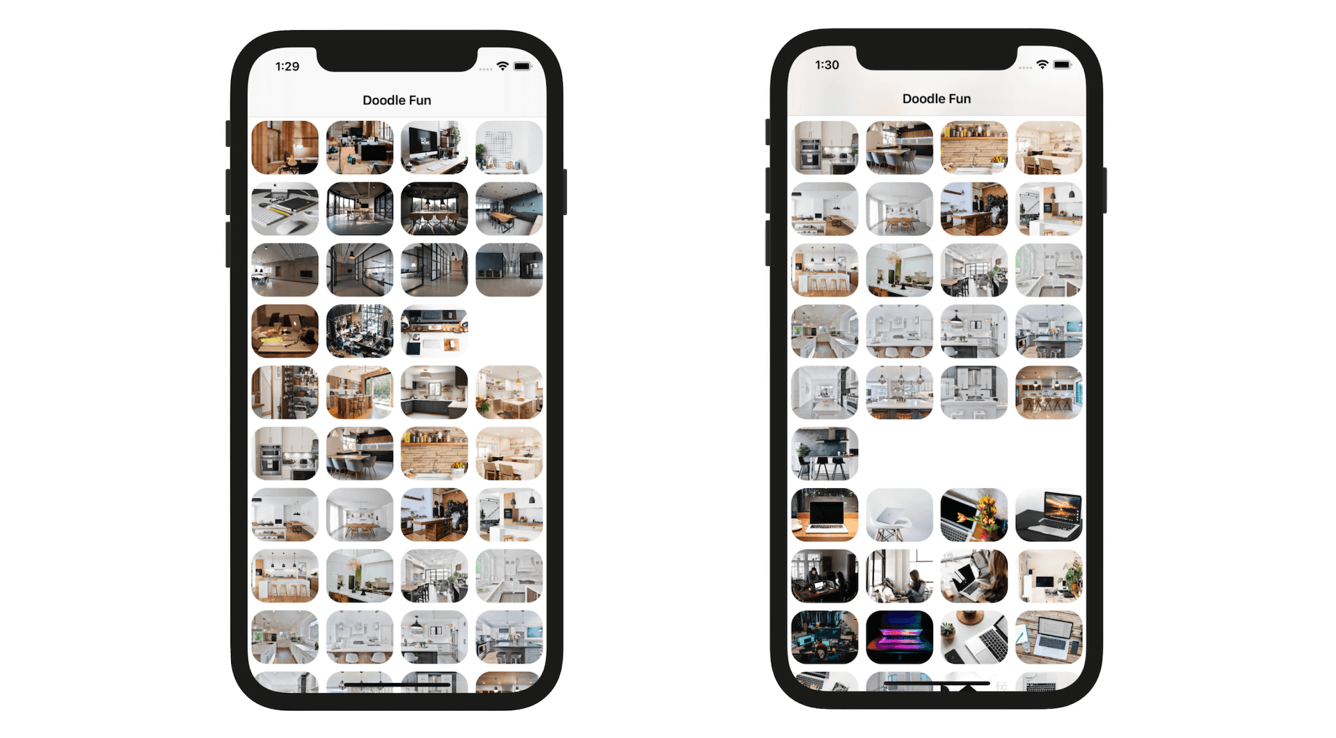
That's it! We're ready to test the app. Compile and run the app on the iPhone 12 Pro simulator. Try to test the app in both portrait and landscape orientation. What do you think? The app looks pretty good in landscape mode, right? However, it falls short in portrait orientation.
UICollectionView can automatically determine the number of columns that best fits its contents according to the cell size. As you can see below, the number of columns varies depending on the width of the device. In portrait mode, the screen width of iPhone 13 Pro is 390 points. If you do a simple calculation (e.g. [390 - 20 (cell spacing)] / 128 = 2.9), you should understand why it can only display cells in two columns, leaving a large gap between columns.
Designing for size classes
If you test the app on other devices like iPhone SE and iPhone 8, they also have the same issue. So how can you fix this issue to make the app look better? Obviously you can reduce the cell size so that it fits well on all Apple devices. A better way to resolve the issue, however, is to make the cell size adaptive.
The collection view works pretty well in landscape orientation regardless of device types. To fix the display issue, we are going to keep the size of the cell the same (i.e. 128x128 points) for devices in landscape mode but minimize the cell for iPhones in portrait mode.
The real question is how do you find out the current device and its orientation? In the past, you would determine the device type and orientation using code like this:
let device = UIDevice.current
let orientation = device.orientation
let isPhone = (device.userInterfaceIdiom == UIUserInterfaceIdiom.phone) ? true : false

if isPhone {
    if orientation.isPortrait {
        // Change cell size
    }
}
Starting from iOS 8, the above code is not ideal. You're discouraged from using UIUserInterfaceIdiom to verify the device type. Instead, you should use size classes to handle issues related to idiom and orientation. I covered size classes in Chapter 1, so I won't go into the details here. In short, it boils down to this two by two grid:
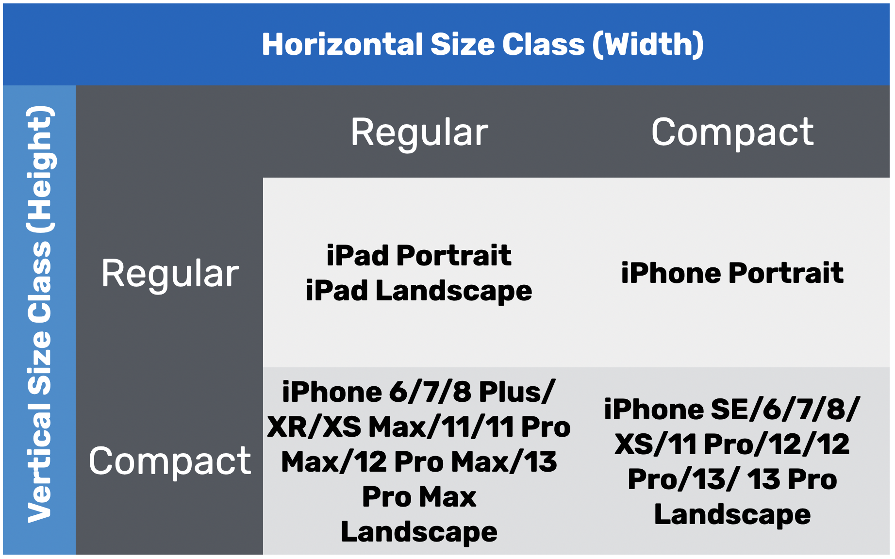
There is no concept of orientation. For iPhones in portrait mode, it is indicated by a compact horizontal class and regular vertical class.
So how can you access the current size class from code?
Understanding Trait Collections
Well, you use a new system called Traits. The horizontal and vertical size classes are considered traits. Together with other properties like userInterfaceIdiom and display scale they make up a so-called trait collection.
In iOS SDK, Apple provided a protocol known as trait environments (i.e. UITraitEnvironment). This protocol is capable to return the current trait collection. Because UIViewController conforms to the UITraitEnvironment protocol, you can access the current trait collection through the traitCollection property.
If you put the following line of code in the viewDidLoad method to print its content to console:
print("\(traitCollection)")
You should have something like this when running the app on an iPhone 8 Plus:
<UITraitCollection: 0x600003abc8f0; UserInterfaceIdiom = Phone, DisplayScale = 3, DisplayGamut = P3, HorizontalSizeClass = Compact, VerticalSizeClass = Regular, UserInterfaceStyle = Light, UserInterfaceLayoutDirection = LTR, ForceTouchCapability = Unavailable, PreferredContentSizeCategory = L, AccessibilityContrast = Normal, UserInterfaceLevel = Base>
From the above information, you discover that the device is an iPhone which has the Compact horizontal and Regular vertical size classes. The display scale of 3x and is using a Light theme.
Adaptive Collection View
With a basic understanding of trait collections, you should understand how to determine the current size class of a device. Now it's time to make the collection view adaptive.
By default, a collection view uses UICollectionViewFlowLayout to organize the items into a grid. UICollectionViewFlowLayout actually adopts the UICollectionViewDelegateFlowLayout protocol and has implemented some of the required methods. If you look into the documentation of the protocol, it provides an optional method for specifying the size of a cell:
optional func collectionView(_ collectionView: UICollectionView, layout collectionViewLayout: UICollectionViewLayout, sizeForItemAt indexPath: IndexPath) -> CGSize
To resize a cell at runtime, all you need to do is adopt the protocol in DoodleViewController and implement the method to return the exact size of the cell for different screen sizes.
Now create another extension to adopt the UICollectionViewDelegateFlowLayout protocol. Because we only want to alter the cell size for iPhones in portrait mode, we will implement the method like this:
extension DoodleViewController: UICollectionViewDelegateFlowLayout {
    func collectionView(_ collectionView: UICollectionView, layout collectionViewLayout: UICollectionViewLayout, sizeForItemAt indexPath: IndexPath) -> CGSize {

        let sideSize = (traitCollection.horizontalSizeClass == .compact && traitCollection.verticalSizeClass == .regular) ? 80.0 : 128.0
        return CGSize(width: sideSize, height: sideSize)
    }
}
For devices with a Compact horizontal and a Regular vertical size class (i.e. iPhone Portrait), we set the size of the cell to 80x80 points. Otherwise, we just keep the cell size the same.
Lastly, we need to set the delegate of the UICollectionViewDelegateFlowLayout protocol to self in the viewDidLoad() method:
collectionView.delegate = self
Run the app again on iPhone 13 Pro. It should look great on both landscape and portrait modes of iPhone 13 Pro, as well as, other iPhone models and iPad.
For reference, you can download the complete project from http://www.appcoda.com/resources/swift55/DoodleFunAdaptive.zip.
Introducing Compositional Layouts
Now that you should know how to use trait collection to handle various types of screen sizes, let's move onto the next topic and see how you can create some advanced layouts. So far, we only use the default flow layout to arrange the content in a collection view. It is designed for displaying elements in grid layout. What if we need to build UIs similar to that of App Store or Netflix? The flow layout is not designed for that. Prior to iOS 13, you will have to create your own layout by subclassing UICollectionViewLayout. Starting from iOS 13, Apple introduced a new kind of collection view layout called compositional layout. As mentioned by Apple, this layout is composable, flexible, and fast. Most importantly, it allows developers to build any kind of visual arrangement for various types of content without writing a lot of code.
After you understand compositional layouts, you will also be able to any kind of visual arrangement for your content.
Compositional layout, a type of collection view layout that’s composable, flexible, and fast, letting you build any kind of visual arrangement for your content.
- Apple's API documentation
So, what are we going to work on? I already showed you the final delivable at the very beginning of the chapter. Figure 20.10 shows you the screen layout again. The collection view has three sections: Office, Kitchen, and MacBook. Each section has a different visual arrangement for the photos. The Office section shows one photo at a time. Users can scroll horizontally to reveal other photos. Both the Kitchen and the MacBook sections displays the photos in grid layouts but with different numbers of columns.
This looks complicated, right? With compositional layouts, it is pretty easy to arrange the content visually. To begin, however, I will first show you how to create a grid layout using compositional layout. And then we will continue to tweak the code and work all the ways to achieve our final goal.
Explaining the Starter Project
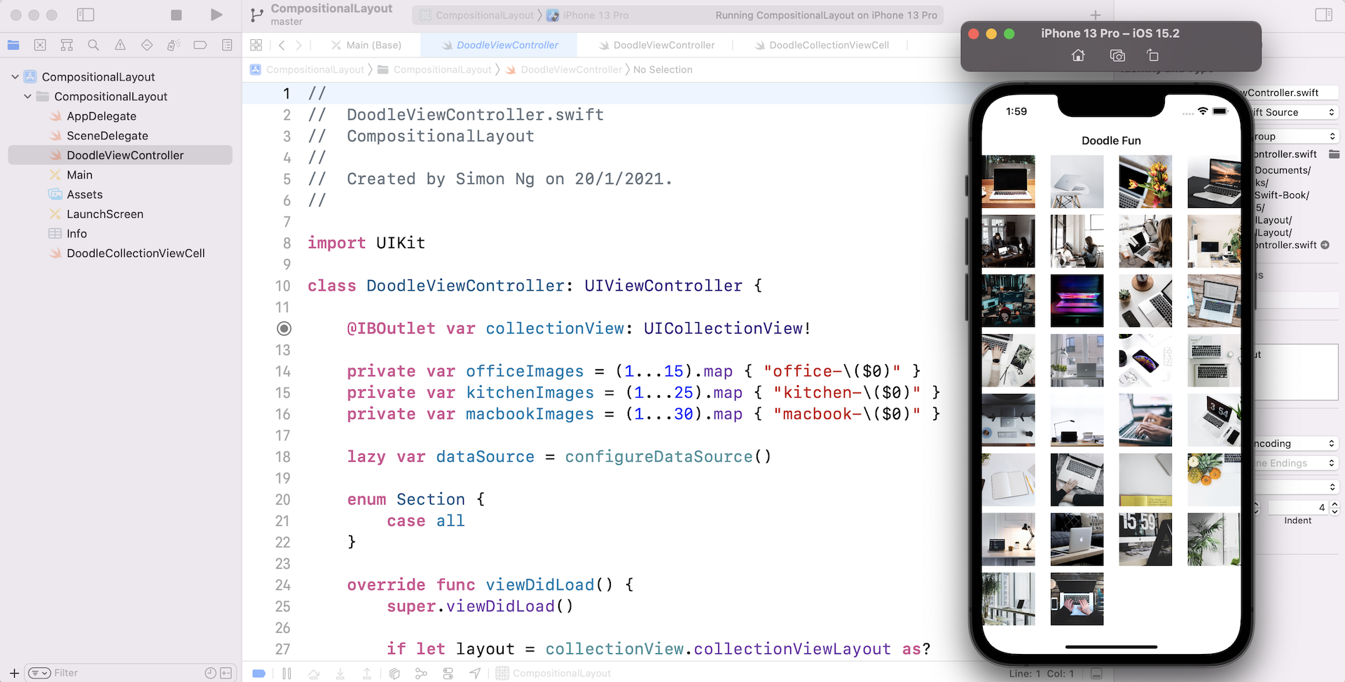
Similar to the first project, I also prepared a starter project for this demo. You can download it from http://www.appcoda.com/resources/swift55/CompositionalLayoutStarter.zip. This starter project already comes with the images and includes the code needed for presenting the data in a collection view. If you open Main storyboard, the design is exactly the same as the previous project. We reuse most of the code in the DoodleFun project except that we use three different sets of images. In the DoodleViewController.swift file, you should find these variable declarations:
private var officeImages = (1...15).map { "office-\($0)" }
private var kitchenImages = (1...25).map { "kitchen-\($0)" }
private var macbookImages = (1...30).map { "macbook-\($0)" }
Each array variable stores the image names of the corresponding set of images. Right now, the starter project only defines a single section:
enum Section {
    case all
}
And, we still use the diffable data source approach to handle the data of the collection view. Run the project using an iPhone simulator and it should result a grid view showing those MacBook images.
Building the Grid View Using Compositional Layouts
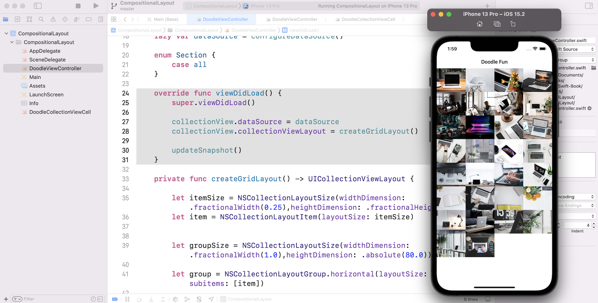
The starter project makes use of the flow layout to arrange the grid view. What we are going to do is to migrate the code to use compositional layouts. Rather than telling you how compositional layouts work, let's write the code and see it in action. Insert the following method in the DoodleViewController class:
private func createGridLayout() -> UICollectionViewLayout {

    let itemSize = NSCollectionLayoutSize(widthDimension: .fractionalWidth(0.25),heightDimension: .fractionalHeight(1.0))
    let item = NSCollectionLayoutItem(layoutSize: itemSize)


    let groupSize = NSCollectionLayoutSize(widthDimension: .fractionalWidth(1.0),heightDimension: .absolute(80.0))

    let group = NSCollectionLayoutGroup.horizontal(layoutSize: groupSize, subitems: [item])

    let section = NSCollectionLayoutSection(group: group)
    let layout = UICollectionViewCompositionalLayout(section: section)

    return layout

}
I will walk you through the code in details later. In brief, the method returns an instance of UICollectionViewLayout such that the layout is a 4-column grid.
Since we are migrating the collection view to use the compositional layout, we need to modify the viewDidLoad() method like this:
override func viewDidLoad() {
    super.viewDidLoad()

    collectionView.dataSource = dataSource
    collectionView.collectionViewLayout = createGridLayout()

    updateSnapshot()
}
We made a couple of changes. First, we removed the code related to the flow layout. Secondly, we set the collectionViewLayout property to the grid layout returned by the createGridLayout() method. This is all you need to implement compositional layout.
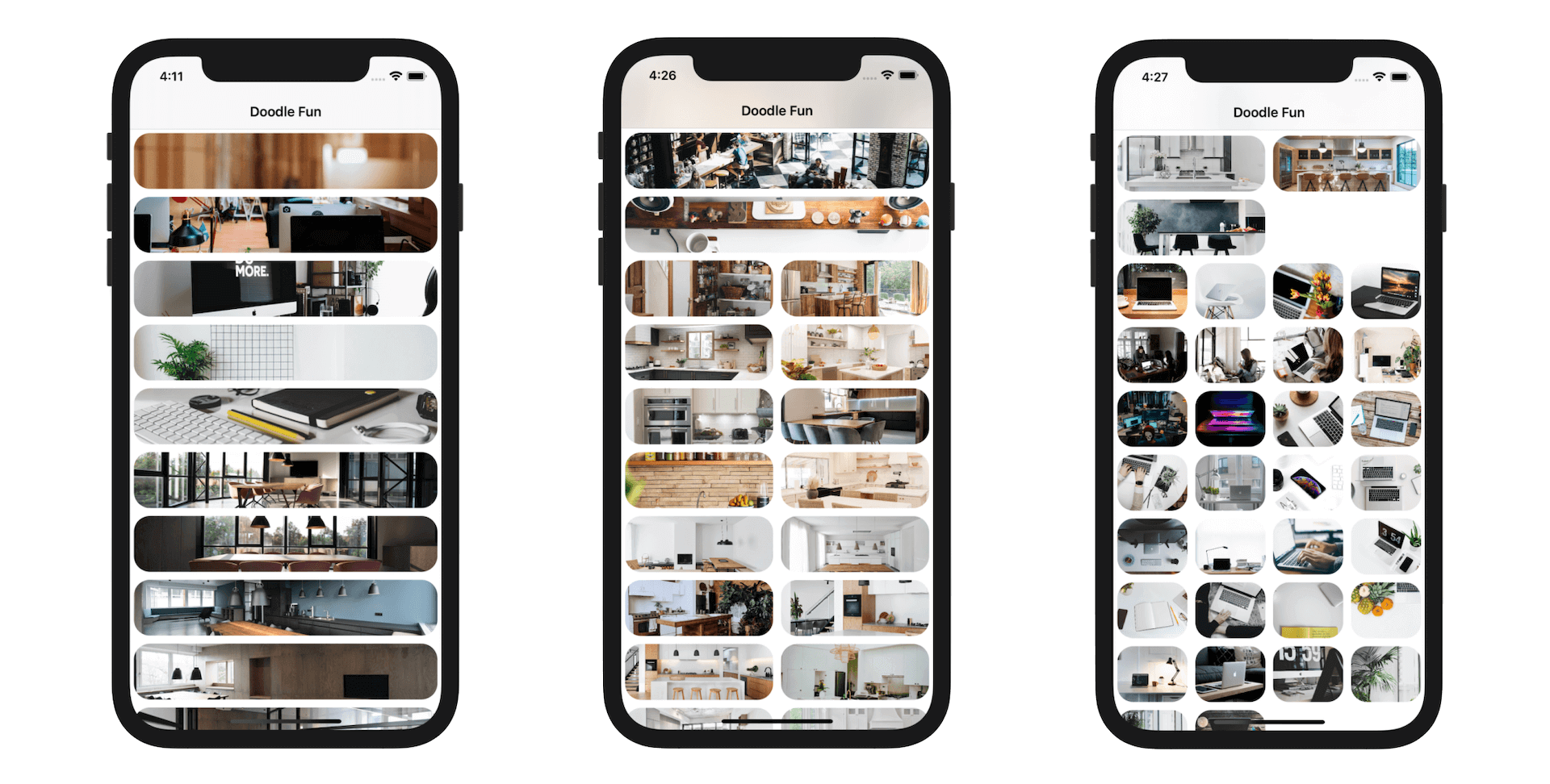
Run the app to have a quick test. It should result a 4-column grid.
Compositional Layouts Explained
A compositional layout is composed of these elements:
- Section
- Group
- Item
For the grid layout we just built, it has one section. In the section, it has multiple groups of photos such that each group consists of 4 photos. Figure 21.13 illustrates the relationship between the terms listed above.
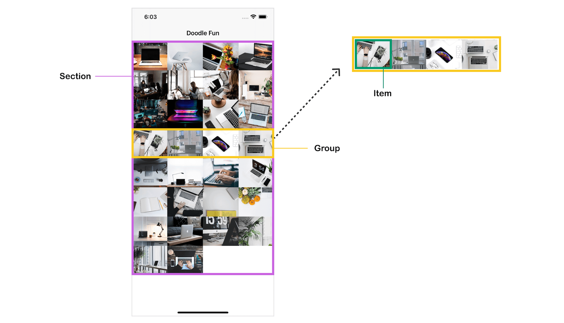
With some understanding of these building blocks, it's time to examine the code of createGridLayout() again. Instead of walking you through the code from the beginning, let's study the code backward. To create a compositional layout, you create an instance of UICollectionViewCompositionalLayout and pass it the section object:
let layout = UICollectionViewCompositionalLayout(section: section)
A compositional layout can have one or more sections. The code above creates a compositional layout with one section. As explained earlier, each section contains multiple groups. This is the line of code that creates the section with the specified group container:
let section = NSCollectionLayoutSection(group: group)
So how can we define the criteria of a group such as size? It all comes down to these two lines of code:
let groupSize = NSCollectionLayoutSize(widthDimension: .fractionalWidth(1.0),heightDimension: .absolute(80.0))
let group = NSCollectionLayoutGroup.horizontal(layoutSize: groupSize, subitems: [item])
To define the size of a group, you create an instance of NSCollectionLayoutSize. The value .fractionalWidth(1.0) means that the group takes up the full width of the screen. Let's say, if your group only needs to take up half of the screen, you can use .fractionalWidth(0.5). Other than using fraction size, you can also provide an absolute value. For the heightDimension parameter, we use .absolute(80.0). This means the group's height should be set to 80 points.
Once we define the group size, we can create a group using NSCollectionLayoutGroup. A group may lay out its items in a horizontal row, a vertical column, or a custom arrangement. In the code above, we use the horizontal arrangement by calling the horizontal method. In this case, items in the group are arranged horizontally. This means each new item added to the group is placed right next to the previous item. When the width of the items exceeds the group's width, the system creates a new group on a new row and places the item there.
The grid shows 4 photos in a row. This is configured by these two lines of code:
let itemSize = NSCollectionLayoutSize(widthDimension: .fractionalWidth(0.25),heightDimension: .fractionalHeight(1.0))
let item = NSCollectionLayoutItem(layoutSize: itemSize)
We define the item's width to .fractionalWidth(0.25). This means each item takes up 1/4 of the group's width (i.e. screen width). For the height of the item, we set its value to .fractionalHeight(1.0). In this case, the item's height would be the same as the group's height (i.e. 80 points).
This is how you implement a compositional layout for collection views. As you may notice, we just need to alter the fractional width of the item to create a grid with more/less columns. Say, if you want to create a 2-column grid, you can set the value of widthDimension to .fractionalWidth(0.5).
Item and Group Spacing
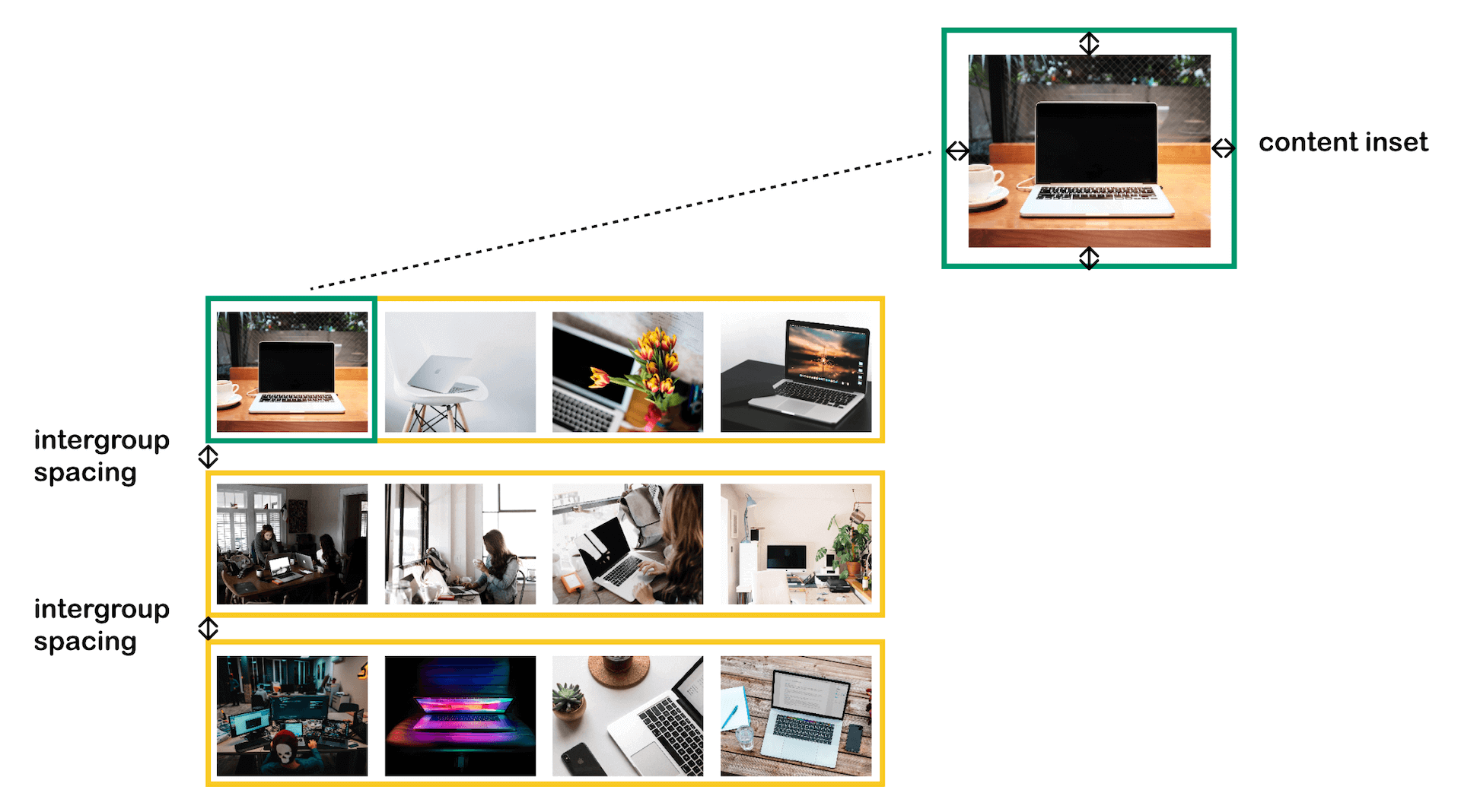
Compositional layouts offer a number of ways for developers to adjust the spacing between items. By default, there is no space between items and groups. To add space between groups, you can insert this line of code in createGridLayout() before the instantiation of layout:
section.interGroupSpacing = 20.0
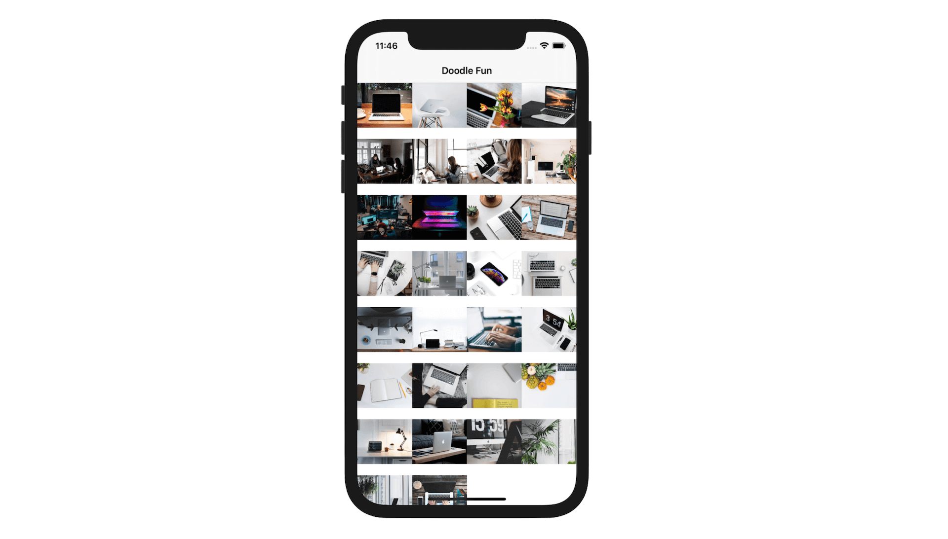
This adds a 20 point space between each group of photos. Figure 20.14 shows you the end result.
To add some spaces between items, you can define the spacing by setting the contentInsets property of the item. Here is an example:
item.contentInsets = NSDirectionalEdgeInsets(top: 5, leading: 5, bottom: 5, trailing: 5)
If you insert the above line of code in createGridLayout(), you add some space around each of the image. Figure 20.15 illustrates the difference between inter-group spacing and content insets of an item.
If you are like me and prefer to have images with rounded corners, you can modify the imageView outlet variable in DoodleCollectionViewCell like this:
@IBOutlet var imageView: UIImageView! {
    didSet {
        imageView.layer.cornerRadius = 20.0
        imageView.clipsToBounds = true
    }
}
This should give you an even better looking grid in my opinion.
Handling Multiple Sections
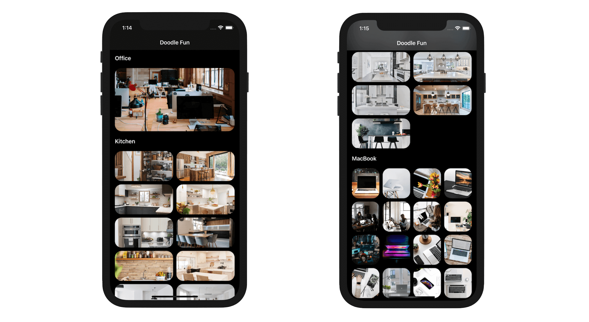
Since I introduced collection view and compositional layout to you, we only focus on developing layout for a single section of data. In the starter project, I prepared three sets of images. So far, we just display the MacBook images in the collection view and arrange them in a 4-column grid.
What we are going to implement is to display the rest of the image sets in the following formats:
- Office images - 1 column grid
- Kitchen images - 2 colomn grid
Therefore, each section has its own grid layout. If you understand the implementation of compositional layout, it is very easy to create this kind of grid layout. First, let's modify the Section enum like this:
enum Section: Int {
    case office
    case kitchen
    case macbook

    var columnCount: Int {
        switch self {
        case .office: return 1
        case .kitchen: return 2
        case .macbook: return 4
        }
    }

    var name: String {
        switch self {
        case .office: return "Office"
        case .kitchen: return "Kitchen"
        case .macbook: return "MacBook"
        }
    }
}
The enum now has three cases to represent three different sections. We also added a columnCount variable which returns the number of columns for the section. The name variable returns the section name, which will be used later.
Next, we need to update the updateSnapshot method to add the images to the snapshot. Modify the method like this:
func updateSnapshot(animatingChange: Bool = false) {

    // Create a snapshot and populate the data
    var snapshot = NSDiffableDataSourceSnapshot<Section, String>()
    snapshot.appendSections([.office, .kitchen, .macbook])
    snapshot.appendItems(officeImages, toSection: .office)
    snapshot.appendItems(kitchenImages, toSection: .kitchen)
    snapshot.appendItems(macbookImages, toSection: .macbook)

    dataSource.apply(snapshot, animatingDifferences: false)
}
We add the sections to the snapshot by calling appendSections and then add the images for each section separately. If you run the app again, you should see a 4-column grid view showing all images.
Now it's time to convert the layout such that each section has a different grid layout. Instead of modifying the createGridLayout() method, let's create a new method called createMultiGridLayout() like this:
private func createMultiGridLayout() -> UICollectionViewLayout {

    let layout = UICollectionViewCompositionalLayout { (sectionIndex, layoutEnvironment) -> NSCollectionLayoutSection? in

        var column = 1

        if let dataSection = Section(rawValue: sectionIndex) {
            column = dataSection.columnCount
        }

        let itemSize = NSCollectionLayoutSize(widthDimension: .fractionalWidth(1.0/CGFloat(column)),heightDimension: .fractionalHeight(1.0))
        let item = NSCollectionLayoutItem(layoutSize: itemSize)
        item.contentInsets = NSDirectionalEdgeInsets(top: 5, leading: 5, bottom: 5, trailing: 5)

        let groupSize = NSCollectionLayoutSize(widthDimension: .fractionalWidth(1.0),heightDimension: .absolute(80.0))

        let group = NSCollectionLayoutGroup.horizontal(layoutSize: groupSize, subitems: [item])

        let section = NSCollectionLayoutSection(group: group)

        return section
    }

    return layout

}
The code looks very similar to that we created earlier but we use a different initializer to create the instance of UICollectionViewCompositionalLayout. Earlier, we instantiate a compositional layout object using a single section. For multiple sections, we pass a section provider to supply the layout's section.
The section provider passes us the index of the section that it's currently creating. With sectionIndex, we can configure a different type of layout for each section. In the closure, we first find out the column count of a particular section. And then we calculate the fractional width of the item using the column count. This line of code is the core of the implementation:
let itemSize = NSCollectionLayoutSize(widthDimension: .fractionalWidth(1.0/CGFloat(column)),heightDimension: .fractionalHeight(1.0))
To switch to this new layout, update the collectionViewLayout property like this:
collectionView.collectionViewLayout = createMultiGridLayout()
Now run the app to have a test. Your app should show three different grids for each section.
Adding Section Headers
Collection views allow you to add a section header to describe what the section is about. To add the header, switch over to Main storyboard to design the section header. Select the collection view and check the Section Header option under the attributes inspector. Xcode then adds a section header right above the prototype cell.
For this demo, I will keep the section header simple. Let's just add a label object to the header. And we will write the UI of the section header view programmatically.
In the project navigator, right click the CompositionalLayout folder and choose the Cocoa Touch Class template. Name the class SectionHeaderView and set it as a subclass of UICollectionReusableView.
Once created the file, update the code like this:
import UIKit

class SectionHeaderView: UICollectionReusableView {

    var titleLabel: UILabel = {
        let label = UILabel()

        label.translatesAutoresizingMaskIntoConstraints = false
        label.font = UIFont.preferredFont(forTextStyle: .headline)

        return label
    }()

    override init(frame: CGRect) {
        super.init(frame: frame)

        addSubview(titleLabel)

        NSLayoutConstraint.activate([
            titleLabel.centerYAnchor.constraint(equalTo: centerYAnchor),
            titleLabel.leadingAnchor.constraint(equalTo: titleLabel.superview!.layoutMarginsGuide.leadingAnchor, constant: 20)
        ])
    }

    required init?(coder: NSCoder) {
        fatalError("init(coder:) has not been implemented")
    }
}
In the code above, we added a title label and created the layout constraints for it.
Switch back to Main storyboard and choose the section header. In the Identity inspector, set the custom class to SectionHeaderView. In the Attributes inspector, set the identifier to header.
Now go back to DoodleViewController to write the code. First, create a new method named configureHeader() in the extension:
func configureHeader() {

    dataSource.supplementaryViewProvider = { (
        collectionView: UICollectionView,
        kind: String,
        indexPath: IndexPath) -> UICollectionReusableView? in

        if kind == UICollectionView.elementKindSectionFooter {
            return nil
        }

        let section = self.dataSource.snapshot().sectionIdentifiers[indexPath.section]

        let headerView = collectionView.dequeueReusableSupplementaryView(ofKind: "header", withReuseIdentifier: "header", for: indexPath) as! SectionHeaderView

        headerView.titleLabel.text = section.name

        return headerView
    }
}
To add a section header to the collection view, we need to provide the supplementary view provider. The implementation should look familiar to you. Since the section header view is designed to be reusable, we call the dequeueReusableSupplementaryView method to get the view and then set the section's name to the label.
We will make the call in the viewDidLoad() method, so insert the following line of code in viewDidLoad() before calling updateSnapshot():
collectionView.register(SectionHeaderView.self, forSupplementaryViewOfKind: "header", withReuseIdentifier: "header")

configureHeader()
We also added a line of code to register the section header. There is still one thing left. We need to update the layout to include the section header. Insert these lines of code in createMultiGridLayout() and place them before return section:
let headerSize = NSCollectionLayoutSize(widthDimension: .fractionalWidth(1.0), heightDimension: .estimated(50))
let headerElement = NSCollectionLayoutBoundarySupplementaryItem(layoutSize: headerSize, elementKind: "header", alignment: .top)

section.boundarySupplementaryItems = [headerElement]
To add a section header to the layout, all you need is to set the boundarySupplementaryItems property. Here, we set it to our section header. The height of the section header is set to 50 points. If you want to make it a bit taller, you can change the value.
Now it's ready to test the app. If you've made the changes correctly, your app should display the header in every section.
Using Orthogonal Scrolling Behavior
The first section of the collection view shows a one-column grid. However, this doesn't look really good. I think it's better to let users navigate through the office images horizontally rather than verticially. At first, it sounds a bit troublesome. Does it mean we need to change a lot of code?
With compositional layouts, you just need a line of code to arrange the section items horizontally. Insert this line of code after the initialization of section in the createMultiGridLayout() method:
if sectionIndex == 0 {
    section.orthogonalScrollingBehavior = .continuous
}
By default, the orthogonalScrollingBehavior property of the section is set to .none. In this case, all items are arranged vertically. When we set it to .continuous, iOS will place the item along the horizontal axis and let users scroll the content with continuous scrolling. Optionally, you can set the value to .paging if you prefer to scroll the images page by page.
To make the UI even better, update the groupSize variable like this:
let groupSize = NSCollectionLayoutSize(widthDimension: .fractionalWidth(1.0),heightDimension: .absolute(sectionIndex == 0 ? 200 : 80.0))
For the first section, we change its height to 200 points. Furthermore, I want to add a horizontal padding for each of the group to polish the layout. Insert this line of code after the initialization of group:
group.contentInsets = NSDirectionalEdgeInsets(top: 0, leading: 10, bottom: 0, trailing: 10)
That's it! Run the app on an iPhone simulator and see the result. You should be able to scroll through the images horizontally for the office section.
Summary
I hope you enjoyed this chapter. We covered quite a lot of techniques about the layout of collection views. The compositional layout introduced in iOS 13 allows developers to build complex UIs easily. By combining compositional layout with trait collection API, you can create adaptive layout that works great on both iPad and iPhone.
For reference, you can download the Xcode project from http://www.appcoda.com/resources/swift55/CompositionalLayout.zip.